BI tools
note prerequisites
PREREQUISITES
Ensure you have validated a successful connection, can list data views, and use a data view for the BI tool for which you want to try out this use case.
tabs
Power BI Desktop
  1. In the Data pane:

    1. Select daterange.
    2. Select product_name.
    3. Select ∑ purchase_revenue.
    4. Select ∑ purchases.

    You see an empty table displaying only the column headers for the selected element. For better visibility, enlarge the visualization.

  2. In the Filters pane:

    1. Select the daterange is (All) from Filters on this visual.
    2. Select Relative date as the Filter type.
    3. Define the filter to Show items when the value is in the last 1 calendar years.
    4. Select Apply filter.

    You see the table updated with the applied daterange filter.

  3. In the Visualization pane:

    1. Use CrossSize75 to remove daterange from Columns.
    2. Drag and drop Sum of purchases_revenue underneath Sum of purchases in Columns.
  4. On the Table visualization:

    1. Select Sum of purchase_revenue to sort the product names in descending purchase revenue order. Your Power BI Desktop should look like below.

    Power BI Desktop Use Case 5 Table status {modal="regular"}

  5. In the Filters pane:

    1. Select product_name is (All).
    2. Set Filter type to Top N.
    3. Define the filter to Show items Top 10 By value.
    4. Drag and drop purchase_revenue into By value Add data fields here.
    5. Select Apply filter.

    You see the table updated with values for purchase revenue in sync with the Freeform table visualization in Analysis Workspace.

  6. In the Visualizations pane:

    1. Select the Line and stacked column chart visualization.

    A line and stacked column chart visualization replaces the table while using the same data as the table.

  7. Drag and drop purchases onto Line y-axis in the Visualizations pane.

    The line and stacked column chart is updated. Your Power BI Desktop should look like below.

    Power BI Desktop Use Case 5 Graph {modal="regular"}

  8. On the Line and stacked column chart visualization:

    1. Select More .
    2. From the context menu, select Show as a table.

    The main view is updated to show both a line visualization and a table.

    Power BI Desktop Use Case 2 Final Daily Trend visualization {modal="regular"}

Tableau Desktop
  1. Select the Sheet 1 tab at the bottom to switch from Data source. In the Sheet 1 view:

    1. Drag the Daterange entry from the Tables list in the Data pane and drop the entry onto the Filters shelf.

    2. In the Filters Field [Daterange] dialog, select Range of Dates and select Next >.

    3. In the Filter [Daterange] dialog, select Range of dates and specify a period of 01/01/2023 - 31/12/2023. Select Apply and OK.

      Tableau Desktop Filter {modal="regular"}

    4. Drag and drop Product Name from the Tables list in the Data pane and drop the entry in the field next to Rows.

    5. Drag and drop Purchases from the Tables (Measure Names) list in the Data pane and drop the entry in the field next to Rows. The value is automatically converted to SUM(Purchases).

    6. Drag and drop Purchase Revenue from the Tables (Measure Names) list in the Data pane and drop the entry in the field next to Columns and left from SUM(Purchases). The value is automatically converted to SUM(Purchase Revenue).

    7. To order both charts in descending purchase revenue order, hover over the Purchase Revenue title and select the sort icon.

    8. To limit the number of entries in the charts, select SUM(Purchase Revenue) in Rows and from the dropdown menu select Filter.

    9. In the Filter [Purchase Revenue] dialog select Range of values and enter appropriate values. For example: 1,000,000 - 2,000,000. Select Apply and OK.

    10. To convert the two bar charts to a dual combination chart, select SUM(Purchases) in Rows and from the dropdown menu, select Dual Axis. The bar charts transform into a scatter plot.

    11. To modify the scatter plot to a bar chart:

      1. Select SUM(Purchases) in the Marks area and select Line from the dropdown menu.
      2. Select SUM(Purchase Revenue) in the Marks area and select Bar from the dropdown menu.

    Your Tableau Desktop should look like below.

    Tableau Desktop Graph {modal="regular"}

  2. Select Duplicate from the Sheet 1 tab context menu to create a second sheet.

  3. Select Rename from the Sheet 1 tab context menu to rename the sheet to Data.

  4. Select Rename from the Sheet 1 (2) tab context menu to rename the sheet to Graph.

  5. Ensure that the Data sheet is selected.

    1. Select Show me at the top right and select Text table (upper left top visualization) to modify the content of the two charts to a table.
    2. To order purchase revenue in descending order, hover over Purchase Revenue in the table and select SortOrderDown .
    3. Select Entire View from the Fit dropdown menu.

    Your Tableau Desktop should look like below.

    Tableau Desktop Data {modal="regular"}

  6. Select New Dashboard tab button (at the bottom) to create a new Dashboard 1 view. In the Dashboard 1 view:

    1. Drag and drop the Graph sheet from the Sheets shelf onto the Dashboard 1 view that reads Drop sheets here.
    2. Drag and drop the Data sheet from the Sheets shelf below the Graph sheet onto the Dashboard 1 view.
    3. Select the Data sheet in the view and modify Entire View to Fix Width.

    Your Dashboard 1 view should look like below.

    Tableau Desktop Dashboard 1 {modal="regular"}

Looker
  1. In the Explore interface of Looker, ensure you do have a clean setup. If not, select Setting Remove fields and filters.

  2. Select + Filter underneath Filters.

  3. In the Add Filter dialog:

    1. Select ‣ Cc Data View

    2. From the list of fields, select ‣ Daterange Date then Daterange Date.

      Looker filter {modal="regular"}

  4. Specify the Cc Data View Daterange Date filter as is in range 2023/01/01 until (before) 2024/01/01.

  5. From the ‣ Cc Data View section in the left rail, select Product Name.

  6. From the ‣ Custom Fields section in the left rail:

    1. Select Custom Measure from the + Add dropdown menu.

    2. In the Create custom measure dialog:

      1. Select Purchase Revenue from the Field to measure dropdown menu.

      2. Select Sum from the Measure type dropdown menu.

      3. Enter a custom field name for Name. For example: Purchase Revenue.

      4. Select the Field details tab.

      5. Select Decimals from the Format dropdown menu and ensure 0 is entered in Decimals.

        Looker custom metric field {modal="regular"}

      6. Select Save.

    3. Select Custom Measure once more from the + Add dropdown menu. In the Create custom measure dialog:

      1. Select Purchases from the Field to measure dropdown menu.
      2. Select Sum from the Measure type dropdown menu.
      3. Enter a custom field name for Name. For example: Sum of Purchases.
      4. Select the Field details tab.
      5. Select Decimals from the Format dropdown menu and ensure 0 is entered in Decimals.
      6. Select Save.
    4. Both fields are automatically added to the Data view.

  7. Select + Filter to add another Filters and to limit the data.

  8. In the Add Filter dialog, select ‣ Custom Fields, then Purchase Revenue.

  9. Make the appropriate selections and enter the proposed values, so the filter reads is between inclusive 1000000 AND 2000000.

  10. Select Run.

  11. Select ‣ Visualization to display the line visualization.

  12. Select Edit in Visualization to update the visualization. In the popup dialog:

    1. Select the Series tab.

    2. Scroll down to see Purchases and change the Type to Line.

    3. Select the Y tab.

    4. Drag Purchases from the **Left 1 ** container to where it reads Drag series here to create a new left axis. This action creates a Left 2 container.

      Looker visualization configuration {modal="regular"}

    5. Select CrossSize75 next to Edit to hide the popup dialog

You should see a visualization and table similar as shown below.

Looker result daily trend {modal="regular"}

Jupyter Notebook
  1. Enter the following statements in a new cell.

    code language-python
    import seaborn as sns
    import matplotlib.pyplot as plt
    data = %sql SELECT product_name AS `Product Name`, SUM(purchase_revenue) AS `Purchase Revenue`, SUM(purchases) AS `Purchases` \
                FROM cc_data_view \
                WHERE daterange BETWEEN '2023-01-01' AND '2024-01-01' \
                GROUP BY 1 \
                LIMIT 10;
    df = data.DataFrame()
    df = df.groupby('Product Name', as_index=False).sum()
    plt.figure(figsize=(15, 3))
    sns.barplot(x='Purchase Revenue', y='Product Name', data=df)
    plt.show()
    display(data)
    
  2. Execute the cell. You should see output similar to the screenshot below.

    Jupyter Notebook Results

RStudio
  1. Enter the following statements between ```{r} and ``` in a new chunk.

    code language-r
    library(tidyr)
    
    ## Single dimension ranked
    df <- dv %>%
       filter(daterange >= "2023-01-01" & daterange < "2024-01-01") %>%
       group_by(product_name) %>%
       summarise(purchase_revenue = sum(purchase_revenue), purchases = sum(purchases)) %>%
       arrange(product_name, .by_group = FALSE)
    dfV <- df %>%
       head(5)
    ggplot(dfV, aes(x = purchase_revenue, y = product_name)) +
       geom_col(position = "dodge") +
       geom_text(aes(label = purchase_revenue), vjust = -0.5)
    print(df)
    
  2. Run the chunk. You should see output similar to the screenshot below.

    RStudio Results

Multiple dimension ranked

In this use case, you want to display a table that breaks down the purchase revenue and purchases for product names within product categories over 2023. On top of that you want to use some visualizations to illustrate both the product category distribution and product name contributions within each product category.

Customer Journey Analytics

An example Multiple Dimension Ranked panel for the use case:

Customer Journey Analytics Multiple Dimension Ranked panel {modal="regular"}

BI tools
note prerequisites
PREREQUISITES
Ensure you have validated a successful connection, can list data views, and use a data view for the BI tool for which you want to try out this use case.
tabs
Power BI Desktop
  1. To ensure the date range apply to all visualizations, drag and drop daterangeday from the Data pane on to Filters on this page.

    1. Select the daterangeday is (All) from Filters on this page.
    2. Select Relative date as the Filter type.
    3. Define the filter to Show items when the value is in the last 1 calendar years.
    4. Select Apply filter.
  2. In the Data pane:

    1. Select datarangeday.
    2. Select product_category.
    3. Select product_name.
    4. Select ∑ purchase_revenue
    5. Select ∑ purchases
  3. To modify the vertical bar chart to a Table, ensure you have the table selected and select Matrix from the Visualizations pane.

    • Drag product_name from Columns and drop the field underneath product_categor y in Rows in the Visualization pane.
  4. To limit the number of displayed products within the table, select product_name is (All) in the Filters pane.

    1. Select Advanced filtering.
    2. Select Filter type Top N Show items Top 15 By Value.
    3. Drag purchases from the Data pane onto the Add data fields here.
    4. Select Apply filter.
  5. To improve readability, select View from the top menu, and select Page View > Actual size and resize the table visualization.

  6. To break down each category in the table, select + at the product category level. Your Power BI Desktop should look like below.

    Power BI Desktop Multiple Dimensions Ranked matrix table {modal="regular"}

  7. Select Home from the top menu, and select New visual. A new visual is added to your report.

  8. In the Data pane:

    1. Select product_category.
    2. Select product_name.
    3. Select purchase_revenue.
  9. To modify the visual, select the bar chart and select Treemap from the Visualizations pane.

  10. Ensure that product_category is listed underneath Category, and product_name is listed underneath Details in the Visualizations pane.

    Your Power BI Desktop should look like below.

    Power BI Desktop Multiple Dimensions Ranked treemap {modal="regular"}

  11. Select Home from the top menu, and select New visual. A new visual is added to your report.

  12. In the Data pane:

    1. Select product_category.
    2. Select purchase_revenue.
    3. Select purchase.
  13. In the Visualizations pane:

    1. To modify the visualization, select Line and stacked column chart.
    2. Drag sum_of_purchases from Column y-axis to Line y-axis.
  14. In the report, reshuffle the individual visualizations.

    Your Power BI Desktop should look like below.

    Power BI Desktop Multiple Dimensions Ranked final {modal="regular"}

Tableau Desktop
  1. Select the Sheet 1 tab at the bottom to switch from Data source. In the Sheet 1 view:

    1. Drag the Daterange entry from the Tables list in the Data pane and drop the entry onto the Filters shelf.

    2. In the Filters Field [Daterange] dialog, select Range of Dates and select Next >.

    3. In the Filter [Daterange] dialog, select Relative dates, select Years, and specify Previous year. Select Apply and OK.

      Your Tableau Desktop should look like below.

      Tableau Desktop Multiple Dimension Ranked Filter {modal="regular"}

    4. Drag Product Category and drop next to Columns.

    5. Drag Purchase Revenue and drop next to Rows. The value changes to SUM(Purchase Revenue).

    6. Drag Purchases and drop next to Rows. The value changes to SUM(Purchases).

    7. Select SUM(Purchases) and from the dropdown menu select Dual Axis.

    8. Select SUM(Purchases) in Marks and select Line from the dropdown menu.

    9. Select SUM(Purchase Revenue) in Marks and select Bar from the dropdown menu.

    10. Select Entire View from the Fit menu.

    11. Select the Purchase Revenue title in the chart and ensure that the purchase revenue is in ascending order.

      Your Tableau Desktop should look like below.

      Tableau Desktop Multiple Dimensions Ranked Category {modal="regular"}

  2. Rename the current Sheet 1 sheet to Category.

  3. Select New Worksheet to create a new sheet, and rename it to Data.

    1. Drag the Daterange entry from the Tables list in the Data pane and drop the entry onto the Filters shelf.

    2. In the Filters Field [Daterange] dialog, select Range of Dates and select Next >.

    3. In the Filter [Daterange] dialog, select Relative dates, select Years, and specify Previous year. Select Apply and OK.

    4. Drag Purchase Revenue from Data pane to Columns. The value changes to SUM(Purchase Revenue).

    5. Drag Purchase from Data pane to Columns, next to Purchase Revenue. The value changes to SUM(Purchases).

    6. Drag Product Category from the Data pane to Rows.

    7. Drag Product Name from the Data pane to Rows, next to Product Category.

    8. To change the two horizontal bars to a table, select Text Table from Show Me.

    9. To limit the number of products, select Purchases in Measure Values. From the dropdown menu, select Filter.

    10. In the Filter [Purchases] dialog, select At least and enter 7000. Select Apply and OK.

    11. Select Fit Width from the Fit dropdown menu.

      Your Tableau Desktop should look like below.

      Tableau Desktop Multiple Dimension Ranked Data {modal="regular"}

  4. Select New worksheet to create a new sheet and rename it to Treemap.

    1. Drag the Daterange entry from the Tables list in the Data pane and drop the entry onto the Filters shelf.

    2. In the Filters Field [Daterange] dialog, select Range of Dates and select Next >.

    3. In the Filter [Daterange] dialog, select Relative dates, select Years, and specify Previous year. Select Apply and OK.

    4. Drag Purchase Revenue from the Data pane to Rows. The values changes to SUM(Purchase Revenue).

    5. Drag Purchase from the Data pane to Rows, next to Purchase Revenue. The value changes to SUM(Purchases).

    6. Drag Product Category from the Data pane to Columns.

    7. Drag Product Name from the Data pane to Columns.

    8. To change the two vertical bar charts to a treemap, select Treemap from Show Me.

    9. To limit the number of products, select Purchases in Measure Values. From the dropdown menu, select Filter.

    10. In the Filter [Purchases] dialog, select At least and enter 7000. Select Apply and OK.

    11. Select Fit Width from the Fit dropdown menu.

      Your Tableau Desktop should look like below.

      Tableau Desktop Multiple Dimension Ranked Data {modal="regular"}

  5. Select New Dashboard tab button (at the bottom) to create a new Dashboard 1 view. In the Dashboard 1 view:

    1. Drag and drop the Category sheet from the Sheets shelf onto the Dashboard 1 view that reads Drop sheets here.
    2. Drag and drop the Treemap sheet from the Sheets shelf underneath the Category sheet on the Dashboard 1 view.
    3. Drag and drop the Data sheet from the Sheets shelf underneath the Treemap sheet on the Dashboard 1 view.
    4. Resize each of the sheets in the view.

    Your Dashboard 1 view should look like below.

    Tableau Desktop Dashboard 1 {modal="regular"}

Looker
  1. In the Explore interface of Looker, ensure you do have a clean setup. If not, select Setting Remove fields and filters.

  2. Select + Filter underneath Filters.

  3. In the Add Filter dialog:

    1. Select ‣ Cc Data View

    2. From the list of fields, select ‣ Daterange Date then Daterange Date.

      Looker filter {modal="regular"}

  4. Specify the Cc Data View Daterange Date filter as is in range 2023/01/01 until (before) 2024/01/01.

  5. From the ‣ Cc Data View section in the left rail:

    1. Select Product Category.
    2. Select Product Name.
  6. From the ‣ Custom Fields section in the left rail:

    1. Select Custom Measure from the + Add dropdown menu.

    2. In the Create custom measure dialog:

      1. Select Purchase Revenue from the Field to measure dropdown menu.

      2. Select Sum from the Measure type dropdown menu.

      3. Enter a custom field name for Name. For example: Sum of Purchase Revenue.

      4. Select the Field details tab.

      5. Select Decimals from the Format dropdown menu and ensure 0 is entered in Decimals.

        Looker custom metric field {modal="regular"}

      6. Select Save.

    3. Select Custom Measure once more from the + Add dropdown menu. In the Create custom measure dialog:

      1. Select Purchases from the Field to measure dropdown menu.
      2. Select Sum from the Measure type dropdown menu.
      3. Enter a custom field name for Name. For example: Sum of Purchases.
      4. Select the Field details tab.
      5. Select Decimals from the Format dropdown menu and ensure 0 is entered in Decimals.
      6. Select Save.
    4. Both fields are automatically added to the Data view.

  7. In the Filters section, select + Filter. In the Add Filter dialog. Select ‣ Custom Fields, then Purchase Revenue.

  8. Select is > and enter 800000 to limit the results.

  9. Select Run.

  10. Select ‣ Visualization to display the line visualization.

  11. Select Edit in Visualization to update the visualization. In the popup dialog:

    1. Select the Plot tab.

    2. Scroll down and select Edit Chart Config.

    3. Modify the JSON in Chart Config (Override) like in the screenshot below, and then select Preview.

      Looker vsualization config {modal="regular"}

    4. Select Apply.

    5. Select CrossSize75 next to Edit to hide the popup dialog

You should see a visualization and table similar as shown below.

Looker result daily trend {modal="regular"}

Jupyter Notebook
  1. Enter the following statements in a new cell.

    code language-python
    import seaborn as sns
    import matplotlib.pyplot as plt
    data = %sql SELECT product_category AS `Product Category`, product_name AS `Product Name`, SUM(purchase_revenue) AS `Purchase Revenue`, SUM(purchases) AS `Purchases` \
                FROM cc_data_view \
                WHERE daterange BETWEEN '2023-01-01' AND '2024-01-01' \
                GROUP BY 1, 2 \
                ORDER BY `Purchase Revenue` DESC \
                LIMIT 10;
    df = data.DataFrame()
    df = df.groupby(['Product Category', 'Product Name'], as_index=False).sum()
    plt.figure(figsize=(8, 8))
    sns.scatterplot(x='Product Category', y='Product Name', size='Purchase Revenue', sizes=(10, 200), hue='Purchases', palette='husl', data=df)
    plt.show()
    display(data)
    
  2. Execute the cell. You should see output similar to the screenshot below.

    Jupyter Notebook Results

RStudio
  1. Enter the following statements between ```{r} and ``` in a new chunk.

    code language-r
    ## Multiple dimensions ranked
    df <- dv %>%
       filter(daterange >= "2023-01-01" & daterange < "2024-01-01") %>%
       group_by(product_category, product_name) %>%
       summarise(purchase_revenue = sum(purchase_revenue), purchases = sum(purchases), .groups = "keep") %>%
       arrange(desc(purchase_revenue), .by_group = FALSE)
    print(df)
    
  2. Run the chunk. You should see output similar to the screenshot below.

    RStudio Results

Count distinct dimension values

In this use case, you want to get the distinct number of product names that have been reported on during January 2023.

Customer Journey Analytics

To report on a distinct count of product names, you set up a calculated metric in Customer Journey Analytics, with Title Product Name (Count Distinct) and External Id product_name_count_distinct.

Customer Journey Analytics Product Name (Distincr Count) calculated metric {modal="regular"}

You then can use that metric in an example Count Distinct Dimension Values panel for the use case:

Customer Journey Analytics Distinct Count Values {modal="regular"}

BI tools
note prerequisites
PREREQUISITES
Ensure you have validated a successful connection, can list data views, and use a data view for the BI tool for which you want to try out this use case.
tabs
Power BI Desktop
  1. To ensure the date range apply to all visualizations, drag and drop daterangeday from the Data pane on to Filters on this page.

    1. Select the daterangeday is (All) from Filters on this page.
    2. Select Advanced filtering as the Filter type.
    3. Define the filter to Show items when the value is on or after 1/1/2023 And is before 2/1/2023.
    4. Select Apply filter.
  2. In the Data pane:

    1. Select datarangeday.
    2. Select ∑ cm_product_name_count_distinct, which is the calculated metric defined in Customer Journey Analytics.
  3. To modify the vertical bar chart to a Table, ensure you have the chart selected and select Table from the Visualizations pane.

    Your Power BI Desktop should look like below.

    Power BI Desktop Multiple Count Distinct table {modal="regular"}

  4. Select the table visualization. From the context menu, select Copy > Copy visual.

  5. Paste the visualization using ctrl-v. The exact copy of the visualization overlaps the original one. Move it to the right in the report area.

  6. To modify the copied visualization from a table to a card, select Card from Visualizations.

    Your Power BI Desktop should look like below.

    Power BI Desktop Multiple Count Distinct table {modal="regular"}

Alternatively, you can use the count distinct functionality from Power BI.

  1. Select the product_name dimension.

  2. Apply the Count (Distinct) function on the product_name dimension in Columns.

    Power BI Count Distinct {modal="regular"}

Tableau Desktop
  1. Select the Sheet 1 tab at the bottom to switch from Data source. In the Sheet 1 view:

    1. Drag the Daterange entry from the Tables list in the Data pane and drop the entry onto the Filters shelf.

    2. In the Filter Field [Daterange] dialog, select Range of Dates and select Next >.

    3. In the Filter [Daterange] dialog, select Range of dates, and select 01/01/2023 - 31/1/2023. Select Apply and OK.

    4. Drag Cm Product Name Count Distinct to Rows. The value changes to SUM(Cm Product Name Count Distinct). This field is the calculated metric that you have defined in Customer Journey Analytics.

    5. Drag Daterangeday and drop next to Columns. Select Daterangeday and from the dropdown menu select Day.

    6. To modify the lines visualization to a table, select Text Table from Show Me.

    7. Select Swap Rows and Columns from the toolbar.

    8. Select Fit Width from the Fit dropdown menu.

      Your Tableau Desktop should look like below.

      Tableau Desktop Multiple Dimension Ranked Filter {modal="regular"}

  2. Select Duplicate from the Sheet 1 tab context menu to create a second sheet.

  3. Select Rename from the Sheet 1 tab context menu to rename the sheet to Data.

  4. Select Rename from the Sheet 1 (2) tab context menu to rename the sheet to Card.

  5. Ensure you have selected the Card view.

  6. Select DAY(Daterangeday) and from the dropdown menu select Month. The value changes to MONTH(Daterangeday).

  7. Select SUM(Cm Product Name Count Distinct) in Marks and from the dropdown menu select Format.

  8. To change the font size, in the Format SUM(CM Product Name Count Distinct) pane, select Font within Default and select 72 for the font size.

  9. To align the number, select Automatic next to Alignment and set Horizontal to centered.

  10. To use whole numbers, select 123.456 next to Numbers and select Number (Custom). Set Decimal places to 0.

    Your Tableau Desktop should look like below.

    Tableau Desktop Multiple Dimension Ranked Filter {modal="regular"}

  11. Select New Dashboard tab button (at the bottom) to create a new Dashboard 1 view. In the Dashboard 1 view:

    1. Drag and drop the Card sheet from the Sheets shelf onto the Dashboard 1 view that reads Drop sheets here.
    2. Drag and drop the Data sheet from the Sheets shelf underneath the Card sheet on the Dashboard 1 view.

    Your Dashboard 1 view should look like below.

    Tableau Desktop Dashboard 1 {modal="regular"}

Alternatively, you can use the count distinct functionality from Tableau Desktop.

  1. Use Product Name instead of Cm Product Name Count Distinct.

  2. Apply Measure > Count (Distinct) on Product Name in Marks.

    Tableau Count Distinct {modal="regular"}

Looker
  1. In the Explore interface of Looker, ensure you do have a clean setup. If not, select Setting Remove fields and filters.

  2. Select + Filter underneath Filters.

  3. In the Add Filter dialog:

    1. Select ‣ Cc Data View

    2. From the list of fields, select ‣ Daterange Date then Daterange Date.

      Looker filter {modal="regular"}

  4. Specify the Cc Data View Daterange Date filter as is in range 2023/01/01 until (before) 2023/02/01.

  5. From the ‣ Cc Data View section in the left rail:

    1. Select Daterange Date, then Date.

    2. Select Aggregate ‣ Count Distinct from the ⋮ More context menu on Product Name.

      Looker Product Name Context menu {modal="regular"}

  6. Select Run.

  7. Select ‣ Visualization and select 6︎⃣ from the toolbar to display a Single value visualization.

You should see a visualization and table similar as shown below.

Looker count distinct {modal="regular"}

Jupyter Notebook
  1. Enter the following statements in a new cell.

    code language-python
    data = %sql SELECT COUNT(DISTINCT(product_name)) AS `Product Name` \
       FROM cc_data_view \
       WHERE daterange BETWEEN '2023-01-01' AND '2023-02-01';
    display(data)
    
  2. Execute the cell. You should see output similar to the screenshot below.

    Jupyter Notebook Results

RStudio
  1. Enter the following statements between ```{r} and ``` in a new chunk.

    code language-r
    ## Count Distinct
    df <- dv %>%
       filter(daterange >= "2023-01-01" & daterange < "2023-02-01") %>%
       summarise(product_name_count_distinct = n_distinct(product_name))
    print(df)
    
  2. Run the chunk. You should see output similar to the screenshot below.

    RStudio Results

Use date range names to filter

In this use case you want to use a date range that you have defined in Customer Journey Analytics to filter and report on occurrences (events) during the last year.

Customer Journey Analytics

To report using a date range, you set up a date range in Customer Journey Analytics, with Title Last Year 2023.

Customer Journey Analytics Use date Range Names to filter {modal="regular"}

You then can use that date range in an example Using Date Range Names To Filter panel for the use case:

Customer Journey Analytics Distinct Count Values {modal="regular"}

Note how the date range defined in the Freeform table visualization overrules the date range applied to the panel.

BI tools
note prerequisites
PREREQUISITES
Ensure you have validated a successful connection, can list data views, and use a data view for the BI tool for which you want to try out this use case.
tabs
Power BI Desktop
  1. In the Data pane:

    1. Select daterangemonth.
    2. Select daterangeName.
    3. Select ∑ occurrences.

    You see a visualization displaying Error fetching data for this visual.

  2. In the Filters pane:

    1. Select the daterangeName is (All) from Filters on this visual.
    2. Select Basic filtering as the Filter type.
    3. Underneath the Search field, select Last Year 2023, which is the name of your date range defined in Customer Journey Analytics.
    4. Select CrossSize75 to remove daterangeName from Columns.

    You see the table updated with the applied daterangeName filter. Your Power BI Desktop should look like below.

    Power BI Desktop Using Date Range Names To Filter {modal="regular"}

Tableau Desktop
  1. Select the Sheet 1 tab at the bottom to switch from Data source. In the Sheet 1 view:

    1. Drag the Daterange Name entry from the Tables list in the Filters shelf.

    2. In the Filter [Daterange Name] dialog ensure Select from list is selected, and select Last Year 2023 from the list. Select Apply and OK.

    3. Drag Daterangemonth entry from the Tables list and drop the entry in the field next to Rows. Select Daterangemonth and select Month. The value changes to MONTH(Daterangemonth).

    4. Drag Occurrences entry from the Tables list and drop the entry in the field next to Columns. The value changes to SUM(Occurrences).

    5. Select Text Table from Show Me.

    6. Select Swap Rows and Columns from the toolbar.

    7. Select Fit Width from the Fit dropdown menu.

      Your Tableau Desktop should look like below.

      Tableau Desktop Multiple Dimension Ranked Filter {modal="regular"}

Looker
  1. In the Explore interface of Looker, ensure you do have a clean setup. If not, select Setting Remove fields and filters.

  2. Select + Filter underneath Filters.

  3. In the Add Filter dialog:

    1. Select ‣ Cc Data View
    2. From the list of fields, select ‣ Daterange Name.
  4. Specify the Cc Data View Daterange Name filter as is and select Last Year 2023 from the list of values.

  5. From the ‣ Cc Data View section in the left rail:

    1. Select Daterange Month, then Month.
    2. Select Count underneath MEASURES in the left rail (at the bottom).
  6. Select Run.

  7. Select ‣ Visualization.

You should see a visualization and table similar as shown below.

Looker count distinct {modal="regular"}

Jupyter Notebook
  1. Enter the following statements in a new cell.

    code language-python
    data = %sql SELECT daterangeName FROM cc_data_view;
    style = {'description_width': 'initial'}
    daterange_name = widgets.Dropdown(
       options=[d for d, in data],
       description='Date Range Name:',
       style=style
    )
    display(daterange_name)
    
  2. Execute the cell. You should see output similar to the screenshot below.

    Jupyter Notebook Results

  3. Select Fishing Products from the dropdown menu.

  4. Enter the following statements in a new cell.

    code language-python
    import seaborn as sns
    import matplotlib.pyplot as plt
    data = %sql SELECT daterangemonth AS Month, COUNT(*) AS Events \
                FROM cc_data_view \
                WHERE daterangeName = '{daterange_name.value}' \
                GROUP BY 1 \
                ORDER BY Month ASC
    df = data.DataFrame()
    df = df.groupby('Month', as_index=False).sum()
    plt.figure(figsize=(15, 3))
    sns.lineplot(x='Month', y='Events', data=df)
    plt.show()
    display(data)
    
  5. Execute the cell. You should see output similar to the screenshot below.

    Jupyter Notebook Results

RStudio
  1. Enter the following statements between ```{r} and ``` in a new chunk. Ensure you use the appropriate date range name. For example, Last Year 2023.

    code language-r
    ## Monthly Events for Last Year
    df <- dv %>%
       filter(daterangeName == "Last Year 2023") %>%
       group_by(daterangemonth) %>%
       count() %>%
       arrange(daterangemonth, .by_group = FALSE)
    ggplot(df, aes(x = daterangemonth, y = n)) +
       geom_line(color = "#69b3a2") +
       ylab("Events") +
       xlab("Hour")
    print(df)
    
  2. Run the chunk. You should see output similar to the screenshot below.

    RStudio Results

Use filter names to filter

In this use case, you want to use an existing filter for the Fishing product category, that you have defined in Customer Journey Analytics. To filter and report on product names and occurrences (events) during January 2023.

Customer Journey Analytics

Inspect the filter that you want to use in Customer Journey Analytics.

Customer Journey Analytics Use Filter Names To Filter {modal="regular"}

You then can use that filter in an example Using Date Range Names To Filter panel for the use case:

Customer Journey Analytics Distinct Count Values {modal="regular"}

BI tools
note prerequisites
PREREQUISITES
Ensure you have validated a successful connection, can list data views, and use a data view for the BI tool for which you want to try out this use case.
tabs
Power BI Desktop
  1. In the Data pane:

    1. Select daterange.
    2. Select filterName.
    3. Select product_name.
    4. Select ∑ occurrences.

You see a visualization displaying Error fetching data for this visual.

  1. In the Filters pane:

    1. Select filterName is (All) from Filters on this visual.
    2. Select Basic filtering as the Filter type.
    3. Underneath the Search field, select Fishing Products, which is the name of the existing filter defined in Customer Journey Analytics.
    4. Select daterange is (All) from Filters on this visual.
    5. Select Advanced filtering as the Filter type.
    6. Define the filter to Show items when the value is on or after 1/1/2023 And is before 2/1/2023.
    7. Select CrossSize75 to remove filterName from Columns.
    8. Select CrossSize75 to remove daterange from Columns.

    You see the table updated with the applied filterName filter. Your Power BI Desktop should look like below.

    Power BI Desktop Using Date Range Names To Filter {modal="regular"}

Tableau Desktop
  1. Select the Sheet 1 tab at the bottom to switch from Data source. In the Sheet 1 view:

    1. Drag the Filter Name entry from the Tables list in the Filters shelf.

    2. In the Filter [Filter Name] dialog ensure Select from list is selected, and select Fishing Products from the list. Select Apply and OK.

    3. Drag Daterange entry from the Tables list in the Filters shelf.

    4. In the Filter Field [Daterange] dialog, select Range of Dates and select Next >.

    5. In the Filter [Daterange] dialog, select Range of dates, and select 01/01/2023 - 01/02/2023. Select Apply and OK.

    6. Drag Product Name from the Tables list to Rows.

    7. Drag Occurrences entry from the Tables list and drop the entry in the field next to Columns. The value changes to SUM(Occurrences).

    8. Select Text Table from Show Me.

    9. Select Fit Width from the Fit dropdown menu.

      Your Tableau Desktop should look like below.

      Tableau Desktop Multiple Dimension Ranked Filter {modal="regular"}

Looker
  1. In the Explore interface of Looker, ensure you do have a clean setup. If not, select Setting Remove fields and filters.

  2. Select + Filter underneath Filters.

  3. In the Add Filter dialog:

    1. Select ‣ Cc Data View

    2. From the list of fields, select ‣ Daterange Date then Daterange Date.

      Looker filter {modal="regular"}

  4. Specify the Cc Data View Daterange Date filter as is in range 2023/01/01 until (before) 2023/02/01.

  5. Select + Filter underneath Filters to add another filter.

  6. In the Add Filter dialog:

    1. Select ‣ Cc Data View
    2. From the list of fields, select ‣ Filter name.
  7. Ensure is the selection for the filter.

  8. Select Fishing Products from the list of possible values.

  9. From the ‣ Cc Data View section in the left rail:

    1. Select Product Name.
    2. Select Count underneath MEASURES in the left rail (at the bottom).
  10. Select Run.

  11. Select ‣ Visualization.

You should see a visualization and table similar as shown below.

Looker count distinct {modal="regular"}

Jupyter Notebook
  1. Enter the following statements in a new cell.

    code language-python
    data = %sql SELECT filterName FROM cc_data_view;
    style = {'description_width': 'initial'}
    filter_name = widgets.Dropdown(
       options=[d for d, in data],
       description='Filter Name:',
       style=style
    )
    display(filter_name)
    
  2. Execute the cell. You should see output similar to the screenshot below.

    Jupyter Notebook Results

  3. Select Fishing Products from the dropdown menu.

  4. Enter the following statements in a new cell.

    code language-python
    import seaborn as sns
    import matplotlib.pyplot as plt
    data = %sql SELECT product_name AS `Product Name`, COUNT(*) AS Events \
                FROM cc_data_view \
                WHERE daterange BETWEEN '2023-01-01' AND '2023-02-01' \
                   AND filterName = '{filter_name.value}' \
                GROUP BY 1 \
                LIMIT 10;
    df = data.DataFrame()
    df = df.groupby('Product Name', as_index=False).sum()
    plt.figure(figsize=(15, 3))
    sns.barplot(x='Events', y='Product Name', data=df)
    plt.show()
    display(data)
    
  5. Execute the cell. You should see output similar to the screenshot below.

    Jupyter Notebook Results

RStudio
  1. Enter the following statements between ```{r} and ``` in a new chunk. Ensure you use the appropriate filter name. For example, Fishing Products.

    code language-r
    ## Dimension filtered by name
    df <- dv %>%
       filter(daterange >= "2023-01-01" & daterange < "2023-02-01" & filterName == "Fishing Products") %>%
       group_by(product_name) %>%
       count() %>%
       arrange(desc(n), .by_group = FALSE)
    print(df)
    
  2. Run the chunk. You should see output similar to the screenshot below.

    RStudio Results

Use dimension values to filter

You use the dynamic Hunting value for Product Category to filter products from the hunting category. Alternatively, for those BI tools that do not support the dynamic retrieval of product category values, you create a new filter in Customer Journey Analytics that filters on products from the hunting product category.
Then you want to use the new filter to report on product names and occurrences (events) for products from the hunting category during January 2023.

Customer Journey Analytics

Create a new filter with Title Hunting Products in Customer Journey Analytics.
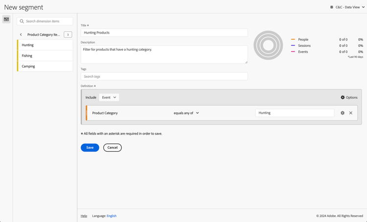
Customer Journey Analytics Use Dimension Values To Filter {modal="regular"}

You then can use that filter in an example Using Dimension Values To Filter panel for the use case:

Customer Journey Analytics Distinct Count Values {modal="regular"}

BI tools
note prerequisites
PREREQUISITES
Ensure you have validated a successful connection, can list data views, and use a data view for the BI tool for which you want to try out this use case.
tabs
Power BI Desktop
  1. Select Home from the menu, then select Refresh from the toolbar. You need to refresh the connection to pick up the new filter you just defined in Customer Journey Analytics.

  2. In the Data pane:

    1. Select daterange.
    2. Select product_category.
    3. Select product_name.
    4. Select ∑ occurrences.

You see a visualization displaying Error fetching data for this visual.

  1. In the Filters pane:

    1. Select filterName is (All) from Filters on this visual.
    2. Select Basic filtering as the Filter type.
    3. Select daterange is (All) from Filters on this visual.
    4. Select Advanced filtering as the Filter type.
    5. Define the filter to Show items when the value is on or after 1/1/2023 And is before 2/1/2023.
    6. Select Basic filter as the Filter type for product_category, and select Hunting from the list of possible values.
    7. Select CrossSize75 to remove filterName from Columns.
    8. Select CrossSize75 to remove daterange from Columns.

    You see the table updated with the applied product_category filter. Your Power BI Desktop should look like below.

    Power BI Desktop Using Date Range Names To Filter {modal="regular"}

Tableau Desktop

AlertRed Tableau Desktop does not support fetching the dynamic list of product categories from Customer Journey Analytics. Instead, this use case uses the newly created filter for Hunting Products and use the filter name critetia.

  1. In the Data Source view, underneath Data, from the context menu on cc_data_view(prod:cja%3FFLATTEN), select Refresh. You need to refresh the connection to pick up the new filter you just defined in Customer Journey Analytics.

  2. Select the Sheet 1 tab at the bottom to switch from Data source. In the Sheet 1 view:

    1. Drag the Filter Name entry from the Tables list in the Filters shelf.

    2. In the Filter [Filter Name] dialog ensure Select from list is selected, and select Hunting Products from the list. Select Apply and OK.

    3. Drag Daterange entry from the Tables list in the Filters shelf.

    4. In the Filter Field [Daterange] dialog, select Range of Dates and select Next >.

    5. In the Filter [Daterange] dialog, select Range of dates, and select 01/01/2023 - 1/2/2023. Select Apply and OK.

    6. Drag Product Name from the Tables list to Rows.

    7. Drag Occurrences entry from the Tables list and drop the entry in the field next to Columns. The value changes to SUM(Occurrences).

    8. Select Text Table from Show Me.

    9. Select Fit Width from the Fit dropdown menu.

      Your Tableau Desktop should look like below.

      Tableau Desktop Multiple Dimension Ranked Filter {modal="regular"}

Looker
  1. In the 1. In the Explore interface of Looker, refresh your connection. Select Setting Clear cache and refresh.

  2. In the Explore interface of Looker, ensure you do have a clean setup. If not, select Setting Remove fields and filters.

  3. Select + Filter underneath Filters.

  4. In the Add Filter dialog:

    1. Select ‣ Cc Data View

    2. From the list of fields, select ‣ Daterange Date then Daterange Date.

      Looker filter {modal="regular"}

  5. Specify the Cc Data View Daterange Date filter as is in range 2023/01/01 until (before) 2023/02/01.

  6. Select + Filter underneath Filters to add another filter.

  7. In the Add Filter dialog:

    1. Select ‣ Cc Data View
    2. From the list of fields, select ‣ Product Category.
  8. Ensure is as the selection for the filter.

AlertRed Lookes does not show the list of possible values for Product Category.

Looker count distinct {modal="regular"}

Jupyter Notebook
  1. Enter the following statements in a new cell.

    code language-python
    data = %sql SELECT DISTINCT product_category FROM cc_data_view WHERE daterange BETWEEN '2023-01-01' AND '2024-01-01';
    style = {'description_width': 'initial'}
    category_filter = widgets.Dropdown(
       options=[d for d, in data],
       description='Product Category:',
       style=style
    )
    display(category_filter)
    
  2. Execute the cell. You should see output similar to the screenshot below.

    Jupyter Notebook Results

  3. Select Hunting from the dropdown menu.

  4. Enter the following statements in a new cell.

    code language-python
    import seaborn as sns
    import matplotlib.pyplot as plt
    data = %sql SELECT product_name AS `Product Name`, COUNT(*) AS Events \
                FROM cc_data_view \
                WHERE daterange BETWEEN '2023-01-01' AND '2023-02-01' \
                AND product_category = '{category_filter.value}' \
                GROUP BY 1 \
                ORDER BY Events DESC \
                LIMIT 10;
    df = data.DataFrame()
    df = df.groupby('Product Name', as_index=False).sum()
    plt.figure(figsize=(15, 3))
    sns.barplot(x='Events', y='Product Name', data=df)
    plt.show()
    display(data)
    
  5. Execute the cell. You should see output similar to the screenshot below.

    Jupyter Notebook Results

RStudio
  1. Enter the following statements between ```{r} and ``` in a new chunk. Ensure you use an appropriate category. For examplee, Hunting.

    code language-r
    ## Dimension 1 Filtered by Dimension 2 value
    df <- dv %>%
       filter(daterange >= "2023-01-01" & daterange < "2023-02-01" & product_category == "Hunting") %>%
       group_by(product_name) %>%
       count() %>%
       arrange(desc(n), .by_group = FALSE)
    print(df)
    
  2. Run the chunk. You should see output similar to the screenshot below.

    RStudio Results

Sort

In this use case, you want to report on purchase revenue and purchases for product names during January 2023, sorted in descending purchase revenue order.

Customer Journey Analytics

An example Sort panel for the use case:

Customer Journey Analytics Sort panel {modal="regular"}

BI tools
note prerequisites
PREREQUISITES
Ensure you have validated a successful connection, can list data views, and use a data view for the BI tool for which you want to try out this use case.
tabs
Power BI Desktop
  1. In the Data pane:

    1. Select daterange.
    2. Select product_namr.
    3. Select ∑ purchase_revenue.
    4. Select ∑ purchases.
  2. In the Filters pane:

    1. Select daterange is (All) from Filters on this visual.
    2. Select Advanced filtering as the Filter type.
    3. Define the filter to Show items when the value is on or after 1/1/2023 And is before 2/1/2023.
  3. In the Visualizations pane:

    1. Select CrossSize75 to remove daterange from Columns.
    2. Drag Sum of purchase_revenue to the bottom of Column items.
  4. In the report, select Sum of purchase_revenue to sort the table in descending order of purchase revenue.

    Your Power BI Desktop should look like below.

    Power BI Desktop Using Date Range Names To Filter {modal="regular"}

The query executed by Power BI Desktop using the BI extension is not including a sort statement. The lack of a sort statement implies that the sort is executed client side.

code language-sql
select "_"."product_name",
    "_"."a0",
    "_"."a1"
from
(
    select "rows"."product_name" as "product_name",
        sum("rows"."purchases") as "a0",
        sum("rows"."purchase_revenue") as "a1"
    from
    (
        select "_"."daterangeName",
            "_"."daterange",
            "_"."filterId",
            "_"."filterName",
            "_"."timestamp",
            "_"."affiliate_name",
            "_"."affiliate_url",
            "_"."commerce.order.priceTotal",
            "_"."customer_city",
            "_"."customer_region",
            "_"."daterangeday",
            "_"."daterangefifteenminute",
            "_"."daterangefiveminute",
            "_"."daterangehour",
            "_"."daterangeminute",
            "_"."daterangemonth",
            "_"."daterangequarter",
            "_"."daterangesecond",
            "_"."daterangethirtyminute",
            "_"."daterangeweek",
            "_"."daterangeyear",
            "_"."hitdatetime",
            "_"."page_name",
            "_"."page_url",
            "_"."product_category",
            "_"."product_name",
            "_"."product_short_review",
            "_"."product_subCategory",
            "_"."referrer_url",
            "_"."search_engine",
            "_"."search_keywords",
            "_"."store_city",
            "_"."store_name",
            "_"."store_region",
            "_"."store_type",
            "_"."timepartdayofmonth",
            "_"."timepartdayofweek",
            "_"."timepartdayofyear",
            "_"."timeparthourofday",
            "_"."timepartminuteofhour",
            "_"."timepartmonthofyear",
            "_"."timepartquarterofyear",
            "_"."timepartweekofyear",
            "_"."cm_session_end_rate_defaultmetric",
            "_"."cm_session_person_defaultmetric",
            "_"."cm_session_start_rate_defaultmetric",
            "_"."cm_timespent_person_defaultmetric",
            "_"."cm_timespent_session_defaultmetric",
            "_"."cm_product_name_count_distinct",
            "_"."ad_views",
            "_"."adobe_sessionends",
            "_"."adobe_sessionstarts",
            "_"."adobe_timespent",
            "_"."exchange_buybacks",
            "_"."exchange_cost",
            "_"."exchange_purchases",
            "_"."exchange_revenue",
            "_"."occurrences",
            "_"."page_views",
            "_"."product_quantity",
            "_"."product_reviews",
            "_"."product_views",
            "_"."purchase_revenue",
            "_"."purchases",
            "_"."visitors",
            "_"."visits"
        from "public"."cc_data_view" "_"
        where "_"."daterange" < date '2023-02-01' and "_"."daterange" >= date '2023-01-01'
    ) "rows"
    group by "product_name"
) "_"
where not "_"."a0" is null or not "_"."a1" is null
limit 1000001
Tableau Desktop
  1. Select the Sheet 1 tab at the bottom to switch from Data source. In the Sheet 1 view:

    1. Drag Daterange entry from the Tables list in the Filters shelf.

    2. In the Filter Field [Daterange] dialog, select Range of Dates and select Next >.

    3. In the Filter [Daterange] dialog, select Range of dates, and select 01/01/2023 - 1/2/2023. Select Apply and OK.

    4. Drag Product Name from the Tables list and drop the entry in the field next to Rows.

    5. Drag Purchases entry from the Tables list and drop the entry in the field next to Columns. The value changes to SUM(Purchases).

    6. Drag Purchase Revenue entry from the Tables list and drop the entry in the field next to Columns, next to SUM(Purchases). The value changes to SUM(Purchase Revenue).

    7. Select Text Table from Show Me.

    8. Select Fit Width from the Fit dropdown menu.

    9. Select the Purchase Revenue column header and sort the table on this column in descending order.

      Your Tableau Desktop should look like below.

      Tableau Desktop Sort {modal="regular"}

The query executed by Tableau Desktop using the BI extension is not including a sort statement. The lack of this sort statement implies that the sort is executed client side.

code language-sql
SELECT CAST("cc_data_view"."product_name" AS TEXT) AS "product_name",
  SUM("cc_data_view"."occurrences") AS "sum:occurrences:ok",
  SUM("cc_data_view"."purchase_revenue") AS "sum:purchase_revenue:ok",
  SUM("cc_data_view"."purchases") AS "sum:purchases:ok"
FROM "public"."cc_data_view" "cc_data_view"
WHERE (("cc_data_view"."daterange" >= (DATE '2023-01-01')) AND ("cc_data_view"."daterange" <= (DATE '2023-02-01')))
GROUP BY 1
Looker
  1. In the Explore interface of Looker, refresh your connection. Select Setting Clear cache and refresh.

  2. In the Explore interface of Looker, ensure you do have a clean setup. If not, select Setting Remove fields and filters.

  3. Select + Filter underneath Filters.

  4. In the Add Filter dialog:

    1. Select ‣ Cc Data View

    2. From the list of fields, select ‣ Daterange Date then Daterange Date.

      Looker filter {modal="regular"}

  5. Specify the Cc Data View Daterange Date filter as is in range 2023/01/01 until (before) 2023/02/01.

  6. From the ‣ Cc Data View section in the left rail, select Product Name.

  7. From the ‣ Custom Fields section in the left rail:

    1. Select Custom Measure from the + Add dropdown menu.

    2. In the Create custom measure dialog:

      1. Select Purchase Revenue from the Field to measure dropdown menu.

      2. Select Sum from the Measure type dropdown menu.

      3. Enter a custom field name for Name. For example: Sum of Purchase Revenue.

      4. Select the Field details tab.

      5. Select Decimals from the Format dropdown menu and ensure 0 is entered in Decimals.

        Looker custom metric field {modal="regular"}

      6. Select Save.

  8. Ensure you select (Descending, Sort Order: 1) on the Purchase Revenue column.

  9. Select Run.

  10. Select ‣ Visualization.

You should see a visualization and table similar as shown below.

Looker count distinct {modal="regular"}

The query generated by Looker using the BI extension is including ORDER BY, which implies that the sort is executed through Looker and the BI extension.

code language-sql
-- Looker Query Context '{"user_id":6,"history_slug":"fc83573987b999306eaf6e1a3f2cde70","instance_slug":"71d4667f0b76c0011463658f45c3f7a3"}'
SELECT
    cc_data_view."product_name"  AS "cc_data_view.product_name",
    COALESCE(SUM(CAST(( cc_data_view."purchase_revenue"  ) AS DOUBLE PRECISION)), 0) AS "purchase_revenue"
FROM
    "public"."cc_data_view" AS "cc_data_view"
WHERE ((( cc_data_view."daterange"  ) >= (DATE_TRUNC('day', DATE '2024-01-31')) AND ( cc_data_view."daterange"  ) < (DATE_TRUNC('day', DATE '2023-02-01'))))
GROUP BY
    1
ORDER BY
    2 DESC
FETCH NEXT 500 ROWS ONLY
Jupyter Notebook
  1. Enter the following statements in a new cell.

    code language-python
    data = %sql SELECT product_name AS `Product Name`, SUM(purchase_revenue) AS `Purchase Revenue`, SUM(purchases) AS `Purchases` \
                FROM cc_data_view \
                WHERE daterange BETWEEN '2023-01-01' AND '2023-02-01' \
                GROUP BY 1 \
                ORDER BY `Purchase Revenue` DESC \
                LIMIT 5;
    display(data)
    
  2. Execute the cell. You should see output similar to the screenshot below.

    Jupyter Notebook Results

The query is excuted by the BI extension as defined in Jupyter Notebook.

RStudio
  1. Enter the following statements between ```{r} and ``` in a new chunk.

    code language-r
    ## Dimension 1 Sorted
    df <- dv %>%
       filter(daterange >= "2023-01-01" & daterange < "2023-02-01") %>%
       group_by(product_name) %>%
       summarise(purchase_revenue = sum(purchase_revenue), purchases = sum(purchases), .groups = "keep") %>%
       arrange(desc(purchase_revenue), .by_group = FALSE)
    print(df)
    
  2. Run the chunk. You should see output similar to the screenshot below.

    RStudio Results

The query generated by RStudio using the BI extension is including ORDER BY, which implies that the order is applied through RStudio and the BI extension.

code language-sql
SELECT
  "product_name",
  SUM("purchase_revenue") AS "purchase_revenue",
  SUM("purchases") AS "purchases"
FROM (
  SELECT "cc_data_view".*
  FROM "cc_data_view"
  WHERE ("daterange" >= '2023-01-01' AND "daterange" < '2023-02-01')
) AS "q01"
GROUP BY "product_name"
ORDER BY "purchase_revenue" DESC
LIMIT 1000

Limits

In this use case, you want to report on the top 5 occurrences of product names during 2023.

Customer Journey Analytics

An example Limit panel for the use case:

Customer Journey Analytics Limit panel {modal="regular"}