| void;
export type SlotMethod = (
callback: (next: unknown, state: State) => P
) => void;
export enum AgreementMode {
MANUAL = 'manual',
AUTO = 'auto',
}
. . .
Agreements?: SlotProps<{
appendAgreement: SlotMethod<{
name: string;
mode: AgreementMode;
text?: string;
translationId?: string;
}>;
}>;
. . .
```
- The `appendAgreement` configuration is a callback function which accepts the following attributes to configure an agreement:
- **`name`**
The agreement identifier
- **`mode`**
Specifies the mode how the checkbox should appear:
- 'manual': the user is required to manually check and accept the conditions to place an order
- 'auto': the checkbox will appear checked by default, conditions are automatically accepted upon checkout
- **`text`**
Optional attribute that contains directly the text to show, and it accepts HTML with links to a specific page in EDS. In case this attribute is not provided, the `translationId` must to. Finally, if both `text` and `translationId` are provided, the `text` has more preference and its content will be shown
- **`translationId`**
- This attribute references the translation label that contains the checkbox text. It first looks in the placeholders/checkout.json file for this label identifier, otherwise it looks up the entry in the dictionary. This attribute must be provided if it is not. As a reminder, if both `text` and `translationId` are provided, the `text` has more preference and its content will be shown.
## Example 1: Render a custom agreement
The following example renders the `TermsAndConditions` container on the checkout page, displaying a custom agreement that directly includes the label to show along with the link to the EDS page, within the element having the class `.checkout__terms-and-conditions`:
```ts
// Checkout Dropin
const $termsAndConditions = checkoutFragment.querySelector(
'.checkout__terms-and-conditions',
);
CheckoutProvider.render(TermsAndConditions, {
slots: {
Agreements: (ctx) => {
ctx.appendAgreement(() => ({
name: 'custom',
mode: 'auto',
text: 'Custom terms and conditions [Terms & Conditions](/en/terms-and-conditions).',
}));
},
},
})($termsAndConditions),
```
## Example 2: Render three different agreements using the translations configured in EDS
The following example renders the `TermsAndConditions` container on the checkout page. The container displays three different agreements using the labels from the translations in the **`placeholders`** sheet, within the element with the class `.checkout__terms-and-conditions`:
```ts
// Checkout Dropin
const $termsAndConditions = checkoutFragment.querySelector(
'.checkout__terms-and-conditions',
);
CheckoutProvider.render(TermsAndConditions, {
slots: {
Agreements: (ctx) => {
ctx.appendAgreement(() => ({
name: 'default',
mode: 'auto',
translationId: 'Checkout.TermsAndConditions.label',
}));
ctx.appendAgreement(() => ({
name: 'terms',
mode: 'manual',
translationId: 'Checkout.TermsAndConditions.terms_label',
}));
ctx.appendAgreement(() => ({
name: 'privacy',
mode: 'auto',
translationId: 'Checkout.TermsAndConditions.privacy_label',
}));
},
},
})($termsAndConditions),
```
## Example 3: Render the available agreements configured in the Admin Panel
The following example renders the `TermsAndConditions` container on a checkout page, displaying the available agreements configured in the Admin Panel retrieved using the `getCheckoutAgreements()` API function, in the element with the class `.checkout__terms-and-conditions`:
```ts
// Checkout Dropin
const $termsAndConditions = checkoutFragment.querySelector(
'.checkout__terms-and-conditions',
);
CheckoutProvider.render(TermsAndConditions, {
slots: {
Agreements: async (ctx) => {
const agreements = await checkoutApi.getCheckoutAgreements();
agreements.forEach((agreement) => {
ctx.appendAgreement(() => ({
name: agreement.name,
mode: agreement.mode,
text: agreement.text,
}));
});
},
},
})($termsAndConditions),
```
---
# Checkout Dictionary
The **Checkout dictionary** contains all user-facing text, labels, and messages displayed by this drop-in. Customize the dictionary to:
- **Localize** the drop-in for different languages and regions
- **Customize** labels and messages to match your brand voice
- **Override** default text without modifying source code for the drop-in
Dictionaries use the **i18n (internationalization)** pattern, where each text string is identified by a unique key path.
Version: 3.2.0
## How to customize
Override dictionary values during drop-in initialization. The drop-in deep-merges your custom values with the defaults.
```javascript
await initialize({
langDefinitions: {
en_US: {
"Checkout": {
"AddressValidation": {
"title": "My Custom Title",
"subtitle": "My Custom Title"
}
}
}
}
});
```
You only need to include the keys you want to change. For multi-language support and advanced patterns, see the [Dictionary customization guide](https://experienceleague.adobe.com/developer/commerce/storefront/dropins/all/dictionaries/).
## Default keys and values
Below are the default English (`en_US`) strings provided by the **Checkout** drop-in:
```json title="en_US.json"
{
"Checkout": {
"AddressValidation": {
"title": "Verify your address",
"subtitle": "To ensure accurate delivery, we suggest the changes highlighted below. Please choose which address you would like to use. If neither option is correct, edit your address.",
"suggestedAddress": "Suggested Address",
"originalAddress": "Original Address"
},
"BillToShippingAddress": {
"cartSyncError": "We were unable to save your changes. Please try again later.",
"title": "Bill to shipping address"
},
"EmptyCart": {
"button": "Start shopping",
"title": "Your cart is empty"
},
"EstimateShipping": {
"estimated": "Estimated Shipping",
"freeShipping": "Free",
"label": "Shipping",
"taxToBeDetermined": "TBD",
"withoutTaxes": "Excluding taxes",
"withTaxes": "Including taxes"
},
"LoginForm": {
"account": "Already have an account?",
"ariaLabel": "Email",
"emailExists": {
"alreadyHaveAccount": "It looks like you already have an account.",
"forFasterCheckout": "for a faster checkout.",
"signInButton": "Sign in"
},
"floatingLabel": "Email *",
"invalidEmailError": "Please enter a valid email address.",
"missingEmailError": "Enter an email address.",
"cartSyncError": "We were unable to save your changes. Please try again later.",
"placeholder": "Enter your email address",
"signIn": "Sign In",
"signOut": "Sign Out",
"switch": "Do you want to switch account?",
"title": "Contact details"
},
"MergedCartBanner": {
"items": {
"many": "{{count}} items from a previous session were added to your cart. Please review your new subtotal.",
"one": "1 item from a previous session was added to your cart. Please review your new subtotal."
}
},
"OutOfStock": {
"actions": {
"removeOutOfStock": "Remove out of stock items",
"reviewCart": "Review cart"
},
"alert": "Out of stock!",
"lowInventory": {
"many": "Only {{count}} left!",
"one": "Last item!"
},
"message": "The following items are out of stock:",
"title": "Your cart contains items that are out of stock"
},
"PaymentMethods": {
"cartSyncError": "We were unable to save your changes. Please try again later.",
"emptyState": "No payment methods available",
"title": "Payment"
},
"PaymentOnAccount": {
"referenceNumberLabel": "Custom Reference Number",
"referenceNumberPlaceholder": "Enter custom reference number",
"referenceNumberHint": "",
"availableCreditLabel": "Available Credit",
"exceedLimitWarning": "The credit limit is {{creditLimit}}. It will be exceeded by {{exceededAmount}} with this order.",
"exceedLimitWarningPrefix": "The credit limit is",
"exceedLimitWarningMiddle": ". It will be exceeded by",
"exceedLimitWarningSuffix": "with this order.",
"exceedLimitError": "Payment On Account cannot be used for this order because your order amount exceeds your credit amount."
},
"PurchaseOrder": {
"missingReferenceNumberError": "Reference number is required",
"referenceNumberHint": "",
"referenceNumberLabel": "Custom Reference Number",
"referenceNumberPlaceholder": "Enter custom reference number"
},
"PlaceOrder": {
"button": "Place Order"
},
"ServerError": {
"button": "Try again",
"contactSupport": "If you continue to have issues, please contact support.",
"title": "We were unable to process your order",
"unexpected": "An unexpected error occurred while processing your order. Please try again later.",
"permissionDenied": "You do not have permission to complete checkout. Please contact your administrator for assistance."
},
"Quote": {
"permissionDenied": "You do not have permission to checkout with this quote.",
"dataError": "We were unable to retrieve the quote data. Please try again later."
},
"ShippingMethods": {
"cartSyncError": "We were unable to save your changes. Please try again later.",
"emptyState": "This order can't be shipped to the address provided. Please review the address details you entered and make sure they're correct.",
"title": "Shipping options"
},
"Summary": {
"Edit": "Edit",
"heading": "Your Cart ({count})"
},
"Addresses": {
"billToNewAddress": "Bill to new address",
"shippingAddressTitle": "Shipping address",
"billingAddressTitle": "Billing address"
},
"TermsAndConditions": {
"error": "Please accept the Terms and Conditions to continue.",
"label": "I have read, understand, and accept our [Terms of Use, Terms of Sales, Privacy Policy, and Return Policy](https://www.adobe.com/legal/terms.html)."
},
"title": "Checkout"
}
}
```
---
# Error handling
Errors that occur during the checkout process must be caught and logged with clear context for quick resolution. This prevents unnecessary error propagation and provides better user experience and debugging capabilities. The checkout drop-in component must implement an error handling mechanism to improve observability and debugging capabilities.
It is critical to resolve errors promptly to avoid inconsistent states and clearly inform users about what occurred. This prevents data inconsistencies between the local application and the backend, which could result in incorrect orders.
## Generic strategy
Most issues arise from API call errors. The system must focus on how these errors propagate from API calls to the user interface and how they are presented to users in a friendly manner across different scenarios. Each container requires a centralized error handling system that captures errors as they occur, enabling control over error management and decision-making about subsequent actions.
## "Optimistic" UI updates with rollback pattern
The system implements optimistic UI updates with a rollback mechanism. This technique improves user experience by making the application feel more responsive to user interactions.
In an optimistic update, the UI behaves as though a change was successfully completed before receiving confirmation from the backend that it actually occurred. The system optimistically assumes it will eventually receive confirmation rather than an error. This approach allows for a more responsive user experience.
When a user performs an action that changes the state, the system immediately sends the information to the backend and optimistically updates the user interface (UI) to reflect the change. This process is called "optimistic" because the system updates the UI with the expectation that the backend will accept the state change. If the system waited for backend confirmation before updating the UI, the delay would negatively impact the user experience.
If the backend returns an error, the system performs a rollback to revert to the previous state (when possible) and displays an error message such as an inline alert. Additionally, the containers provide callback functions that merchants can use in the integration layer to display custom error messages.
---
# Event handling
The checkout drop-in component implements an event-driven architecture that uses the `@adobe-commerce/event-bus` package to facilitate communication between components. This event system enables containers to respond to application state changes, maintain loose coupling between components, and keep their state synchronized with the cart.
## Event system architecture
The system uses a publish-subscribe pattern where containers can:
1. Subscribe to specific events using `events.on()`
2. Emit events using `events.emit()`
3. Unsubscribe using `subscription.off()`
## Events declaration
The following code snippet shows the contracts that define the relationship between each event and its payload:
```js title='event-bus.d.ts'
declare module '@adobe-commerce/event-bus' {
interface Events {
'cart/initialized': CartModel | null;
'cart/updated': CartModel | null;
'cart/reset': void;
'cart/merged': { oldCartItems: any[] };
'checkout/initialized': CheckoutData | null;
'checkout/updated': CheckoutData | null;
'checkout/values': ValuesModel;
'shipping/estimate': ShippingEstimate;
authenticated: boolean;
error: { source: string; type: string; error: Error };
}
interface Cart extends CartModel {}
}
```
## Event subscription
If a component wants to listen for an event fired in another component, the component must subscribe to that event.
### Subscription configuration
To subscribe to an event, you must provide the following information:
1. The name of the event.
2. The event handler, which is a callback function to be executed when a new event is fired (the payload is passed as a parameter).
3. Event subscriptions can include an additional configuration parameter:
- `eager: true`: The handler executes immediately if the event has been emitted previously.
- `eager: false`: The handler only responds to future emissions of the event.
```js
const subscription = events.on('event-name', handler, { eager: true/false });
```
### Events subscribed by containers
The following list shows the events subscribed by the checkout drop-in component containers:
#### (i) External
When the event is fired by external components:
- `authenticated`: Indicates that a user has authenticated.
- `cart/initialized`: Indicates that a new cart has been created and initialized.
- `cart/reset`: Indicates that the order has been placed and the cart is not active any more.
- `cart/updated`: Indicates that the cart data has been added or updated.
- `cart/merged`: Indicates that a guest cart (created during the anonymous checkout) has been merged with a customer cart (recovered from a previous checkout process).
- `cart/data`: Provides cart data.
- `locale`: Indicates that the locale has been changed.
#### (ii) Internal
When the event is fired by internal checkout drop-in components:
- `checkout/initialized`: Indicates that the checkout drop-in has been initialized with cart data.
- `checkout/updated`: Indicates that the checkout data has been added or updated.
- `shipping/estimate`: Provides shipping estimate based on shipping method selected within a shipping address.
### Example
Listen to the checkout initialization event:
```js
events.on('checkout/initialized', (data) => {
// Handle checkout data
});
```
## Event emission
Each component can emit an event if it wants to share information with other components or drop-ins.
### Emission configuration
To emit an event, you must provide the following information:
1. The name of the event
2. The payload containing the data to be shared
```js
events.emit('event-name', payload);
```
### Events emitted by containers
The following list shows the events emitted by the checkout drop-in component containers:
- `checkout/initialized`: Indicates that the checkout drop-in has been initialized with cart data.
- `checkout/updated`: Indicates that the checkout data has been added or updated.
- `checkout/values`: Provides the local state values.
- `shipping/estimate`: Provides shipping estimate based on shipping method selected within a shipping address.
- `error`: Indicates that the system has received a network error type.
### Example
Emit the checkout values event:
```js
events.emit('checkout/values', data);
```
---
# Checkout Data & Events
The **Checkout** drop-in uses the [event bus](https://experienceleague.adobe.com/developer/commerce/storefront/sdk/reference/events/) to emit and listen to events for communication between drop-ins and external integrations.
Version: 3.2.0
## Events reference
{/* EVENTS_TABLE_START */}
| Event | Direction | Description |
|-------|-----------|-------------|
| [checkout/values](#checkoutvalues-emits) | Emits | Emitted when form or configuration values change. |
| [cart/data](#cartdata-listens) | Listens | Fired by Cart (`cart`) when data is available or changes. |
| [cart/initialized](#cartinitialized-listens) | Listens | Fired by Cart (`cart`) when the component completes initialization. |
| [cart/merged](#cartmerged-listens) | Listens | Fired by Cart (`cart`) when data is merged. |
| [cart/reset](#cartreset-listens) | Listens | Fired by Cart (`cart`) when the component state is reset. |
| [quote-management/quote-data](#quote-managementquote-data-listens) | Listens | Fired by Quote-management (`quote-management`) when a specific condition or state change occurs. |
| [checkout/error](#checkouterror-emits-and-listens) | Emits and listens | Triggered when an error occurs. |
| [checkout/initialized](#checkoutinitialized-emits-and-listens) | Emits and listens | Triggered when the component completes initialization. |
| [checkout/updated](#checkoutupdated-emits-and-listens) | Emits and listens | Triggered when the component state is updated. |
| [shipping/estimate](#shippingestimate-emits-and-listens) | Emits and listens | Triggered when an estimate is calculated. |
| [authenticated](#authenticated-listens) | Listens | Fired by Auth (`auth`) when the user authentication state changes. |
{/* EVENTS_TABLE_END */}
## Event details
The following sections provide detailed information about each event, including its direction, event payload, and usage examples.
### `cart/data` (listens)
Triggered when cart data is available or changes. This event provides the current cart state including items, totals, and addresses.
#### Event payload
```typescript
Cart | null
```
See [`Cart`](#cart) for full type definition.
#### Example
```js
events.on('cart/data', (payload) => {
console.log('cart/data event received:', payload);
// Add your custom logic here
});
```
### `cart/initialized` (listens)
Fired by Cart (`cart`) when the component completes initialization.
#### Event payload
```typescript
CartModel | null
```
See [`CartModel`](#cartmodel) for full type definition.
#### Example
```js
events.on('cart/initialized', (payload) => {
console.log('cart/initialized event received:', payload);
// Add your custom logic here
});
```
### `cart/merged` (listens)
Fired by Cart (`cart`) when data is merged.
#### Event payload
```typescript
{ oldCartItems: any[] }
```
#### Example
```js
events.on('cart/merged', (payload) => {
console.log('cart/merged event received:', payload);
// Add your custom logic here
});
```
### `cart/reset` (listens)
Fired by Cart (`cart`) when the component state is reset.
#### Event payload
#### Example
```js
events.on('cart/reset', (payload) => {
console.log('cart/reset event received:', payload);
// Add your custom logic here
});
```
### `checkout/error` (emits and listens)
Triggered when an error occurs during checkout operations such as address validation, payment processing, or order placement.
#### Event payload
```typescript
CheckoutError
```
See [`CheckoutError`](#checkouterror) for full type definition.
#### Example
```js
events.on('checkout/error', (payload) => {
console.log('checkout/error event received:', payload);
// Add your custom logic here
});
```
### `checkout/initialized` (emits and listens)
Triggered when the checkout component completes initialization with either cart or negotiable quote data. This indicates the checkout is ready for user interaction.
#### Event payload
```typescript
Cart | NegotiableQuote | null
```
See [`Cart`](#cart), [`NegotiableQuote`](#negotiablequote) for full type definitions.
#### Example
```js
events.on('checkout/initialized', (payload) => {
console.log('checkout/initialized event received:', payload);
// Add your custom logic here
});
```
### `checkout/updated` (emits and listens)
Triggered when the checkout state is updated, such as when shipping methods are selected, addresses are entered, or payment methods are chosen.
#### Event payload
```typescript
Cart | NegotiableQuote | null
```
See [`Cart`](#cart), [`NegotiableQuote`](#negotiablequote) for full type definitions.
#### Example
```js
events.on('checkout/updated', (payload) => {
console.log('checkout/updated event received:', payload);
// Add your custom logic here
});
```
### `checkout/values` (emits)
Emitted when form or configuration values change in the checkout. This event is useful for tracking user input, validating form fields, or synchronizing state across components.
#### Event payload
```typescript
ValuesModel
```
See [`ValuesModel`](#valuesmodel) for full type definition.
#### Example
```js
events.on('checkout/values', (payload) => {
console.log('checkout/values event received:', payload);
// Add your custom logic here
});
```
### `quote-management/quote-data` (listens)
Fired by Quote-management (`quote-management`) when a specific condition or state change occurs.
#### Event payload
```typescript
{
quote: NegotiableQuoteModel;
permissions: {
requestQuote: boolean;
editQuote: boolean;
deleteQuote: boolean;
checkoutQuote: boolean;
}
}
```
See [`NegotiableQuoteModel`](#negotiablequotemodel) for full type definition.
#### Example
```js
events.on('quote-management/quote-data', (payload) => {
console.log('quote-management/quote-data event received:', payload);
// Add your custom logic here
});
```
### `shipping/estimate` (emits and listens)
Triggered when shipping cost estimates are calculated for a given address. This event provides both the address used for estimation and the resulting shipping method with its cost.
#### Event payload
```typescript
ShippingEstimate
```
See [`ShippingEstimate`](#shippingestimate) for full type definition.
#### Example
```js
events.on('shipping/estimate', (payload) => {
console.log('shipping/estimate event received:', payload);
// Add your custom logic here
});
```
### `authenticated` (listens)
Fired by Auth (`auth`) when the user authentication state changes. Checkout listens to this event to update the `LoginForm` display — hiding the sign-in prompt when a user is authenticated and restoring it when they sign out.
#### Event payload
```typescript
boolean
```
The payload is `true` if the user is authenticated, `false` otherwise.
#### Example
```js
events.on('authenticated', (isAuthenticated) => {
console.log('authenticated event received:', isAuthenticated);
// Add your custom logic here
});
```
## Data Models
The following data models are used in event payloads for this drop-in.
### Cart
The `Cart` interface represents a shopping cart including items, pricing, addresses, and shipping/payment methods.
Used in: [`cart/data`](#cartdata-listens), [`checkout/initialized`](#checkoutinitialized-emits-and-listens), [`checkout/updated`](#checkoutupdated-emits-and-listens).
```ts
interface Cart {
type: 'cart';
availablePaymentMethods?: PaymentMethod[];
billingAddress?: CartAddress;
email?: string;
id: string;
isEmpty: boolean;
isGuest: boolean;
isVirtual: boolean;
selectedPaymentMethod?: PaymentMethod;
shippingAddresses: CartShippingAddress[];
}
```
### CartModel
Used in: [`cart/initialized`](#cartinitialized-listens).
```ts
interface CartModel {
id: string;
totalQuantity: number;
errors?: ItemError[];
items: Item[];
miniCartMaxItems: Item[];
total: {
includingTax: Price;
excludingTax: Price;
};
discount?: Price;
subtotal: {
excludingTax: Price;
includingTax: Price;
includingDiscountOnly: Price;
};
appliedTaxes: TotalPriceModifier[];
totalTax?: Price;
appliedDiscounts: TotalPriceModifier[];
shipping?: Price;
isVirtual?: boolean;
addresses: {
shipping?: {
countryCode: string;
zipCode?: string;
regionCode?: string;
}[];
};
isGuestCart?: boolean;
}
```
### CheckoutError
Used in: [`checkout/error`](#checkouterror-emits-and-listens).
```ts
interface CheckoutError {
/**
* The primary, user-friendly error message. This should be safe to display
* directly in the UI.
* @example "Your card was declined."
*/
message: string;
/**
* An optional, unique error code for programmatic handling. This allows the
* ServerError component to show specific icons, links, or actions.
* @example "payment_intent_declined"
*/
code?: string;
}
```
### NegotiableQuote
The `NegotiableQuote` interface represents a B2B negotiable quote, which functions similarly to a cart but includes additional negotiation features like price adjustments and approval workflows.
Used in: [`checkout/initialized`](#checkoutinitialized-emits-and-listens), [`checkout/updated`](#checkoutupdated-emits-and-listens).
```ts
interface NegotiableQuote {
type: 'quote';
availablePaymentMethods?: PaymentMethod[];
billingAddress?: Address;
email?: string;
isEmpty: boolean;
isVirtual: boolean;
name: string;
selectedPaymentMethod?: PaymentMethod;
shippingAddresses: ShippingAddress[];
status: NegotiableQuoteStatus;
uid: string;
}
```
### NegotiableQuoteModel
Used in: [`quote-management/quote-data`](#quote-managementquote-data-listens).
```ts
interface NegotiableQuoteModel {
uid: string;
name: string;
createdAt: string;
salesRepName: string;
expirationDate: string;
updatedAt: string;
status: NegotiableQuoteStatus;
buyer: {
firstname: string;
lastname: string;
};
templateName?: string;
comments?: {
uid: string;
createdAt: string;
author: {
firstname: string;
lastname: string;
};
text: string;
attachments?: {
name: string;
url: string;
}[];
}[];
history?: NegotiableQuoteHistoryEntry[];
prices: {
appliedDiscounts?: Discount[];
appliedTaxes?: Tax[];
discount?: Currency;
grandTotal?: Currency;
grandTotalExcludingTax?: Currency;
shippingExcludingTax?: Currency;
shippingIncludingTax?: Currency;
subtotalExcludingTax?: Currency;
subtotalIncludingTax?: Currency;
subtotalWithDiscountExcludingTax?: Currency;
totalTax?: Currency;
};
items: NegotiableQuoteCartItem[];
shippingAddresses?: ShippingAddress[];
canCheckout: boolean;
canSendForReview: boolean;
}
```
### ShippingEstimate
Used in: [`shipping/estimate`](#shippingestimate-emits-and-listens).
```ts
interface ShippingEstimate {
address: PartialShippingAddress;
availableShippingMethods?: ShippingMethod[];
shippingMethod: ShippingEstimateShippingMethod | null;
success?: boolean;
}
```
### ValuesModel
Used in: [`checkout/values`](#checkoutvalues-emits).
```ts
interface ValuesModel {
email: string;
isBillToShipping: boolean | undefined;
selectedPaymentMethod: PaymentMethod | null;
selectedShippingMethod: ShippingMethod | null;
}
```
---
# Extending the checkout drop-in component
The checkout drop-in component follows the Adobe Commerce out-of-process extensibility (OOPE) pattern, which requires components to be flexible and extensible. When the checkout drop-in component lacks a specific feature, it provides mechanisms that allow developers to easily expand and customize its functionality.
## GraphQL API
To extend the data payload of the drop-in, developers must use the GraphQL Extensibility API. This API allows developers to extend existing GraphQL operations to meet additional data requirements without increasing code complexity or negatively impacting performance. The API provides a flexible and efficient way to customize GraphQL fragments by integrating build-time modifications into the storefront's development pipeline.
GraphQL fragments are reusable pieces of GraphQL that developers can use to extend or customize the API for a drop-in component. Drop-in components expose the list of fragments that can be extended in the `fragments.ts` file. If the drop-in component does not expose these fragments, the build process fails when you install the application because it cannot locate the fragment you want to extend.
The checkout drop-in component exposes the following fragments:
```js title='fragments.ts'
export {
BILLING_CART_ADDRESS_FRAGMENT,
SHIPPING_CART_ADDRESS_FRAGMENT,
} from '@/checkout/api/graphql/CartAddressFragment.graphql';
export { CHECKOUT_DATA_FRAGMENT } from '@/checkout/api/graphql/CheckoutDataFragment.graphql';
export { CUSTOMER_FRAGMENT } from '@/checkout/api/graphql/CustomerFragment.graphql';
export {
NEGOTIABLE_QUOTE_BILLING_ADDRESS_FRAGMENT,
NEGOTIABLE_QUOTE_SHIPPING_ADDRESS_FRAGMENT,
} from '@/checkout/api/graphql/NegotiableQuoteAddressFragment.graphql';
export { NEGOTIABLE_QUOTE_FRAGMENT } from '@/checkout/api/graphql/NegotiableQuoteFragment.graphql';
export {
AVAILABLE_PAYMENT_METHOD_FRAGMENT,
SELECTED_PAYMENT_METHOD_FRAGMENT,
} from '@/checkout/api/graphql/PaymentMethodFragment.graphql';
export {
AVAILABLE_SHIPPING_METHOD_FRAGMENT,
ESTIMATE_SHIPPING_METHOD_FRAGMENT,
SELECTED_SHIPPING_METHOD_FRAGMENT,
} from '@/checkout/api/graphql/ShippingMethodFragment.graphql';
```
The fragment names above match the symbols exported from `@dropins/storefront-checkout` (for example, the package `fragments` entry). The `@/checkout/...` import paths reflect the checkout drop-in source layout; in your storefront, point `build.mjs` at the same fragment names using whatever `fragments.ts` path and re-exports your scaffold provides.
The `ESTIMATE_SHIPPING_METHOD_FRAGMENT` applies to the `estimateShippingMethods` mutation. Pair it with the `EstimateShippingModel` initializer model when you need to transform extended fields from the shipping estimate response. `AVAILABLE_SHIPPING_METHOD_FRAGMENT` and `SELECTED_SHIPPING_METHOD_FRAGMENT` cover cart shipping methods on the main checkout flow.
### Extend or customize a fragment
To make GraphQL fragments extensible in the drop-in component, you must first update the GraphQL fragment that the drop-in uses to request the additional field. You accomplish this by modifying the `build.mjs` script located at the root of your storefront project.
The `build.mjs` script automatically generates a new GraphQL query for the checkout drop-in component when you run the install command. This generated query includes the additional data that you specified in your fragment extensions.
#### Example 1: Adding new information
The merchant wants to extend the customer information by adding the gender and date of birth data.
```js title='build.mjs'
/* eslint-disable import/no-extraneous-dependencies */
overrideGQLOperations([
{
npm: '@dropins/storefront-checkout',
operations: [
`
fragment CUSTOMER_FRAGMENT on Customer {
gender
date_of_birth
}
`,
],
},
]);
```
After extending the API, you must extend the models and transformers during the initialization phase if data transformation is required. You accomplish this by modifying the `/scripts/initializers/checkout.js` script.
```js title='/scripts/initializers/checkout.js'
// Initialize checkout
await initializeDropin(async () => {
// Register the checkout component with models extensibility
const models = {
CustomerModel: {
transformer: (data) => ({
gender: ((gender) => {
switch (gender) {
case 1:
return "Male";
case 2:
return "Female";
case 3:
return "Not Specified";
default:
return "";
}
})(data?.gender),
dateOfBirth: data?.date_of_birth,
}),
},
};
// Register initializers
return initializers.mountImmediately(initialize, {
models
});
})();
```
#### Example 2: Removing information
The merchant wants to remove the selected payment method data.
```js title='build.mjs'
/* eslint-disable import/no-extraneous-dependencies */
overrideGQLOperations([
{
npm: '@dropins/storefront-checkout',
skipFragments: ['SELECTED_PAYMENT_METHOD_FRAGMENT'],
operations: [],
},
]);
```
> **Extending fragments** If the `build.mjs` script references a fragment that the drop-in component does not expose, the application build process fails.
> **Extending drop-in components** See the [GraphQL Extensibility API](https://experienceleague.adobe.com/developer/commerce/storefront/sdk/reference/graphql/) and [Extending drop-in components](https://experienceleague.adobe.com/developer/commerce/storefront/dropins/all/extending/) documentation to learn more about how to extend the API for a drop-in component.
---
# Checkout Functions
The Checkout drop-in provides API functions that enable you to programmatically control behavior, fetch data, and integrate with Adobe Commerce backend services.
Version: 3.2.0
| Function | Description |
| --- | --- |
| [`authenticateCustomer`](#authenticatecustomer) | API function for the drop-in. |
| [`estimateShippingMethods`](#estimateshippingmethods) | Calls the `estimateShippingMethods` mutation. |
| [`getCart`](#getcart) | Retrieves the current cart's checkout data from Adobe Commerce. |
| [`getCheckoutAgreements`](#getcheckoutagreements) | Returns a list with the available checkout agreements. |
| [`getCompanyCredit`](#getcompanycredit) | API function for the drop-in. |
| [`getCustomer`](#getcustomer) | API function for the drop-in. |
| [`getNegotiableQuote`](#getnegotiablequote) | Retrieves a negotiable quote for B2B customers. |
| [`getStoreConfig`](#getstoreconfig) | The `storeConfig` query defines information about a store's configuration. |
| [`getStoreConfigCache`](#getstoreconfigcache) | API function for the drop-in. |
| [`initializeCheckout`](#initializecheckout) | API function for the drop-in. |
| [`isEmailAvailable`](#isemailavailable) | Calls the `isEmailAvailable` query. |
| [`resetCheckout`](#resetcheckout) | API function for the drop-in. |
| [`setBillingAddress`](#setbillingaddress) | Calls the `setBillingAddressOnCart` mutation. |
| [`setGuestEmailOnCart`](#setguestemailoncart) | Calls the `setGuestEmailOnCart` mutation. |
| [`setPaymentMethod`](#setpaymentmethod) | Calls the `setPaymentMethodOnCart` mutation. |
| [`setShippingAddress`](#setshippingaddress) | Calls the `setShippingAddressesOnCart` mutation. |
| [`setShippingMethods`](#setshippingmethods) | Sets one or more shipping methods on the cart. Also exported as `setShippingMethodsOnCart`. |
| [`synchronizeCheckout`](#synchronizecheckout) | API function for the drop-in. |
## authenticateCustomer
### Signature
```typescript
function authenticateCustomer(authenticated = false): Promise
```
### Parameters
| Parameter | Type | Required | Description |
|---|---|---|---|
---
## estimateShippingMethods
The `estimateShippingMethods` function calls the https://developer.adobe.com/commerce/webapi/graphql/schema/cart/mutations/estimate-shipping-methods/ mutation.
```ts
const estimateShippingMethods = async (
input?: EstimateShippingInput
): Promise
```
| Parameter | Type | Req? | Description |
|---|---|---|---|
| `input` | `EstimateShippingInput` | No | An object of type EstimateShippingInput, which contains a criteria object including the following fields: country_code, region_name, region_id, and zip. |
### Events
Emits the [`shipping/estimate`](https://experienceleague.adobe.com/developer/commerce/storefront/dropins/checkout/events/#shippingestimate-emits-and-listens) event.
### Returns
Returns an array of [`ShippingMethod`](#shippingmethod) objects or `null`.
## getCart
The `getCart` function retrieves the current cart's checkout data from Adobe Commerce. It automatically uses the cart ID from internal state and calls either the `getCart` or `customerCart` `GraphQL` query depending on authentication status. The returned data includes billing address, shipping addresses, available and selected payment methods, email, total quantity, and virtual cart status—all the information needed to complete the checkout process.
```ts
const getCart = async (): Promise
```
### Events
Does not emit any drop-in events.
### Returns
Returns a [`Cart`](#cart) model containing complete checkout information.
## getCheckoutAgreements
The `getCheckoutAgreements` function returns a list with the available checkout agreements. Each agreement has a name and the mode (manual or automatic).
```ts
const getCheckoutAgreements = async (): Promise
```
### Events
Does not emit any drop-in events.
### Returns
Returns an array of [`CheckoutAgreement`](#checkoutagreement) objects.
## getCompanyCredit
```ts
const getCompanyCredit = async (): Promise
```
### Events
Does not emit any drop-in events.
### Returns
Returns [`CompanyCredit`](#companycredit) or `null`.
## getCustomer
```ts
const getCustomer = async (): Promise
```
### Events
Does not emit any drop-in events.
### Returns
Returns [`Customer`](#customer) or `null`.
## getNegotiableQuote
The `getNegotiableQuote` function retrieves a negotiable quote for B2B customers. The function calls the https://developer.adobe.com/commerce/webapi/graphql/schema/b2b/negotiable-quote/queries/quote/ query.
```ts
const getNegotiableQuote = async (
input: GetNegotiableQuoteInput = {}
): Promise
```
| Parameter | Type | Req? | Description |
|---|---|---|---|
| `input` | `GetNegotiableQuoteInput` | No | Input parameters including the quote UID to retrieve. |
### Events
Does not emit any drop-in events.
### Returns
Returns `void`.
## getStoreConfig
The `storeConfig` query defines information about a store's configuration. You can query a non-default store by changing the header in your `GraphQL` request.
```ts
const getStoreConfig = async (): Promise
```
### Events
Does not emit any drop-in events.
### Returns
Returns `void`.
## getStoreConfigCache
```ts
const getStoreConfigCache = async (): any
```
### Events
Does not emit any drop-in events.
### Returns
Returns `void`.
## initializeCheckout
### Signature
```typescript
function initializeCheckout(input: InitializeInput): Promise
```
### Parameters
| Parameter | Type | Required | Description |
|---|---|---|---|
| `input` | `InitializeInput` | Yes | |
---
## isEmailAvailable
The `isEmailAvailable` function calls the https://developer.adobe.com/commerce/webapi/graphql/schema/customer/queries/is-email-available/ query.
```ts
const isEmailAvailable = async (
email: string
): Promise
```
| Parameter | Type | Req? | Description |
|---|---|---|---|
| `email` | `string` | Yes | A string representing the email address to check for availability. |
### Events
Does not emit any drop-in events.
### Returns
Returns [`EmailAvailability`](#emailavailability).
## resetCheckout
```ts
const resetCheckout = async (): any
```
### Events
Emits the [`checkout/updated`](https://experienceleague.adobe.com/developer/commerce/storefront/dropins/checkout/events/#checkoutupdated-emits-and-listens) event.
### Returns
Returns `void`.
## setBillingAddress
The `setBillingAddress` function calls the https://developer.adobe.com/commerce/webapi/graphql/schema/cart/mutations/set-billing-address/ mutation.
```ts
const setBillingAddress = async (
input: BillingAddressInputModel
): Promise
```
| Parameter | Type | Req? | Description |
|---|---|---|---|
| `input` | `BillingAddressInputModel` | Yes | The billing address to set on the cart, including street, city, region, country, and postal code. |
### Events
Does not emit any drop-in events.
### Returns
Returns `void`.
## setGuestEmailOnCart
The `setGuestEmailOnCart` function calls the https://developer.adobe.com/commerce/webapi/graphql/schema/cart/mutations/set-guest-email/ mutation.
```ts
const setGuestEmailOnCart = async (
email: string
): Promise
```
| Parameter | Type | Req? | Description |
|---|---|---|---|
| `email` | `string` | Yes | The guest customer's email address for order confirmation and communication. |
### Events
Does not emit any drop-in events.
### Returns
Returns `void`.
## setPaymentMethod
The `setPaymentMethod` function calls the https://developer.adobe.com/commerce/webapi/graphql/schema/cart/mutations/set-payment-method/ mutation.
```ts
const setPaymentMethod = async (
input: PaymentMethodInputModel
): Promise
```
| Parameter | Type | Req? | Description |
|---|---|---|---|
| `input` | `PaymentMethodInputModel` | Yes | The payment method code and additional payment data required by the selected payment processor. |
### Events
Does not emit any drop-in events.
### Returns
Returns `void`.
## setShippingAddress
The `setShippingAddress` function calls the https://developer.adobe.com/commerce/webapi/graphql/schema/cart/mutations/set-shipping-address/ mutation.
```ts
const setShippingAddress = async (
input: ShippingAddressInputModel
): Promise
```
| Parameter | Type | Req? | Description |
|---|---|---|---|
| `input` | `ShippingAddressInputModel` | Yes | The shipping address to set on the cart, including street, city, region, country, and postal code. |
### Events
Does not emit any drop-in events.
### Returns
Returns `void`.
## setShippingMethods
The `setShippingMethods` function sets one or more shipping methods on the cart. The function calls the https://developer.adobe.com/commerce/webapi/graphql/schema/cart/mutations/set-shipping-method/ mutation.
```ts
const setShippingMethods = async (
input: Array
): Promise
```
| Parameter | Type | Req? | Description |
|---|---|---|---|
| `input` | `Array` | Yes | An array of shipping method objects, each containing a carrier code and method code. |
### Events
Does not emit any drop-in events.
### Returns
Returns `void`.
## synchronizeCheckout
### Signature
```typescript
function synchronizeCheckout(data: SynchronizeInput): Promise
```
### Parameters
| Parameter | Type | Required | Description |
|---|---|---|---|
| `data` | `SynchronizeInput` | Yes | |
---
## Data Models
The following data models are used by functions in this drop-in.
### Cart
The `Cart` object is returned by the following functions: [`getCart`](#getcart).
```ts
interface Cart {
type: 'cart';
availablePaymentMethods?: PaymentMethod[];
billingAddress?: CartAddress;
email?: string;
id: string;
isEmpty: boolean;
isGuest: boolean;
isVirtual: boolean;
selectedPaymentMethod?: PaymentMethod;
shippingAddresses: CartShippingAddress[];
}
```
### CheckoutAgreement
The `CheckoutAgreement` object is returned by the following functions: [`getCheckoutAgreements`](#getcheckoutagreements).
```ts
interface CheckoutAgreement {
content: AgreementContent;
id: number;
mode: AgreementMode;
name: string;
text: string;
}
```
### CompanyCredit
The `CompanyCredit` object is returned by the following functions: [`getCompanyCredit`](#getcompanycredit).
```ts
type CompanyCredit = {
availableCredit: Money;
exceedLimit?: boolean;
};
```
### Customer
The `Customer` object is returned by the following functions: [`getCustomer`](#getcustomer).
```ts
interface Customer {
firstName: string;
lastName: string;
email: string;
}
```
### EmailAvailability
The `EmailAvailability` object is returned by the following functions: [`isEmailAvailable`](#isemailavailable).
```ts
type EmailAvailability = boolean;
```
### ShippingMethod
The `ShippingMethod` object is returned by the following functions: [`estimateShippingMethods`](#estimateshippingmethods).
```ts
type ShippingMethod = {
amount: Money;
carrier: Carrier;
code: string;
title: string;
value: string;
amountExclTax?: Money;
amountInclTax?: Money;
};
```
{/* This documentation is auto-generated from the drop-in source repository: REPO_URL */}
---
# Checkout overview
The checkout drop-in component provides a variety of fully-customizable controls to help complete a purchase.
These controls include forms to introduce required information for contact details like email address, delivery and billing addresses, shipping options, and payment methods. Established customers who added items to the cart as a guest have the ability to sign in, automatically loading default addresses and contact details.
## Available resources
The checkout drop-in component includes the following resources:
- **[API Functions](https://experienceleague.adobe.com/developer/commerce/storefront/dropins/checkout/functions/)** - Core functions for managing checkout operations like authentication, shipping methods, and order placement
- **[Utility Functions](https://experienceleague.adobe.com/developer/commerce/storefront/dropins/checkout/utilities/)** - Helper functions for DOM manipulation, form handling, data transforms, and more
- **[Containers](https://experienceleague.adobe.com/developer/commerce/storefront/dropins/checkout/containers/)** - Pre-built UI components for checkout steps
- **[Event Handling](https://experienceleague.adobe.com/developer/commerce/storefront/dropins/all/events/)** - Event-driven architecture for component communication
## Supported Commerce features
The following table provides an overview of the Adobe Commerce features that the checkout component supports:
| Feature | Status |
| ---------------------------------------------------------------------------------- | ----------------------------------------- |
| All product types | Supported |
| Any checkout flow (BOPIS, one/two step) | Supported |
| Any checkout layout | Supported |
| Apply coupons to the order | Supported |
| Apply gift cards to the order | Supported |
| Cart rules | Supported |
| Create account after checkout | Supported |
| Custom customer address attributes | Supported |
| Customer address selection at checkout | Supported |
| Customer checkout | Supported |
| Customer segments | Supported |
| Default customer shipping and billing applied at checkout | Supported |
| Extensibility for payment providers | Supported |
| Guest checkout | Supported |
| Log in during checkout | Supported |
| Low product stock alert | Supported |
| Out of stock/insufficient quantity products | Supported |
| Taxes: Fixed | Roadmap|
| Taxes: Sales, VAT | Supported |
| Terms and conditions consent | Supported |
| Zero subtotal checkout | Supported |
| Multi-step checkout | Supported |
---
# Checkout initialization
The **Checkout initializer** configures the checkout flow, payment processing, shipping options, and order placement. Use initialization to customize checkout behavior, integrate payment providers, and transform checkout data models to match your storefront requirements.
Version: 3.2.0
## Configuration options
The following table describes the configuration options available for the **Checkout** initializer:
| Parameter | Type | Req? | Description |
|---|---|---|---|
| `langDefinitions` | [`LangDefinitions`](#langdefinitions) | No | Language definitions for internationalization (i18n). Override dictionary keys for localization or branding. |
| `models` | [`Record`](#models) | No | Custom data models for type transformations. Extend or modify default models with custom fields and transformers. |
| `defaults` | [`defaults`](#defaults) | No | Configures default checkout behaviors including whether billing address defaults to shipping address and which shipping method is pre-selected. |
| `shipping` | [`shipping`](#shipping) | No | Configures shipping method filtering to control which shipping options are available to customers during checkout. |
| `features` | [`features`](#features) | No | Enables or disables checkout features including B2B quote functionality and custom login routing. |
## Default configuration
The initializer runs with these defaults when no configuration is provided:
```javascript title="scripts/initializers/checkout.js"
// All configuration options are optional
await initializers.mountImmediately(initialize, {
langDefinitions: {}, // Uses built-in English strings
models: {}, // Uses default data models
// Drop-in-specific defaults:
// defaults: undefined // See configuration options below
// shipping: undefined // See configuration options below
// features: undefined // See configuration options below
});
```
## Language definitions
Override dictionary keys for localization or branding. The `langDefinitions` object maps locale keys to custom strings that override default text for the drop-in.
```javascript title="scripts/initializers/checkout.js"
const customStrings = {
'AddToCart': 'Add to Bag',
'Checkout': 'Complete Purchase',
'Price': 'Cost',
};
const langDefinitions = {
default: customStrings,
};
await initializers.mountImmediately(initialize, { langDefinitions });
```
> For complete dictionary customization including all available keys and multi-language support, see the [Checkout Dictionary](https://experienceleague.adobe.com/developer/commerce/storefront/dropins/checkout/dictionary/) page.
## Customizing data models
Extend or transform data models by providing custom transformer functions. Use the `models` option to add custom fields or modify existing data structures returned from the backend.
### Available models
The following models can be customized through the `models` configuration option:
| Model | Description |
|---|---|
| [`CartModel`](#cartmodel) | Transforms cart data during checkout including items, pricing, shipping, billing, and payment information. Use this to add custom fields specific to the checkout flow. |
| [`CustomerModel`](#customermodel) | Transforms `CustomerModel` data from `GraphQL`. |
The following example shows how to customize the `CartModel` model for the **Checkout** drop-in:
```javascript title="scripts/initializers/checkout.js"
const models = {
CartModel: {
transformer: (data) => ({
// Add custom fields from backend data
customField: data?.custom_field,
promotionBadge: data?.promotion?.label,
// Transform existing fields
displayPrice: data?.price?.value ? `${data.price.value}` : 'N/A',
}),
},
};
await initializers.mountImmediately(initialize, { models });
```
## Drop-in configuration
The **Checkout initializer** configures the checkout flow, payment processing, shipping options, and order placement. Use initialization to customize checkout behavior, integrate payment providers, and transform checkout data models to match your storefront requirements.
```javascript title="scripts/initializers/checkout.js"
await initializers.mountImmediately(initialize, {
defaults: {},
shipping: {},
features: {},
langDefinitions: {},
models: {},
});
```
> Refer to the [Configuration options](#configuration-options) table for detailed descriptions of each option.
## Configuration types
The following TypeScript definitions show the structure of each configuration object:
### defaults
Configures default checkout behaviors including whether billing address defaults to shipping address and which shipping method is pre-selected.
```typescript
defaults?: {
isBillToShipping?: boolean;
selectedShippingMethod?: Selector;
}
```
### shipping
Configures shipping method filtering to control which shipping options are available to customers during checkout.
```typescript
shipping?: {
filterOptions?: Filter;
}
```
### features
Enables or disables checkout features including B2B quote functionality and custom login routing.
```typescript
features?: {
b2b?: {
quotes?: boolean;
routeLogin?: () => string | void;
};
}
```
### langDefinitions
Maps locale identifiers to dictionaries of key-value pairs. The `default` locale is used as the fallback when no specific locale matches. Each dictionary key corresponds to a text string used in the drop-in UI.
```typescript
langDefinitions?: {
[locale: string]: {
[key: string]: string;
};
};
```
### models
Maps model names to transformer functions. Each transformer receives data from GraphQL and returns a modified or extended version. Use the `Model` type from `@dropins/tools` to create type-safe transformers.
```typescript
models?: {
[modelName: string]: Model;
};
```
## Model definitions
The following TypeScript definitions show the structure of each customizable model:
### CartModel
```typescript
export interface CartAddress extends Address {}
```
### CustomerModel
```typescript
export interface Customer {
firstName: string;
lastName: string;
email: string;
}
```
---
# Checkout Quick Start
The Checkout drop-in component provides a customizable UI for the checkout process. The checkout component is designed to be integrated into your storefront and provides a seamless checkout experience for customers.
Version: 3.2.0
## Prerequisites
Since the checkout component relies on containers from several other drop-in components, you must install and configure those components before you can use the checkout component.
The https://github.com/hlxsites/aem-boilerplate-commerce includes all of the necessary drop-in components and configurations to help you get started quickly, so Adobe recommends relying on the boilerplate instead of installing, configuring, and integrating the drop-in components individually.
## Admin configuration
Before you can use the checkout component on your storefront, you must enable and configure https://experienceleague.adobe.com/en/docs/commerce-admin/stores-sales/payments/payments and https://experienceleague.adobe.com/en/docs/commerce-admin/stores-sales/point-of-purchase/checkout/checkout-process in the Adobe Commerce Admin.
:::note
The checkout [overview](https://experienceleague.adobe.com/developer/commerce/storefront/dropins/checkout/) provides a summary of supported Adobe Commerce features.
:::
## Quick example
The Checkout drop-in is included in the https://github.com/hlxsites/aem-boilerplate-commerce. This example shows the basic pattern:
```js
// 1. Import initializer (handles all setup)
// 2. Import the container you need
// 3. Import the provider
// 4. Render in your block
export default async function decorate(block) {
await provider.render(AddressValidation, {
// Configuration options - see Containers page
})(block);
}
```
**New to drop-ins?** See the [Using drop-ins](https://experienceleague.adobe.com/developer/commerce/storefront/dropins/all/quick-start/) guide for complete step-by-step instructions.
## Quick reference
**Import paths:**
- Initializer: `import '../../scripts/initializers/checkout.js'`
- Containers: `import ContainerName from '@dropins/storefront-checkout/containers/ContainerName.js'`
- Provider: `import { render } from '@dropins/storefront-checkout/render.js'`
**Package:** `@dropins/storefront-checkout`
**Version:** 3.2.0 (verify compatibility with your Commerce instance)
**Example container:** `AddressValidation`
## Learn more
- [Containers](https://experienceleague.adobe.com/developer/commerce/storefront/dropins/checkout/containers/) - Available UI components and configuration options
- [Initialization](https://experienceleague.adobe.com/developer/commerce/storefront/dropins/checkout/initialization/) - Customize initializer settings and data models
- [Functions](https://experienceleague.adobe.com/developer/commerce/storefront/dropins/checkout/functions/) - Control drop-in behavior programmatically
- [Events](https://experienceleague.adobe.com/developer/commerce/storefront/dropins/checkout/events/) - Listen to and respond to drop-in state changes
- [Slots](https://experienceleague.adobe.com/developer/commerce/storefront/dropins/checkout/slots/) - Extend containers with custom content
---
# Checkout Slots
The Checkout drop-in exposes slots for customizing specific UI sections. Use slots to replace or extend container components. For default properties available to all slots, see [Extending drop-in components](https://experienceleague.adobe.com/developer/commerce/storefront/dropins/all/extending/).
Version: 3.2.0
| Container | Slots |
|-----------|-------|
| [`LoginForm`](#loginform-slots) | `Heading`, `Preferences` |
| [`PaymentMethods`](#paymentmethods-slots) | None |
| [`PlaceOrder`](#placeorder-slots) | `Content` |
| [`ShippingMethods`](#shippingmethods-slots) | `ShippingMethodItem` |
| [`TermsAndConditions`](#termsandconditions-slots) | `Agreements` |
## LoginForm slots
The slots for the `LoginForm` container allow you to customize its appearance and behavior.
```typescript
interface LoginFormProps {
slots?: {
Heading?: SlotProps<{
authenticated: boolean;
}>;
Preferences?: SlotProps<{
email: string;
isEmailValid: boolean;
isAuthenticated: boolean;
}>;
};
}
```
### Heading slot
The Heading slot allows you to customize the heading section of the `LoginForm` container.
#### Example
```js
await provider.render(LoginForm, {
slots: {
Heading: (ctx) => {
// Your custom implementation
const element = document.createElement('div');
element.innerText = 'Custom Heading';
ctx.appendChild(element);
}
}
})(block);
```
### Preferences slot
The Preferences slot allows you to add custom marketing preference fields within the login form. This slot enables merchants to add their own consent options (such as newsletter subscriptions, SMS updates, or promotional offers) based on their specific business needs and compliance requirements.
The slot receives a context with the following properties:
- `email` - The current email address entered by the user
- `isEmailValid` - A boolean indicating whether the email address is valid
- `isAuthenticated` - A boolean indicating whether the user is authenticated
#### Example
```js
await provider.render(LoginForm, {
slots: {
Preferences: (ctx) => {
if (!ctx.isEmailValid || ctx.isAuthenticated) return;
const element = document.createElement('div');
element.innerHTML = `
`;
ctx.appendChild(element);
}
}
})(block);
```
## PaymentMethods slots
The slots for the `PaymentMethods` container allow you to customize its appearance and behavior.
```typescript
interface PaymentMethodsProps {
slots?: {
Methods?: PaymentMethodHandlers;
};
}
```
## PlaceOrder slots
The slots for the `PlaceOrder` container allow you to customize its appearance and behavior.
```typescript
interface PlaceOrderProps {
slots?: {
Content?: SlotProps;
};
}
```
### Content slot
The Content slot allows you to customize the content section of the `PlaceOrder` container.
#### Example
```js
await provider.render(PlaceOrder, {
slots: {
Content: (ctx) => {
// Your custom implementation
const element = document.createElement('div');
element.innerText = 'Custom Content';
ctx.appendChild(element);
}
}
})(block);
```
## ShippingMethods slots
The slots for the `ShippingMethods` container allow you to fully replace the default shipping method UI with a custom implementation.
```typescript
interface ShippingMethodsProps {
slots?: {
ShippingMethodItem?: SlotProps<{
method: ShippingMethod;
isSelected: boolean;
onSelect: () => void;
}>;
};
}
```
### ShippingMethodItem slot
The ShippingMethodItem slot allows you to replace the default RadioButton or ToggleButton UI for each shipping method with a completely custom element. Use `ctx.replaceWith()` to provide your own UI and `ctx.onRender()` to update it when the context changes.
The slot receives a `ShippingMethodItemContext` with the following properties:
- `method` - The shipping method data (`ShippingMethod` model with carrier, amount, title, and so on.)
- `isSelected` - Whether this method is currently selected
- `onSelect` - Callback that selects this shipping method and triggers the API call to set it on the cart
The internal presentation component that renders the list also accepts a `busy` flag (see the checkout drop-in `ShippingMethods` UI props) when the flow is waiting on pending checkout updates or a shipping estimate. That state is not part of `ShippingMethodItemContext`.
#### Example
```js
function buildShippingMethodCard(ctx) {
const { method, isSelected } = ctx;
const price = method.amount.value === 0
? 'FREE'
: `$${method.amount.value.toFixed(2)}`;
const card = document.createElement('label');
card.className = `custom-shipping-card ${isSelected ? 'custom-shipping-card--selected' : ''}`;
card.innerHTML = `
${method.carrier.title}
${method.title}
${price}
`;
card.querySelector('input').addEventListener('change', () => {
ctx.onSelect();
});
return card;
}
await provider.render(ShippingMethods, {
slots: {
ShippingMethodItem: (ctx) => {
const card = buildShippingMethodCard(ctx);
ctx.replaceWith(card);
ctx.onRender((updatedCtx) => {
card.className = `custom-shipping-card ${updatedCtx.isSelected ? 'custom-shipping-card--selected' : ''}`;
card.querySelector('input').checked = updatedCtx.isSelected;
});
},
},
})(block);
```
## TermsAndConditions slots
The slots for the `TermsAndConditions` container allow you to customize its appearance and behavior.
```typescript
interface TermsAndConditionsProps {
slots?: {
Agreements?: SlotProps<{
appendAgreement: SlotMethod<{
name: string;
mode: AgreementMode;
translationId?: string;
text?: string;
}>;
}>;
};
}
```
### Agreements slot
The Agreements slot allows you to customize the agreements section of the `TermsAndConditions` container.
#### Example
```js
await provider.render(TermsAndConditions, {
slots: {
Agreements: (ctx) => {
// Your custom implementation
const element = document.createElement('div');
element.innerText = 'Custom Agreements';
ctx.appendChild(element);
}
}
})(block);
```
---
# Checkout styles
Customize the Checkout drop-in using CSS classes and design tokens. This page covers the Checkout-specific container classes and customization examples. For comprehensive information about design tokens, responsive breakpoints, and styling best practices, see [Styling Drop-In Components](https://experienceleague.adobe.com/developer/commerce/storefront/dropins/all/styling/).
Version: 3.2.0
## Customization example
Add this to https://github.com/hlxsites/aem-boilerplate-commerce/blob/main/blocks/commerce-checkout/commerce-checkout.css to customize the Checkout drop-in.
For a complete list of available design tokens (colors, spacing, typography, and more), see the [Design tokens reference](https://experienceleague.adobe.com/developer/commerce/storefront/dropins/all/styling/#design-tokens-reference).
```css title="styles/styles.css" del={2-2} ins={3-3}
.checkout-out-of-stock__title {
color: var(--color-neutral-900);
color: var(--color-brand-900);
}
```
## Container classes
The Checkout drop-in uses BEM-style class naming. Use the browser DevTools to inspect elements and find specific class names.
```css
/* AddressValidation */
.checkout-address-validation {}
.checkout-address-validation__option {}
.checkout-address-validation__option-title {}
.checkout-address-validation__options {}
.checkout-address-validation__options--busy {}
.checkout-address-validation__subtitle {}
.checkout-address-validation__title {}
/* BillToShippingAddress */
.checkout-bill-to-shipping-address {}
.checkout-bill-to-shipping-address__error {}
/* EstimateShipping */
.cart-order-summary__shipping {}
.checkout-estimate-shipping {}
.checkout-estimate-shipping__caption {}
.checkout-estimate-shipping__label {}
.checkout-estimate-shipping__label--bold {}
.checkout-estimate-shipping__label--muted {}
.checkout-estimate-shipping__price {}
.checkout-estimate-shipping__price--bold {}
.checkout-estimate-shipping__price--muted {}
.dropin-skeleton {}
/* LoginForm */
.checkout-login-form__content {}
.checkout-login-form__customer-details {}
.checkout-login-form__customer-email {}
.checkout-login-form__customer-name {}
.checkout-login-form__heading {}
.checkout-login-form__heading-label {}
.checkout-login-form__link {}
.checkout-login-form__sign-in {}
.checkout-login-form__sign-out {}
.checkout-login-form__title {}
.dropin-field__hint {}
/* OutOfStock */
.checkout-out-of-stock {}
.checkout-out-of-stock__action {}
.checkout-out-of-stock__actions {}
.checkout-out-of-stock__item {}
.checkout-out-of-stock__items {}
.checkout-out-of-stock__message {}
.checkout-out-of-stock__title {}
.dropin-card {}
.dropin-card__content {}
/* PaymentMethods */
.checkout-payment-methods--full-width {}
.checkout-payment-methods__content {}
.checkout-payment-methods__error {}
.checkout-payment-methods__methods {}
.checkout-payment-methods__spinner {}
.checkout-payment-methods__title {}
.checkout-payment-methods__wrapper {}
.checkout-payment-methods__wrapper--busy {}
.checkout__content {}
/* PaymentOnAccount */
.checkout-payment-on-account {}
.checkout-payment-on-account__credit {}
.checkout-payment-on-account__credit-amount {}
.checkout-payment-on-account__credit-label {}
.checkout-payment-on-account__exceed-message {}
.checkout-payment-on-account__form {}
.dropin-field {}
/* PlaceOrder */
.checkout-place-order {}
.checkout-place-order__button {}
/* PurchaseOrder */
.checkout-purchase-order {}
.checkout-purchase-order__form {}
.dropin-field {}
/* ServerError */
.checkout-server-error {}
.checkout-server-error__icon {}
.error-icon {}
/* ShippingMethods */
.checkout-shipping-methods__content {}
.checkout-shipping-methods__error {}
.checkout-shipping-methods__method {}
.checkout-shipping-methods__options--busy {}
.checkout-shipping-methods__options--toggleButton {}
.checkout-shipping-methods__spinner {}
.checkout-shipping-methods__title {}
.dropin-price {}
.dropin-radio-button__label {}
.dropin-toggle-button__content {}
/* TermsAndConditions */
.checkout-terms-and-conditions {}
.checkout-terms-and-conditions__error {}
/* MergedCartBanner */
.checkout__banner {}
```
---
# Add a payment method
The Checkout drop-in component provides extensibility features for integrating third-party payment providers. Use slots to customize the list of payment methods shown during the checkout process.
> **Supported payment providers** The Checkout drop-in supports Adyen payment methods (including Bancontact) and payment extensions in addition to the Braintree example below. See the [release notes](https://experienceleague.adobe.com/developer/commerce/storefront/releases/) for the latest supported providers.
## Step-by-step
This tutorial walks you through integrating Braintree as a payment provider with the Commerce boilerplate template. While we use Braintree as an example, you can adapt these same steps for other payment providers.
### 1. Prerequisites
For this tutorial, you must configure the Braintree extension on your Adobe Commerce backend before integrating it with the Commerce boilerplate template. The Braintree extension is bundled with Adobe Commerce and can be https://experienceleague.adobe.com/en/docs/commerce-admin/stores-sales/payments/braintree in the Admin.
If you choose to integrate with a different payment provider, consider the following:
- The provider must be supported by Adobe Commerce.
- The provider likely offers an extension that you must install and configure on your Adobe Commerce backend.
### 2. Add the Braintree client SDK
To integrate the Braintree payment provider with the Commerce boilerplate template, you must add the Braintree client SDK to your project.
### HTML element
Use the following `script` tag to add the Braintree client SDK to an HTML file.
```html
```
### Import declaration
Use the following `import` declaration to add the Braintree client SDK directly to the `commerce-checkout.js` block file.
```js
import 'https://js.braintreegateway.com/web/dropin/1.43.0/js/dropin.min.js';
```
### 3. Define a custom handler
1. Create a `braintreeInstance` variable to manage the Braintree drop-in instance.
```js
let braintreeInstance;
```
1. Update the [`PaymentMethods`](https://experienceleague.adobe.com/developer/commerce/storefront/dropins/checkout/containers/payment-methods/) container to include a custom handler for the Braintree payment method. Set `autoSync` to `false` to prevent automatic calls to the [`setPaymentMethod`](https://experienceleague.adobe.com/developer/commerce/storefront/dropins/checkout/functions/#setpaymentmethod) function when the payment method changes.
```js
CheckoutProvider.render(PaymentMethods, {
slots: {
Methods: {
braintree: {
autoSync: false,
render: async (ctx) => {
const container = document.createElement('div');
window.braintree.dropin.create({
authorization: 'sandbox_cstz6tw9_sbj9bzvx2ngq77n4',
container,
}, (err, dropinInstance) => {
if (err) {
console.error(err);
}
braintreeInstance = dropinInstance;
});
ctx.replaceHTML(container);
},
},
},
},
})($paymentMethods),
```
### 4. Handle the payment method
Implement the Braintree payment logic within the `handlePlaceOrder` handler of the [`PlaceOrder`](https://experienceleague.adobe.com/developer/commerce/storefront/dropins/checkout/containers/place-order/) container. This involves processing the payment using the Braintree https://developer.paypal.com/braintree/docs/guides/payment-method-nonces.
```js
CheckoutProvider.render(PlaceOrder, {
handlePlaceOrder: async ({ cartId, code }) => {
await displayOverlaySpinner();
try {
switch (code) {
case 'braintree': {
braintreeInstance.requestPaymentMethod(async (err, payload) => {
if (err) {
removeOverlaySpinner();
console.error(err);
return;
}
await checkoutApi.setPaymentMethod({
code: 'braintree',
braintree: {
is_active_payment_token_enabler: false,
payment_method_nonce: payload.nonce,
},
});
await orderApi.placeOrder(cartId);
});
break;
}
default: {
// Place order
await orderApi.placeOrder(cartId);
}
}
} catch (error) {
console.error(error);
throw error;
} finally {
await removeOverlaySpinner();
}
},
})($placeOrder),
```
## Example
See https://github.com/hlxsites/aem-boilerplate-commerce/tree/demos/blocks/commerce-checkout-braintree in the `demos` branch of the boilerplate repository for complete JS and CSS code for the Braintree payment method checkout flow.
---
# Integrate with a third-party address verification API
You might want to enhance the shopper experience by streamlining the process of populating and verifying the shipping address, thereby reducing the risk of user error. You can achieve this by implementing a third-party address lookup and autocomplete APIs, such as those provided by https://mapsplatform.google.com/maps-products/#places-section.
This tutorial describes how to override any field in a checkout address form and extend it to integrate with this service. The implementation supports backend-configurable validation and full form submission integration.
Upon successful completion of this tutorial, a form similar to the following will be displayed:
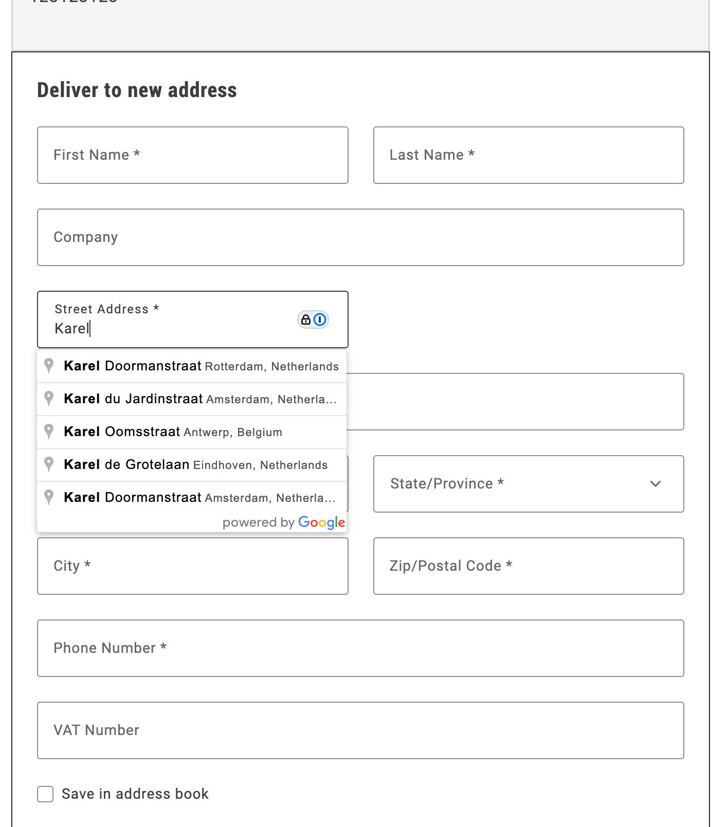
*Autocomplete shipping address*
## Step-by-step
The following steps describe how to integrate the Google Address Validation API with the Commerce boilerplate template using the provided address autocomplete implementation.
### 1. Prerequisites
For this tutorial, you must have a valid Google API key. https://developers.google.com/maps/documentation/javascript/get-api-key describes the process to obtain and set up this key.
### 2. Download and configure the address autocomplete implementation
1. **Download the implementation:**
Copy the `address-autocomplete.js` file from `/public/samples/address-autocomplete.js` in this documentation repository to your project directory.
2. **Replace the API key placeholder:**
Open the `address-autocomplete.js` file and replace `ADD-YOUR-GOOGLE-API-KEY-HERE` with your actual Google API key:
```javascript
const CONFIG = {
googleApiKey: 'YOUR_ACTUAL_GOOGLE_API_KEY',
// ... rest of configuration
};
```
### 3. Import and initialize the autocomplete service
In your `commerce-checkout.js` file, make the following changes to enable address autocomplete:
1. **Import the autocomplete service:**
```javascript
import { initializeAutocompleteWhenReady } from './address-autocomplete.js';
```
2. **Initialize the autocomplete in the `initializeCheckout` function:**
```javascript
const initializeCheckout = async () => {
// ... existing checkout initialization code ...
// Initialize address autocomplete for shipping form
const shippingContainer = document.querySelector('[data-commerce-checkout-shipping]');
if (shippingContainer) {
initializeAutocompleteWhenReady(shippingContainer, 'input[name="street"]');
}
// ... rest of initialization code ...
};
```
The `initializeAutocompleteWhenReady` function automatically:
- Waits for the address form to be rendered
- Attaches autocomplete functionality to the street input field
- Handles form field population when an address is selected
- Manages Google Maps API loading and initialization
## Example
The complete address autocomplete implementation is available in `/public/samples/address-autocomplete.js`. This implementation includes:
- **AddressAutocompleteService class**: Handles Google Places API integration
- **initializeAutocompleteWhenReady function**: Utility function for easy integration
- **Automatic form field population**: Populates street, city, country, and postal code fields
- **Keyboard navigation**: Arrow keys, Enter, and Escape support
- **Error handling**: Graceful fallback when Google Maps API is unavailable
For additional customization options and advanced usage, see the implementation comments in the sample file.
---
# Buy online, pickup in store
Buy online, pickup in store (BOPIS) is a popular fulfillment option that allows customers to purchase items online and pick them up in-store.
The Commerce boilerplate template does not include a BOPIS checkout flow by default, but you can easily implement one using Adobe's drop-in components.
## Step-by-step
The following steps describe how to modify the https://github.com/hlxsites/aem-boilerplate-commerce/blob/main/blocks/commerce-checkout/commerce-checkout.js block file in the boilerplate template to allow users to choose between delivery and in-store pickup during the checkout process.
### 1. Prerequisites
Before you start, you must configure https://experienceleague.adobe.com/en/docs/commerce-admin/stores-sales/delivery/basic-methods/shipping-in-store-delivery options in the Adobe Commerce Admin to define pickup locations. The [`fetchPickupLocations`](#fetch-pickup-locations) function retrieves the list of available pickup locations using a GraphQL query.
### 2. Update content fragment
1. To create a new section for the delivery options, additional DOM elements are required. You can add these elements by modifying the content fragment.
```html
Delivery Method
```
1. You must also add new selectors to render the required components and content.
```javascript
const $deliveryButton = checkoutFragment.querySelector('.checkout-delivery-method__delivery-button');
const $inStorePickupButton = checkoutFragment.querySelector('. checkout-delivery-method__in-store-pickup-button');
const $inStorePickup = checkoutFragment.querySelector('.checkout__in-store-pickup');
```
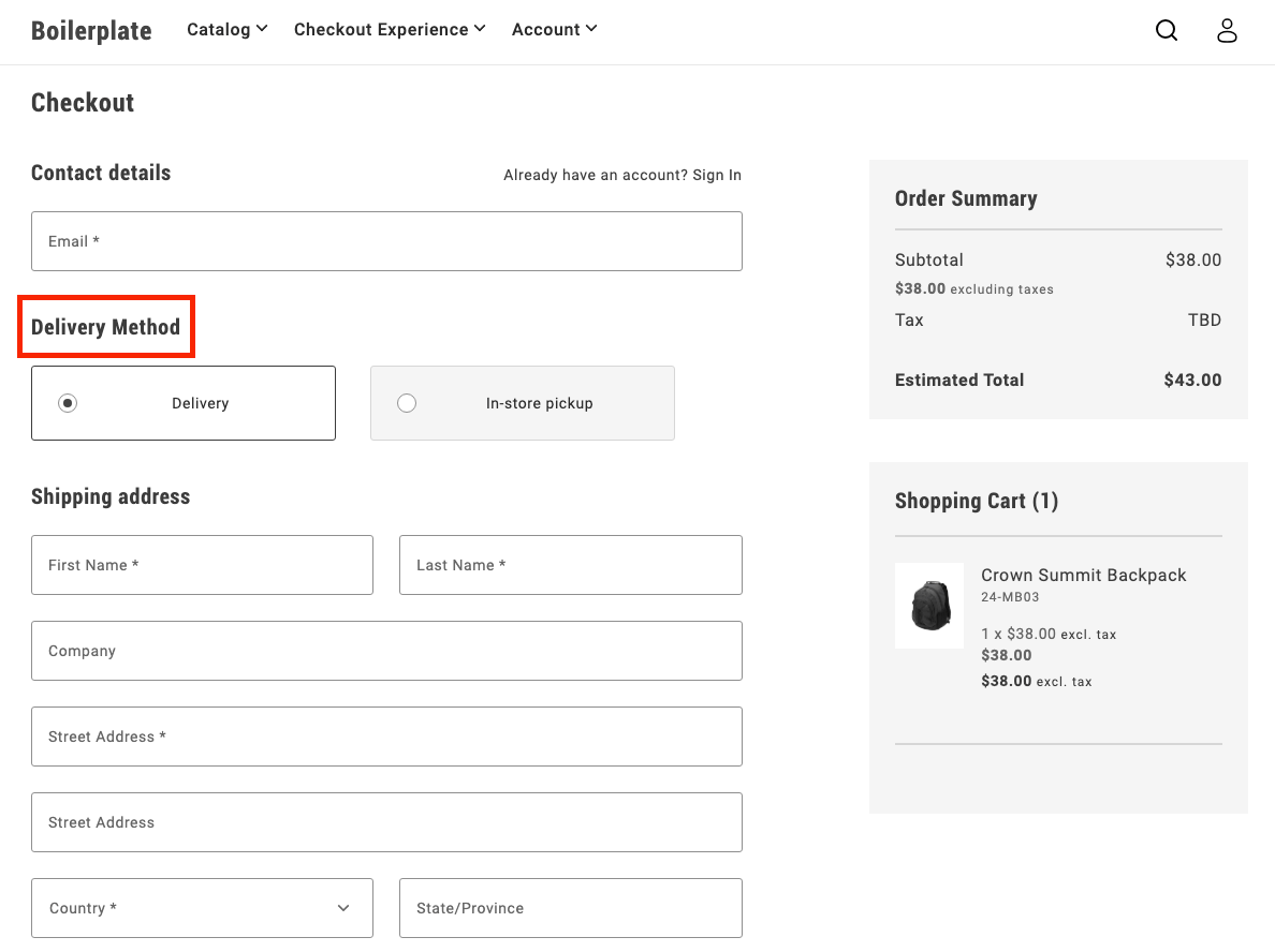
### 3. Add toggle buttons
During initialization, the code renders two buttons:
- Delivery
- In-store pickup
These buttons allow users to toggle between the two options.
```js
UI.render(ToggleButton, {
label: 'Delivery',
onChange: () => onToggle('delivery'),
})($deliveryButton),
UI.render(ToggleButton, {
label: 'In-store Pickup',
onChange: () => onToggle('in-store-pickup'),
})($inStorePickupButton),
```
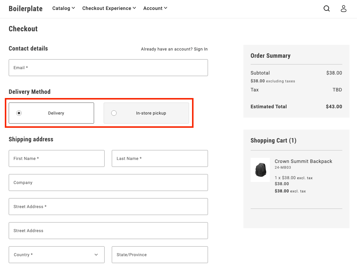
### 4. Toggle between options
The `onToggle` function manages switching between the delivery and in-store pickup options. It updates the selected state of the buttons and toggles the visibility of the corresponding forms.
```js
async function onToggle(type) {
if (type === 'delivery') {
deliveryButton.setProps((prev) => ({ ...prev, selected: true }));
inStorePickupButton.setProps((prev) => ({ ...prev, selected: false }));
$shippingForm.removeAttribute('hidden');
$delivery.removeAttribute('hidden');
$inStorePickup.setAttribute('hidden', '');
} else {
inStorePickupButton.setProps((prev) => ({ ...prev, selected: true }));
deliveryButton.setProps((prev) => ({ ...prev, selected: false }));
$shippingForm.setAttribute('hidden', '');
$delivery.setAttribute('hidden', '');
$inStorePickup.removeAttribute('hidden');
}
}
```
### 5. Fetch pickup locations
The `fetchPickupLocations` function retrieves the list of available pickup locations using a GraphQL query. Users can choose a location where they'd like to pick up their order.
```js
async function fetchPickupLocations() {
return checkoutApi
.fetchGraphQl(
`query pickupLocations {
pickupLocations {
items {
name
pickup_location_code
}
total_count
}
}`,
{ method: 'GET', cache: 'no-cache' }
)
.then((res) => res.data.pickupLocations.items);
}
```
### 6. Render location options
After the code fetches the pickup locations, it renders options as radio buttons. The user can select a location, which updates the shipping address with the corresponding pickup location code.
```js
const pickupLocations = await fetchPickupLocations();
pickupLocations.forEach((location) => {
const { name, pickup_location_code } = location;
const locationRadiobutton = document.createElement('div');
UI.render(RadioButton, {
label: name,
name: 'pickup-location',
value: name,
onChange: () => {
checkoutApi.setShippingAddress({
address: {},
pickupLocationCode: pickup_location_code,
});
},
})(locationRadiobutton);
$inStorePickup.appendChild(locationRadiobutton);
});
```
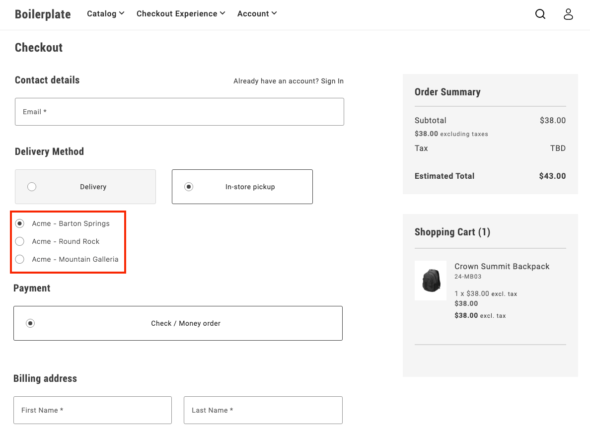
### 7. Finalize the flow
After a user selects **In-store pickup** and chooses a location, the pickup form is shown, while the shipping form is hidden. This provides a clear and seamless way for users to choose how they want to receive their order.
## Example
See https://github.com/hlxsites/aem-boilerplate-commerce/tree/demos/blocks/commerce-checkout-bopis in the `demos` branch of the boilerplate repository for complete JS and CSS code for the BOPIS checkout flow.
---
# Implement multi-step checkout
This tutorial provides a customizable example to implement a comprehensive multi-step checkout in your Adobe Commerce storefront that supports **all user scenarios**: guest users, logged-in customers, and virtual products.
## Overview
This implementation provides a **complete multi-step checkout** for the Adobe Commerce boilerplate that handles:
- **Guest users** - Email capture and address entry
- **Logged-in customers** - Saved address selection and account integration
- **Virtual products** - Automatic shipping step bypass
- **Mixed carts** - Physical + virtual product combinations
- **Modular architecture** - Event-driven step coordination
## Implementation Features
| Feature | Status |
|---------|--------|
| Guest users | ✅ |
| Logged-in customers | ✅ |
| Virtual products | ✅ |
| Mixed carts (physical + virtual products) | ✅ |
| Custom payment/shipping methods | 🔧 |
## Multi-step Customization
Key areas specific to multi-step checkout customization:
- **Step progression logic** - Modify `steps.js` for custom user flows and step transitions
- **Individual step modules** - Customize step behavior in `steps/` folder
- **Step validation** - Control when users can advance between steps
- **Fragment management** - Adapt step-specific HTML fragments in `fragments.js`
- **Step visibility** - Customize CSS classes for active/inactive step states
- **Manual synchronization** - Control when data is saved to the cart
## Architecture
### File Structure
The multi-step checkout implementation follows a modular architecture:
| File | Purpose | Key Features |
|------|---------|--------------|
| `commerce-checkout-multi-step.js` | Entry point and block decorator | Initializes the checkout system |
| `commerce-checkout-multi-step.css` | Step styling and visibility controls | Step progression, visual states, responsive design |
| `steps.js` | Main implementation | Step coordination and state management |
| `steps/shipping.js` | Shipping/contact step logic | Login detection, address forms, email validation |
| `steps/shipping-methods.js` | Delivery method selection | Shipping options, cost calculation |
| `steps/payment-methods.js` | Payment method selection | Payment provider integration |
| `steps/billing-address.js` | Billing address step | Conditional billing form rendering |
| `fragments.js` | HTML fragment creation | Step-specific DOM structure generation |
| `containers.js` | Container rendering functions | Drop-in container management |
| `components.js` | UI component functions | Reusable UI elements |
| `utils.js` | Utility functions and helpers | Virtual cart detection, validation |
| `constants.js` | Shared constants and configuration | CSS classes, form names, storage keys |
### Manual Synchronization Control
In multi-step checkout, containers use **`autoSync: false`** to disable automatic backend synchronization, allowing manual control over when data is saved:
```javascript
// Containers with manual sync control
const containers = [
'LoginForm', // Manual email/authentication handling
'ShippingMethods', // Manual shipping method selection
'PaymentMethods', // Manual payment method selection
'BillToShippingAddress' // Manual billing address control
];
// Example: ShippingMethods with manual sync
CheckoutProvider.render(ShippingMethods, {
UIComponentType: 'ToggleButton',
autoSync: false, // Disable automatic cart updates
})(container);
```
**AutoSync behavior:**
- **`autoSync: true` (default)** - Local changes automatically sync with backend via GraphQL mutations
- **`autoSync: false`** - Changes maintained locally only, no automatic API calls
**Why disable autoSync in multi-step:**
- **Controlled timing** - Save data only when step is completed and validated
- **Better UX** - Prevent partial/invalid data from being sent to cart
- **Step coordination** - Parent step manager controls when to persist data
- **Validation first** - Ensure all step requirements met before saving
**Manual sync example:**
```javascript
// Step completion with manual sync (triggered by continue button)
const continueFromStep = async () => {
if (!validateStepData()) return;
// Manual API call with error handling
try {
await checkoutApi.setShippingMethodsOnCart([{
carrier_code: selectedMethod.carrier.code,
method_code: selectedMethod.code,
}]);
} catch (error) {
console.error('Failed to save step data:', error);
return; // Don't proceed if API call fails
}
// Only continue if API call succeeded
await displayStepSummary(selectedMethod);
await continueToNextStep();
events.emit('checkout/step/completed', null);
};
```
**Key patterns:**
- **Continue button trigger** - API calls happen when user clicks continue, not on selection
- **Try-catch wrapping** - All API calls must be wrapped for error handling
- **Early return on error** - If API fails, don't proceed to next step
- **Success-only progression** - Only move forward if data successfully saved
This approach ensures data integrity and provides smooth step transitions without premature backend updates.
### API Reference
Step modules rely on the checkout drop-in's API functions for cart management. The complete API reference is available in the [Checkout functions](https://experienceleague.adobe.com/developer/commerce/storefront/dropins/checkout/functions/) documentation.
**Key APIs for multi-step implementation:**
| Function | Purpose | Used In Step |
|----------|---------|--------------|
| `setGuestEmailOnCart()` | Set guest user email | Shipping (email capture) |
| `setShippingAddress()` | Set shipping address on cart | Shipping (address collection) |
| `setShippingMethodsOnCart()` | Set shipping methods on cart | Shipping Methods |
| `setPaymentMethod()` | Set payment method on cart | Payment Methods |
| `setBillingAddress()` | Set billing address on cart | Payment Methods, Billing Address |
| `isEmailAvailable()` | Check email availability | Order Header (account creation) |
| `getStoreConfigCache()` | Get cached store configuration | Address forms (default country) |
| `estimateShippingMethods()` | Estimate shipping costs | Address forms (cost calculation) |
All step completion logic should use these APIs with proper error handling as shown in the manual sync examples above.
**Note:** The implementation uses event-driven data (`events.lastPayload()`) instead of direct `getCart()` or `getCustomer()` calls for performance optimization and real-time state management.
### Component Registry Pattern
The `components.js` file implements a registry system specifically for **SDK components and external UI library components**:
```javascript
// components.js - Component registry (separate from containers)
const registry = new Map();
// Component IDs for UI elements
export const COMPONENT_IDS = {
CHECKOUT_HEADER: 'checkoutHeader',
SHIPPING_STEP_CONTINUE_BTN: 'shippingStepContinueBtn',
PAYMENT_STEP_TITLE: 'paymentStepTitle',
// ... more component IDs
};
// Core component methods
export const hasComponent = (id) => registry.has(id);
export const removeComponent = (id) => {
const component = registry.get(id);
if (component) {
component.remove();
registry.delete(id);
}
};
// Render SDK components
export const renderCheckoutHeader = (container) => renderComponent(
COMPONENT_IDS.CHECKOUT_HEADER,
async () => UI.render(Header, {
className: 'checkout-header',
level: 1,
size: 'large',
title: 'Checkout',
})(container)
);
export const renderStepContinueBtn = async (container, stepId, onClick) =>
renderPrimaryButton(container, stepId, { children: 'Continue', onClick });
```
**Key distinction from containers:**
- **`containers.js`** - Manages **drop-in containers** (LoginForm, AddressForm, ShippingMethods, etc.)
- **`components.js`** - Manages **SDK/UI library components** (Button, Header, ProgressSpinner, etc.)
**Usage guidelines:**
- **Use `components.js` for:** Headers, buttons, spinners, modals, and other UI elements from the SDK
- **Use `containers.js` for:** Checkout drop-ins, account drop-ins, cart drop-ins, and other business logic containers
- **Recommended approach:** Keep drop-in containers and UI components in separate registries for better organization
This ensures clean architecture where `components.js` handles pure UI elements while `containers.js` manages complex business logic containers.
### Container Management
The `containers.js` file provides a complete system for managing **drop-in containers** (LoginForm, AddressForm, ShippingMethods, etc.) with registry-based lifecycle management.
**Registry System:**
```javascript
// containers.js - Registry system for drop-in containers
const registry = new Map();
// Core registry methods
export const hasContainer = (id) => registry.has(id);
export const getContainer = (id) => registry.get(id);
export const unmountContainer = (id) => {
if (!registry.has(id)) return;
const containerApi = registry.get(id);
containerApi.remove();
registry.delete(id);
};
// Helper to render or get existing container
const renderContainer = async (id, renderFn) => {
if (registry.has(id)) {
return registry.get(id); // Return existing
}
const container = await renderFn(); // Render new
registry.set(id, container);
return container;
};
```
**Container IDs and render functions:**
Each container is identified by a unique string ID and has a corresponding render function that handles the registry logic:
```javascript
// Predefined container identifiers
export const CONTAINERS = Object.freeze({
LOGIN_FORM: 'loginForm',
SHIPPING_ADDRESS_FORM: 'shippingAddressForm',
SHIPPING_METHODS: 'shippingMethods',
PAYMENT_METHODS: 'paymentMethods',
// ... more containers
});
// Usage in container functions
export const renderLoginForm = async (container) => renderContainer(
CONTAINERS.LOGIN_FORM,
async () => CheckoutProvider.render(LoginForm, { /* config */ })(container)
);
```
**Key benefits of the container system:**
- **Centralized logic** - Complex container configuration in one place
- **Prevents duplicates** - Registry ensures same container isn't rendered multiple times
- **Memory management** - Automatic cleanup prevents memory leaks
- **State preservation** - Containers maintain state across step transitions
**Registry lifecycle:**
1. **Check existing** - `hasContainer()` / `getContainer()` to find existing instances
2. **Render once** - `renderContainer()` creates new containers only if needed
3. **Cleanup** - `unmountContainer()` removes containers and clears references
This comprehensive container management approach ensures efficient resource usage and prevents common issues like duplicate event listeners or memory leaks.
### Step Modules
The `steps/` folder contains individual step modules that handle specific checkout phases. Each step module implements a consistent interface and manages its own domain logic, UI rendering, and data validation.
**Step module structure:**
Each step file in the `steps/` folder follows the same architectural pattern:
```javascript
// steps/shipping.js - Example step module
export const createShippingStep = ({ getElement, api, events, ui }) => {
return {
async display(data) {
// Render step UI using containers (LoginForm, AddressForm)
// Handle different user types (guest vs logged-in)
// Use manual sync patterns for form data
},
async displaySummary(data) {
// Show completed step summary using fragment functions
// Create edit functionality for step modifications
},
async continue() {
// Validate step data and make API calls
// Handle step progression logic
// Emit completion events
},
isComplete(data) {
// Validate step completion based on cart data
// Handle virtual product logic
},
isActive() {
// Check if step is currently active
}
};
};
```
**Available step modules:**
- **`shipping.js`** - Handles email capture (LoginForm) and shipping address collection (AddressForm)
- **`shipping-methods.js`** - Manages delivery method selection and shipping cost calculation
- **`payment-methods.js`** - Handles payment provider integration and method selection
- **`billing-address.js`** - Manages conditional billing address form rendering
**Step module responsibilities:**
- **UI rendering** - Uses container functions to render drop-ins
- **Data validation** - Validates step completion
- **API integration** - Makes manual API calls with error handling
- **Event handling** - Responds to checkout events
- **Summary creation** - Generates read-only summaries with edit functionality
### Fragment Management
The `fragments.js` file is responsible for creating all DOM structure in the multi-step checkout. It provides a centralized system for generating HTML fragments, managing selectors, and creating reusable summary components.
**Core responsibilities:**
- **DOM Structure Creation** - Generates HTML fragments for each step and the main checkout layout
- **Selector Management** - Centralizes all CSS selectors in a frozen object for consistency
- **Summary Components** - Provides reusable functions for creating step summaries with edit functionality
- **Utility Functions** - Helper functions for fragment creation and DOM querying
**Fragment Creation Pattern:**
```javascript
// Step-specific fragment creation
function createShippingStepFragment() {
return createFragment(`
`);
}
// Main checkout structure
export function createCheckoutFragment() {
const checkoutFragment = createFragment(`
`);
// Append step fragments to main structure
return checkoutFragment;
}
```
**Centralized Selector System:**
```javascript
// All selectors defined in one place
export const selectors = Object.freeze({
checkout: {
loginForm: '.checkout__login',
shippingAddressForm: '.checkout__shipping-form',
shippingStepContinueBtn: '.checkout__continue-to-shipping-methods',
// ... more selectors
}
});
```
**Summary Creation Functions:**
```javascript
// Reusable summary components with edit functionality
export const createLoginFormSummary = (email, onEditClick) => {
const content = document.createElement('div');
content.textContent = email;
return createSummary(content, onEditClick);
};
export const createAddressSummary = (data, onEditClick) => {
// Format address data into summary display
return createSummary(formattedContent, onEditClick);
};
```
**Key benefits of fragment management:**
- **Consistent DOM structure** - All HTML is generated through standardized functions
- **CSS class coordination** - Selectors and fragments use the same class names
- **Reusable components** - Summary functions can be used across different steps
- **Maintainable markup** - All HTML structure defined in one centralized location
### Element Access Pattern
Step modules access DOM elements using the centralized selector system from `fragments.js`. Here's how step modules import and use those selectors:
```javascript
// steps/shipping.js - Element access in step modules
const { checkout } = selectors;
const elements = {
$loginForm: getElement(checkout.loginForm),
$loginFormSummary: getElement(checkout.loginFormSummary),
$shippingAddressForm: getElement(checkout.shippingAddressForm),
$shippingAddressFormSummary: getElement(checkout.shippingAddressFormSummary),
$shippingStep: getElement(checkout.shippingStep),
$shippingStepContinueBtn: getElement(checkout.shippingStepContinueBtn),
};
```
**Key benefits of this pattern:**
- **Centralized selectors** - All CSS classes defined in one location
- **Type safety** - Object structure prevents typos and missing selectors
- **Maintainability** - Easy to update selectors across the entire system
- **Consistency** - All step modules follow the same element access pattern
- **Fragment coordination** - Selectors match the structure created by fragments
This ensures that fragments create the DOM structure and steps access it through a consistent, maintainable selector system.
### Summary and Edit Pattern
When users complete a step by clicking the continue button and validation succeeds, the step transitions to **summary mode**:
```javascript
// Step completion flow
async function continueFromStep() {
// 1. Validate step data
if (!validateStep()) return;
// 2. Save data to cart
await api.setStepData(formData);
// 3. Hide step content, show summary
await displayStepSummary(data);
// 4. Move to next step
await displayNextStep();
}
```
**Summary features:**
- **Read-only display** - Shows completed step information in condensed format
- **Edit functionality** - "Edit" link allows users to return and modify data
- **Visual state** - Different styling indicates step completion
- **Persistent data** - Summary reflects the actual saved cart data
**Edit flow:**
```javascript
// Edit button functionality
const handleEdit = async () => {
await displayStep(true); // Reactivate step
// Previous data automatically pre-fills forms
};
```
This pattern ensures users can review their choices and make changes at any point without losing progress.
### Place Order Button Enablement
The **Place Order** button is disabled by default and only becomes enabled when all required steps are completed:
```javascript
// Place order button management
async function updatePlaceOrderButton(data) {
const allStepsComplete = steps.shipping.isComplete(data) &&
(!isVirtualCart(data) ? steps.shippingMethods.isComplete(data) : true) &&
steps.paymentMethods.isComplete(data) &&
steps.billingAddress.isComplete(data);
if (allStepsComplete) {
placeOrderButton.setProps({ disabled: false });
} else {
placeOrderButton.setProps({ disabled: true });
}
}
```
**Progressive enablement features:**
- **Disabled by default** - Prevents incomplete order submissions
- **Step validation** - Checks each step's completion status
- **Virtual product logic** - Skips shipping validation for virtual carts
- **Real-time updates** - Button state updates as users complete steps
- **Visual feedback** - Users can see their progress toward completion
## Implementation Guide
The following sections demonstrate how to build a **production-ready multi-step checkout** using Adobe's drop-in components. This implementation replaces the regular one-step checkout in the boilerplate template with a sophisticated, modular system.
### 1. Create the entry point and main structure
Create the main block file `commerce-checkout.js` and set up the modular architecture:
```javascript
// Initializers
// Block-level utils
// Fragments
export default async function decorate(block) {
setMetaTags('Checkout');
document.title = 'Checkout';
block.replaceChildren(createCheckoutFragment());
const stepsManager = createStepsManager(block);
await stepsManager.init();
}
```
Create `fragments.js` for the main HTML structure:
```javascript
export function createCheckoutFragment() {
return document.createRange().createContextualFragment(`
`);
}
```
This modular approach separates concerns: the entry point coordinates everything, fragments handle HTML creation, and the steps manager handles step logic.
### 2. Step fragments and HTML structure
Create the step-specific fragments in `fragments.js`. Each checkout step gets its own fragment with specific containers and CSS classes:
```javascript
/**
* Creates the shipping address fragment for the checkout.
* Includes login form and address form containers.
*/
function createShippingStepFragment() {
return document.createRange().createContextualFragment(`
`);
}
/**
* Creates the shipping methods fragment for the checkout.
*/
function createShippingMethodsStepFragment() {
return document.createRange().createContextualFragment(`
`);
}
```
**Key fragment concepts:**
- **CHECKOUT_STEP_CONTENT** - Shows containers when step is active (editable mode)
- **CHECKOUT_STEP_SUMMARY** - Shows completed step information (read-only mode)
- **CHECKOUT_STEP_BUTTON** - Continue buttons for step progression
- **Multiple containers per step** - Each fragment can contain multiple containers with their own summary versions
- **CSS-driven visibility** - No DOM manipulation, just class-based show/hide
The shipping step includes **both login and address containers** because guests need both email capture (via LoginForm) and shipping address entry (via AddressForm).
### 3. Create step modules
Create individual step modules that implement the universal step interface. Each step module follows the pattern described in the [Step Modules architecture section](#step-modules).
**Required step files:**
- **`steps/shipping.js`** - Email capture (LoginForm) and shipping address collection (AddressForm)
- **`steps/shipping-methods.js`** - Delivery method selection and cost calculation
- **`steps/payment-methods.js`** - Payment provider integration and method selection
- **`steps/billing-address.js`** - Conditional billing address form rendering
**Implementation reference:**
For complete implementations of these step modules, see the sample files in the https://github.com/hlxsites/aem-boilerplate-commerce/tree/demos/blocks/commerce-checkout-multi-step/steps. Each file demonstrates the full step interface implementation with proper error handling, user flow logic, and integration with containers and APIs.
### 4. Implement the steps manager
Create `steps.js` to coordinate all step logic and manage the checkout flow. Build this step by step:
1. **Set up the basic structure** with imports and function signature:
```javascript
import { createShippingStep } from './steps/shipping.js';
import { createShippingMethodsStep } from './steps/shipping-methods.js';
import { createPaymentMethodsStep } from './steps/payment-methods.js';
import { createBillingAddressStep } from './steps/billing-address.js';
export default function createStepsManager(block) {
// Implementation will go here
}
```
2. **Create step instances** by gathering dependencies and instantiating each step module:
```javascript
export default function createStepsManager(block) {
const elements = getElements(block);
const dependencies = { elements, api, events, ui };
const steps = {
shipping: createShippingStep(dependencies),
shippingMethods: createShippingMethodsStep(dependencies),
paymentMethods: createPaymentMethodsStep(dependencies),
billingAddress: createBillingAddressStep(dependencies)
};
}
```
3. **Implement step coordination logic** that determines which step to show based on completion status:
```javascript
async function handleCheckoutUpdated(data) {
// Step 1: Shipping - always required
if (!steps.shipping.isComplete(data)) {
await steps.shipping.display(data);
return;
}
await steps.shipping.displaySummary(data);
// Step 2: Shipping Methods (skip for virtual products)
if (!isVirtualCart(data)) {
if (!steps.shippingMethods.isComplete(data)) {
await steps.shippingMethods.display(data);
return;
}
await steps.shippingMethods.displaySummary(data);
}
// Step 3: Payment Methods
if (!steps.paymentMethods.isComplete(data)) {
await steps.paymentMethods.display(data);
return;
}
await steps.paymentMethods.displaySummary(data);
// Step 4: Billing Address (if needed)
if (!steps.billingAddress.isComplete(data)) {
await steps.billingAddress.display(data);
return;
}
await steps.billingAddress.displaySummary(data);
}
```
4. **Wire up event handling** to respond to checkout state changes:
```javascript
return {
async init() {
events.on('checkout/initialized', handleCheckoutUpdated);
events.on('checkout/updated', handleCheckoutUpdated);
}
};
```
The steps manager uses the **early return pattern** - if a step is incomplete, it displays that step and exits. Only when all previous steps are complete does it move to the next step. This ensures proper linear progression through the checkout flow.
### 5. Add CSS styling for step controls
Create the CSS that controls step visibility and progression. Add this to your `commerce-checkout-multi-step.css` file:
1. **Step visibility controls** - Define the core classes that show/hide step content:
```css
/* Hide all step content by default */
.checkout-step-content {
display: none;
}
/* Show content when step is active */
.checkout-step-active .checkout-step-content {
display: block;
}
/* Hide summaries by default */
.checkout-step-summary {
display: none;
}
/* Show summaries when step is completed (not active) */
.checkout-step:not(.checkout-step-active) .checkout-step-summary {
display: block;
}
/* Hide continue buttons when step is completed */
.checkout-step:not(.checkout-step-active) .checkout-step-button {
display: none;
}
```
2. **Step progression styling** - For complete visual styling (borders, colors, animations, etc.), see https://github.com/hlxsites/aem-boilerplate-commerce/tree/demos/blocks/commerce-checkout-multi-step/commerce-checkout-multi-step.css in the demo repository.
These CSS rules create the core multi-step behavior: **content shows when active**, **summaries show when completed**, and **step progression controls** guide users through the checkout flow.
## Example
See https://github.com/hlxsites/aem-boilerplate-commerce/tree/demos/blocks/commerce-checkout-multi-step in the `demos` branch of the boilerplate repository for complete JS and CSS code for the multi-step checkout flow.
---
# Validate shipping address
Use the `AddressValidation` container to present both the original and suggested addresses from your verification service, letting shoppers choose before placing their order.
This tutorial shows how to integrate the container in the `commerce-checkout` block.
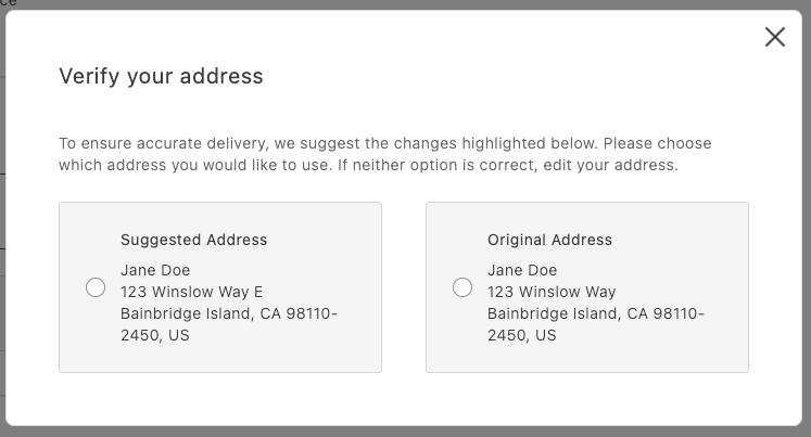
*AddressValidation displayed in a modal*
## Overview
At a high level:
- Call your address verification service before placing the order.
- If it returns a suggestion, open a modal and render `AddressValidation`.
- If the shopper selects the suggestion, persist it as the shipping address; otherwise, use the original address.
## Integration
```javascript
// in commerce-checkout.js block
// Handler passed to the PlaceOrder container
const handlePlaceOrder = async ({ cartId, code }) => {
await displayOverlaySpinner(loaderRef, $loader);
try {
// Payment Services credit card
if (code === PaymentMethodCode.CREDIT_CARD) {
if (!creditCardFormRef.current) {
console.error('Credit card form not rendered.');
return;
}
if (!creditCardFormRef.current.validate()) {
// Credit card form invalid; abort order placement
return;
}
// Submit Payment Services credit card form
await creditCardFormRef.current.submit();
}
// Address validation
const suggestion = await validateAddress();
if (suggestion) {
const container = document.createElement('div');
await showModal(container);
await renderAddressValidation(container, {
suggestedAddress: suggestion,
handleSelectedAddress: async ({ selection, address }) => {
if (selection === 'suggested') {
// Update the shipping form using the suggested address
sessionStorage.removeItem(SHIPPING_ADDRESS_DATA_KEY);
shippingForm.setProps((prevProps) => ({
...prevProps,
inputsDefaultValueSet: address,
}));
} else {
// Place order
await orderApi.placeOrder(cartId);
}
removeModal();
},
});
} else {
// Place order
await orderApi.placeOrder(cartId);
}
} catch (error) {
console.error(error);
throw error;
} finally {
removeOverlaySpinner(loaderRef, $loader);
}
};
```
```javascript
// in containers.js
/**
* Renders the AddressValidation container in its own host element
* @param {HTMLElement} container - DOM element to render into
*/
export const renderAddressValidation = async (
container,
{ suggestedAddress, handleSelectedAddress }
) =>
CheckoutProvider.render(AddressValidation, {
suggestedAddress,
handleSelectedAddress,
})(container);
```
```javascript
// in utils.js (example stub)
export const validateAddress = async () => {
// Here’s where your API call goes
return {
city: 'Bainbridge Island',
countryCode: 'US',
postcode: '98110-2450',
region: 'CA',
street: ['123 Winslow Way E'],
};
};
```
Finally, add some padding for better appearance:
```css
/* commerce-checkout.css */
.modal-content .checkout-address-validation {
padding: var(--spacing-big);
}
```
## Next steps
- See the [`AddressValidation` container](https://experienceleague.adobe.com/developer/commerce/storefront/dropins/checkout/containers/address-validation/) for props and behaviors.
- Ensure your suggestion matches the `CartAddressInput` format.
---
# Checkout utility functions
This topic provides details and instructions for using the utility functions available in the checkout drop-in component. These functions were moved from the integration layer and are now publicly accessible within the checkout block from `@dropins/storefront-checkout/lib/utils.js`.
### Quick imports
```ts
```
## API Functions
### setAddressOnCart
The `setAddressOnCart` function creates a debounced handler for setting shipping or billing addresses on the cart, preventing excessive API calls when address data changes frequently.
```ts
export function setAddressOnCart({
type = 'shipping',
debounceMs = 0,
placeOrderBtn,
}: {
type?: 'shipping' | 'billing';
debounceMs?: number;
placeOrderBtn?: RenderAPI;
}): (change: AddressFormChange) => void;
```
```text
[
['Parameter', 'Type', 'Req?', 'Description'],
['type', 'string', 'No', 'Address type: "shipping" or "billing". Defaults to "shipping".'],
['debounceMs', 'number', 'No', 'Milliseconds to debounce API calls. Defaults to 0.'],
['placeOrderBtn', 'RenderAPI', 'No', 'Place order button API to manage disabled state.'],
]
```
### Returns
Returns a function that accepts address form changes and updates the cart accordingly.
### Usage
```ts
// Set up debounced shipping address handler
const handleShippingChange = setAddressOnCart({
type: 'shipping',
debounceMs: 500,
placeOrderBtn: placeOrderButtonAPI
});
// Use with form change events
shippingForm.addEventListener('input', (event) => {
const formData = getFormValues(event.target.form);
const isValid = validateForm(event.target.form);
handleShippingChange({
data: formData,
isDataValid: isValid
});
});
```
### estimateShippingCost
The `estimateShippingCost` function creates a debounced handler for estimating shipping costs based on address information.
```ts
export function estimateShippingCost({ debounceMs = 0 }): (change: AddressFormChange) => void;
```
```text
[
['Parameter', 'Type', 'Req?', 'Description'],
['debounceMs', 'number', 'No', 'Milliseconds to debounce API calls. Defaults to 0.'],
]
```
### Returns
Returns a function that estimates shipping costs when address data changes.
### Usage
```ts
// Set up shipping cost estimation
const handleEstimateShipping = estimateShippingCost({ debounceMs: 300 });
// Use with address form changes
addressForm.addEventListener('input', (event) => {
const formData = getFormValues(event.target.form);
const isValid = validateForm(event.target.form);
handleEstimateShipping({
data: formData,
isDataValid: isValid
});
});
```
## Cart Data Functions
### isVirtualCart
The `isVirtualCart` function checks if a cart contains only virtual products (no shipping required). If no argument is provided, it reads the latest checkout data.
```ts
export function isVirtualCart(data?: Cart | null): boolean;
```
```text
[
['Parameter', 'Type', 'Req?', 'Description'],
['data', 'Cart | null', 'Yes', 'The cart data object to check.'],
]
```
### Returns
Returns `true` if the cart is virtual, `false` otherwise.
### Usage
```ts
// Check if shipping is required using explicit data
const cartData = await getCart();
const skipShipping = isVirtualCart(cartData);
// Or check using the latest checkout data
const skipShippingFromState = isVirtualCart();
if (skipShipping) {
// Hide shipping-related UI
document.querySelector('.shipping-section').style.display = 'none';
}
```
### isEmptyCart
The `isEmptyCart` function checks if a cart is empty or null.
```ts
export function isEmptyCart(data: Cart | null): boolean;
```
```text
[
['Parameter', 'Type', 'Req?', 'Description'],
['data', 'Cart | null', 'Yes', 'The cart data object to check.'],
]
```
### Returns
Returns `true` if the cart is empty or null, `false` otherwise.
### Usage
```ts
const cartData = await getCart();
if (isEmptyCart(cartData)) {
// Show empty cart message
showEmptyCartMessage();
return;
}
// Proceed with checkout
proceedToCheckout(cartData);
```
### getCartShippingMethod
The `getCartShippingMethod` function retrieves the selected shipping method from cart data.
```ts
export function getCartShippingMethod(data: Cart | null): ShippingMethod | null;
```
```text
[
['Parameter', 'Type', 'Req?', 'Description'],
['data', 'Cart | null', 'Yes', 'The cart data object.'],
]
```
### Returns
Returns the selected shipping method object or `null` if none is selected.
### Usage
```ts
const cartData = await getCart();
const shippingMethod = getCartShippingMethod(cartData);
if (shippingMethod) {
console.log(`Shipping: ${shippingMethod.title} - $${shippingMethod.amount.value}`);
}
```
### getCartAddress
The `getCartAddress` function retrieves shipping or billing address from cart data.
```ts
export function getCartAddress(
data: Cart | null,
type: 'shipping' | 'billing' = 'shipping'
): Record | null;
```
```text
[
['Parameter', 'Type', 'Req?', 'Description'],
['data', 'Cart | null', 'Yes', 'The cart data object.'],
['type', 'string', 'No', 'Address type: "shipping" or "billing". Defaults to "shipping".'],
]
```
### Returns
Returns the address object or `null` if no address is set.
### Usage
```ts
const cartData = await getCart();
const shippingAddress = getCartAddress(cartData, 'shipping');
const billingAddress = getCartAddress(cartData, 'billing');
if (shippingAddress) {
populateAddressForm(shippingAddress);
}
```
### getCartPaymentMethod
The `getCartPaymentMethod` function retrieves the selected payment method from cart data.
```ts
export function getCartPaymentMethod(data: Cart | null): PaymentMethod | null;
```
```text
[
['Parameter', 'Type', 'Req?', 'Description'],
['data', 'Cart | null', 'Yes', 'The cart data object.'],
]
```
### Returns
Returns the selected payment method object or `null` if none is selected.
### Usage
```ts
const cartData = await getCart();
const paymentMethod = getCartPaymentMethod(cartData);
if (paymentMethod) {
console.log(`Payment method: ${paymentMethod.code}`);
}
```
## DOM and Fragment Functions
### createFragment
The `createFragment` function creates a `DocumentFragment` from an HTML string.
```ts
export function createFragment(html: string): DocumentFragment;
```
```text
[
['Parameter', 'Type', 'Req?', 'Description'],
['html', 'string', 'Yes', 'The HTML string to convert to a DocumentFragment.'],
]
```
### Returns
Returns a DocumentFragment containing the parsed HTML.
### Usage
```ts
const html = `
## Payment Information
`;
const fragment = createFragment(html);
document.querySelector('.checkout-container').appendChild(fragment);
```
### createScopedSelector
The `createScopedSelector` function creates a scoped `querySelector` function for a DocumentFragment.
```ts
export function createScopedSelector(
fragment: DocumentFragment
): (selector: string) => HTMLElement | null;
```
```text
[
['Parameter', 'Type', 'Req?', 'Description'],
['fragment', 'DocumentFragment', 'Yes', 'The DocumentFragment to scope the selector to.'],
]
```
### Returns
Returns a function that queries elements within the given fragment.
### Usage
```ts
const html = `
`;
const fragment = createFragment(html);
const $ = createScopedSelector(fragment);
// Query within the fragment only
const nextButton = $('.next-btn');
const prevButton = $('.prev-btn');
nextButton?.addEventListener('click', handleNext);
```
## Form Functions
### validateForm
The `validateForm` function validates a form by name using form references.
```ts
export function validateForm(
formName: string,
formRef: RefObject
): boolean;
```
```text
[
['Parameter', 'Type', 'Req?', 'Description'],
['formName', 'string', 'Yes', 'The name attribute of the form to validate.'],
['formRef', 'RefObject', 'Yes', 'Reference object to the form component.'],
]
```
### Returns
Returns `true` if the form is valid, `false` otherwise.
### Usage
```ts
// Validate checkout form before submission
const isShippingValid = validateForm('shipping-form', shippingFormRef);
const isBillingValid = validateForm('billing-form', billingFormRef);
if (isShippingValid && isBillingValid) {
proceedToPayment();
} else {
showValidationErrors();
}
```
## Meta Functions
### createMetaTag
The `createMetaTag` function creates or updates meta tags in the document head.
```ts
export function createMetaTag(property: string, content: string, type: string): void;
```
```text
[
['Parameter', 'Type', 'Req?', 'Description'],
['property', 'string', 'Yes', 'The property/name of the meta tag.'],
['content', 'string', 'Yes', 'The content value for the meta tag.'],
['type', 'string', 'Yes', 'The type of meta tag: "name" or "property".'],
]
```
### Returns
The function does not return a value; it modifies the document head.
### Usage
```ts
// Set checkout-specific meta tags
createMetaTag('description', 'Complete your purchase securely', 'name');
createMetaTag('og:title', 'Checkout - Your Store', 'property');
```
### setMetaTags
The `setMetaTags` function sets standard meta tags for a drop-in component.
```ts
export function setMetaTags(dropin: string): void;
```
```text
[
['Parameter', 'Type', 'Req?', 'Description'],
['dropin', 'string', 'Yes', 'The name of the drop-in component.'],
]
```
### Returns
The function does not return a value; it sets multiple meta tags.
### Usage
```ts
// Set meta tags for checkout page
setMetaTags('Checkout');
```
## Utility Functions
### scrollToElement
The `scrollToElement` function smoothly scrolls to and focuses on an HTML element.
```ts
export function scrollToElement(element: HTMLElement): void;
```
```text
[
['Parameter', 'Type', 'Req?', 'Description'],
['element', 'HTMLElement', 'Yes', 'The element to scroll to and focus.'],
]
```
### Returns
The function does not return a value; it performs scrolling and focusing.
### Usage
```ts
// Scroll to error field
const errorField = document.querySelector('.field-error');
if (errorField) {
scrollToElement(errorField);
}
// Scroll to next checkout step
const nextStep = document.querySelector('.checkout-step.active');
scrollToElement(nextStep);
```
## Data Transformer Functions
### transformAddressFormValuesToCartAddressInput
The `transformAddressFormValuesToCartAddressInput` function converts form data to cart address input format.
```ts
export const transformAddressFormValuesToCartAddressInput = (
data: Record
): ShippingAddressInput | BillingAddressInput;
```
```text
[
['Parameter', 'Type', 'Req?', 'Description'],
['data', 'Record', 'Yes', 'Form data object containing address information.'],
]
```
### Returns
Returns a formatted address input object for cart API calls.
### Usage
```ts
// Transform form data for API
const formData = getFormValues(addressForm);
const addressInput = transformAddressFormValuesToCartAddressInput(formData);
// Send to cart API
await setShippingAddress(addressInput);
```
### transformCartAddressToFormValues
The `transformCartAddressToFormValues` function converts cart address data to the form values format.
```ts
export const transformCartAddressToFormValues = (
address: CartAddress
): Record;
```
```text
[
['Parameter', 'Type', 'Req?', 'Description'],
['address', 'CartAddress', 'Yes', 'Cart address object to transform.'],
]
```
### Returns
Returns a form-compatible object with address data.
### Usage
```ts
// Pre-populate form with existing address
const cartData = await getCart();
const shippingAddress = getCartAddress(cartData, 'shipping');
if (shippingAddress) {
const formValues = transformCartAddressToFormValues(shippingAddress);
populateForm(shippingForm, formValues);
}
```
## Common Usage Patterns
These utility functions work together to create robust checkout experiences:
### Complete Address Handling
```ts
// Set up address form handling
const handleAddressChange = setAddressOnCart({
type: 'shipping',
debounceMs: 500,
placeOrderBtn: placeOrderAPI
});
// Pre-populate form with existing data
const cartData = await getCart();
const existingAddress = getCartAddress(cartData, 'shipping');
if (existingAddress) {
const formValues = transformCartAddressToFormValues(existingAddress);
populateAddressForm(formValues);
}
// Handle form changes
addressForm.addEventListener('input', (event) => {
const formData = getFormValues(event.target.form);
const isValid = validateForm('shipping-address', formRef);
handleAddressChange({ data: formData, isDataValid: isValid });
});
```
### Cart State Management
```ts
function updateCheckoutUI(cartData) {
// Handle empty cart
if (isEmptyCart(cartData)) {
showEmptyCartMessage();
return;
}
// Handle virtual cart (no shipping)
if (isVirtualCart(cartData)) {
hideShippingSection();
} else {
const shippingMethod = getCartShippingMethod(cartData);
updateShippingDisplay(shippingMethod);
}
// Update payment display
const paymentMethod = getCartPaymentMethod(cartData);
updatePaymentDisplay(paymentMethod);
}
```
### Dynamic Content Creation
```ts
function createCheckoutStep(stepHtml, stepName) {
const fragment = createFragment(stepHtml);
const $ = createScopedSelector(fragment);
// Set up step-specific interactions
const nextButton = $('.next-step');
const prevButton = $('.prev-step');
nextButton?.addEventListener('click', () => {
if (validateCurrentStep()) {
proceedToNextStep();
} else {
const errorField = $('.field-error');
if (errorField) scrollToElement(errorField);
}
});
return fragment;
}
```
---
# Overview
Drop-ins are pre-built, customizable UI components that provide complete commerce functionality for your storefront. Each drop-in handles a specific aspect of the shopping experience, from browsing products to completing checkout.
| Item | Description |
|------|-------------|
| [Cart overview](https://experienceleague.adobe.com/developer/commerce/storefront/dropins/cart/) | Provides editable controls to help you view, update, and merge the products in your cart and mini-cart, including image thumbnails, pricing. |
| [Checkout overview](https://experienceleague.adobe.com/developer/commerce/storefront/dropins/checkout/) | Provides customizable controls to help complete a purchase. |
| [Order overview](https://experienceleague.adobe.com/developer/commerce/storefront/dropins/order/) | Provides tools to manage and display order-related data across various pages and scenarios. |
| [Payment Services overview](https://experienceleague.adobe.com/developer/commerce/storefront/dropins/payment-services/) | Renders the credit card form and the Apple Pay button. |
| [Personalization overview](https://experienceleague.adobe.com/developer/commerce/storefront/dropins/personalization/) | Provides tools to display content conditionally, based on Adobe Commerce customer groups, segments, and cart price rules. |
| [Product details page overview](https://experienceleague.adobe.com/developer/commerce/storefront/dropins/product-details/) | Renders detailed information about your products, including descriptions, specifications, options, pricing, and images. |
| [Product Discovery overview](https://experienceleague.adobe.com/developer/commerce/storefront/dropins/product-discovery/) | Enables you to display and customize product search results, category listings, and faceted navigation. |
| [Product Recommendations overview](https://experienceleague.adobe.com/developer/commerce/storefront/dropins/recommendations/) | Enables you to suggest products to customers based on their browsing patterns and behaviors. |
| [User account overview](https://experienceleague.adobe.com/developer/commerce/storefront/dropins/user-account/) | Provides account management features. |
| [User auth overview](https://experienceleague.adobe.com/developer/commerce/storefront/dropins/user-auth/) | Provides user authentication to allow customers to sign up, log in, and log out. |
| [Wishlist overview](https://experienceleague.adobe.com/developer/commerce/storefront/dropins/wishlist/) | Lets customers store products they are interested in purchasing later. |
---
# OrderStatus container
The `OrderStatus` container displays the current order status and a service message about the order’s condition. It supports three actions: Return, Cancel, and Reorder. The availability of these actions is defined by the backend, based on the order status, individual items, and global configurations.
To display all information, you must enable the following features:
- https://experienceleague.adobe.com/en/docs/commerce-admin/stores-sales/order-management/returns/rma-configure
- https://experienceleague.adobe.com/en/docs/commerce-admin/stores-sales/shopper-tools/reorders-allow
- https://experienceleague.adobe.com/en/docs/commerce-admin/stores-sales/shopper-tools/cancel-allow
*OrderStatus container*
## Configurations
The `OrderStatus` container provides the following configuration options:
```text
[
['Options', 'Type', 'Req?', 'Description'],
['slots.OrderActions', 'slot', 'No', 'Provides the ability to customize / extend available order actions.'],
['orderData', 'OrderDataModel', 'No', 'Contains order information, including the order ID and a list of items.'],
['className', 'string', 'No', 'Allows custom CSS classes to be applied to the form for styling.'],
['statusTitle', 'string', 'No', 'Provides the ability to manually input a custom title for the status section.'],
['status', 'StatusEnumProps', 'No', 'Displays one of the predefined statuses, such as Pending, Shipping, Complete, Processing, On Hold, Canceled, Suspected Fraud, or Payment Review.'],
['routeCreateReturn', 'function', 'No', 'A function that returns the URL to redirect the user to create return page.'],
['onError', 'function', 'No', 'A function executed when an error occurs. It receives an errorInformation object with details about the error.'],
]
```
## Example
The following example demonstrates how to render the `OrderStatus` container:
```javascript
export default async function decorate(block) {
await orderRenderer.render(OrderStatus, {
routeCreateReturn: ({ token, number: orderNumber }) => {
const isAuthenticated = checkIsAuthenticated();
const { searchParams } = new URL(window.location.href);
const orderRefFromUrl = searchParams.get('orderRef');
const newOrderRef = isAuthenticated ? orderNumber : token;
const encodedOrderRef = encodeURIComponent(orderRefFromUrl || newOrderRef);
return checkIsAuthenticated() ? `${CUSTOMER_CREATE_RETURN_PATH}?orderRef=${encodedOrderRef}` : `${CREATE_RETURN_PATH}?orderRef=${encodedOrderRef}`;
},
routeOnSuccess: () => '/cart',
})(block);
}
```
---
# CreateReturn container
The `CreateReturn` container manages the creation of return requests. It supports custom return attributes and configurable validation through the Adobe Commerce Admin. This container consists of three sequential screens that guide users through the item return process:
1. **Select Items.** The first screen displays a list of items eligible for return. The user can select items by checking the boxes next to them and specifying the quantity of each item they wish to return. Once the selection is complete, the user can click the **Continue** button to proceed to the next step.
*CreateReturn container*
1. **Return Reasons.** The second screen shows the selected items. Below each item, an additional form is displayed that allows the customer to specify the reason for the return. This step helps gather information on why each item is being returned, which can be valuable for analytics and improving customer experience.
*CreateReturn container — Return reasons*
1. **Success Screen.** The final screen displays a success message confirming the return process. It also includes a customizable button that allows redirection to any specified page on the website.
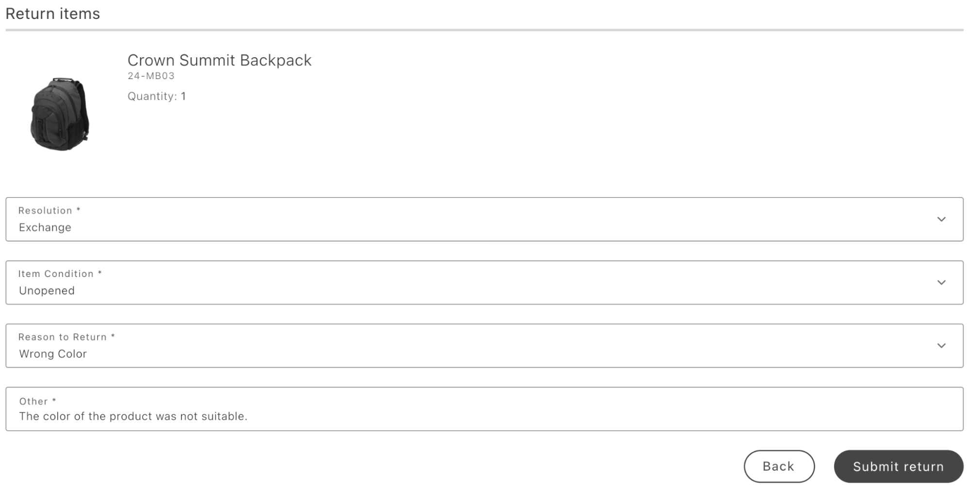
*CreateReturn container — Success*
## Prerequisites
- https://experienceleague.adobe.com/en/docs/commerce-admin/stores-sales/order-management/returns/rma-configure. The **Stores** > Configuration > **Sales** > **Sales** > **RMA Settings** in the Adobe Commerce Admin.
- If you need to add custom return attributes, add them at **Stores** > **Attributes** > **Returns**. You can optionally use the Input Validation field to define custom validation rules.
## Configurations
The `CreateReturn` container provides the following configuration options:
```text
[
['Options', 'Type', 'Req?', 'Description'],
['className', 'string', 'No', 'Allows custom CSS classes to be applied to the container for styling purposes.'],
['orderData', 'OrderDataModel', 'No', 'A structured object containing order-related data. It can be used as an initial value if data is not fetched from the backend, serving as a fallback.'],
['slots.ReturnOrderItem', 'function', 'No', 'Enables integration of additional elements or functionality, allowing customization to meet specific requirements. This can include adding new components, modifying existing ones, or inserting custom content.'],
['slots.ReturnFormActions', 'function', 'No', 'Provides the ability to add custom events or replace existing actions with tailored functionality. Examples include adding unique buttons, setting up custom redirects, or modifying interface elements.'],
['onSuccess', 'function', 'No', 'A callback function executed after the form is successfully submitted.'],
['onError', 'function', 'No', 'A callback function executed when an error occurs during submission. The error is passed as a parameter for handling.'],
['routeReturnSuccess', 'function', '', 'Defines a custom URL to redirect users upon successful return submission.'],
['showConfigurableOptions', 'function', 'No', 'Allows rendering additional product parameters during container integration by defining key-value pairs for further customization.'],
]
```
## Example
The following example demonstrates how to render the `CreateReturn` container:
```javascript
export default async function decorate(block) {
await orderRenderer.render(CreateReturn, {
routeReturnSuccess: (orderData) =>
checkIsAuthenticated()
? `${CUSTOMER_ORDER_DETAILS_PATH}?orderRef=${orderData.number}`
: `${ORDER_DETAILS_PATH}?orderRef=${orderData.token}`,
})(block);
}
```
---
# CustomerDetails container
The `CustomerDetails` container organizes customer and order information into the following sections:
- Contact details
- Shipping address
- Billing address
- Shipping method
- Payment method
- Return details:
The return details section is available exclusively on return pages. It provides information about the return.
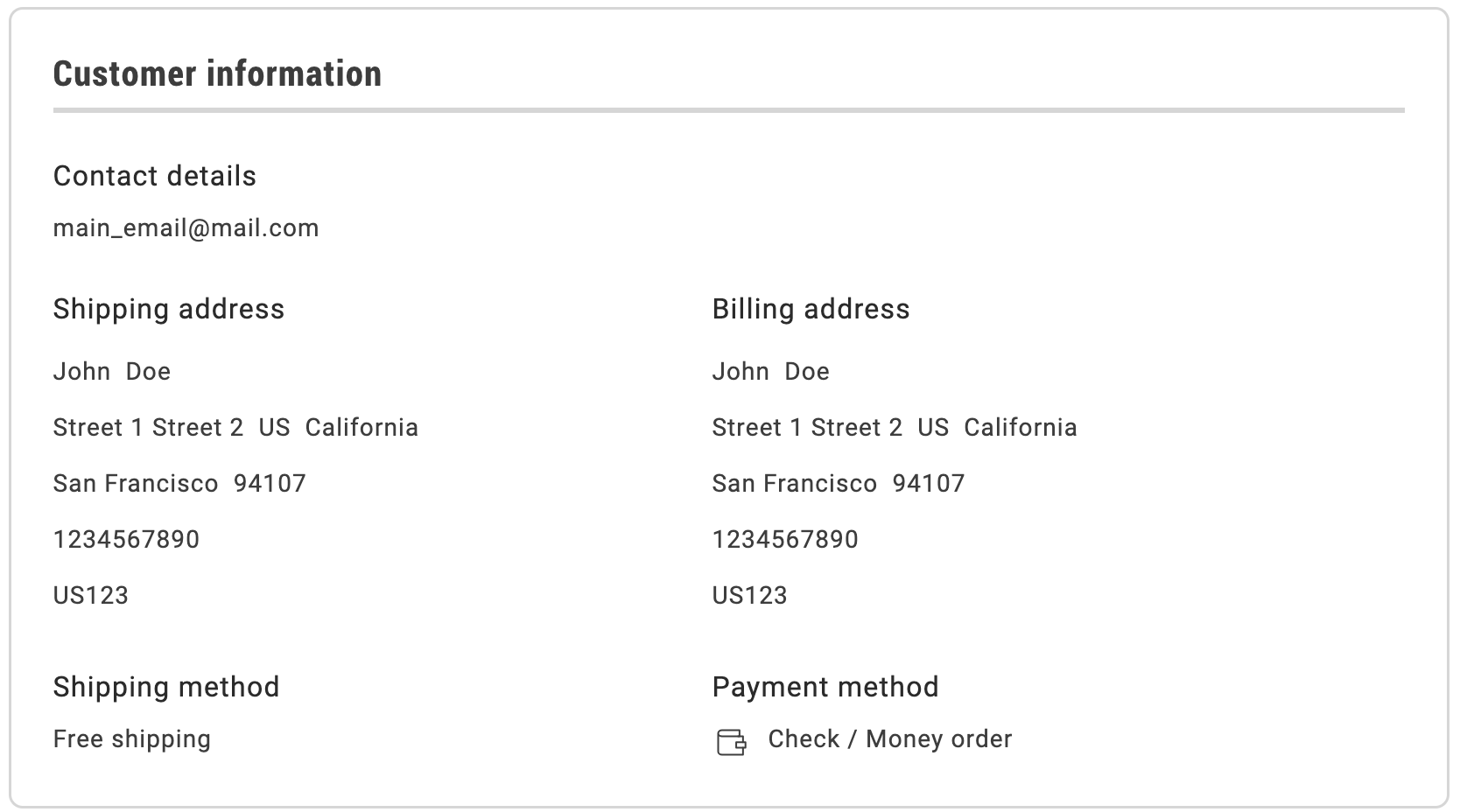
*CustomerDetails container*
## Configurations
The `CustomerDetails` container provides the following configuration options:
```text
[
['Options', 'Type', 'Req?', 'Description'],
['paymentIconsMap', 'Record', 'No', 'Configures the icon list by specifying key-value pairs to set custom icons where value can be either the name of SDK icon or custom SVG icon.'],
['orderData', 'OrderDataModel', 'No', 'A structured object containing transformed order data. It can be used as an initial value if data is not fetched from the backend, serving as a fallback.'],
['title', 'string', 'No', 'Enables setting a custom title to replace the default one during container interaction.'],
['className', 'string', 'No', 'Allows custom CSS classes to be applied to the form.'],
['slots.OrderReturnInformation', 'SlotProps', 'No', 'Allows adding or expanding the return information details section by including additional data or attributes.'],
]
```
## Example
The following example demonstrates how to integrate the `CustomerDetails` container:
```javascript
export default async function decorate(block) {
await orderRenderer.render(CustomerDetails, {})(block);
}
```
---
# Order Containers
The **Order** drop-in provides pre-built container components for integrating into your storefront.
Version: 3.2.0
## What are Containers?
Containers are pre-built UI components that combine functionality, state management, and presentation. They provide a complete solution for specific features and can be customized through props, slots, and CSS.
## Available Containers
| Container | Description |
| --------- | ----------- |
| [CreateReturn](https://experienceleague.adobe.com/developer/commerce/storefront/dropins/order/containers/create-return/) | Learn about the `CreateReturn` container. |
| [CustomerDetails](https://experienceleague.adobe.com/developer/commerce/storefront/dropins/order/containers/customer-details/) | Learn about the `CustomerDetails` container. |
| [OrderCancelForm](https://experienceleague.adobe.com/developer/commerce/storefront/dropins/order/containers/order-cancel-form/) | Learn about the `OrderCancelForm` container. |
| [OrderComments](https://experienceleague.adobe.com/developer/commerce/storefront/dropins/order/containers/order-comments/) | Learn about the `OrderComments` container. |
| [OrderCostSummary](https://experienceleague.adobe.com/developer/commerce/storefront/dropins/order/containers/order-cost-summary/) | Learn about the `OrderCostSummary` container. |
| [OrderHeader](https://experienceleague.adobe.com/developer/commerce/storefront/dropins/order/containers/order-header/) | *Enrichment needed - add description to `_dropin-enrichments/order/containers.json`* |
| [OrderProductList](https://experienceleague.adobe.com/developer/commerce/storefront/dropins/order/containers/order-product-list/) | Learn about the `OrderProductList` container. |
| [OrderReturns](https://experienceleague.adobe.com/developer/commerce/storefront/dropins/order/containers/order-returns/) | Learn about the `OrderReturns` container. |
| [OrderSearch](https://experienceleague.adobe.com/developer/commerce/storefront/dropins/order/containers/order-search/) | Learn about the `OrderSearch` container. |
| [OrderStatus](https://experienceleague.adobe.com/developer/commerce/storefront/dropins/order/containers/order-status/) | *Enrichment needed - add description to `_dropin-enrichments/order/containers.json`* |
| [ReturnsList](https://experienceleague.adobe.com/developer/commerce/storefront/dropins/order/containers/returns-list/) | Learn about the `ReturnsList` container. |
| [ShippingStatus](https://experienceleague.adobe.com/developer/commerce/storefront/dropins/order/containers/shipping-status/) | Learn about the `ShippingStatus` container. |
> Each container is designed to work independently but can be composed together to create comprehensive user experiences.
---
# OrderCancelForm container
The `OrderCancelForm` container provides a cancellation form that allows users to select reasons for canceling an order and perform the cancellation operation.
* OrderCancelForm container*
## Configurations
The `OrderCancelForm container provides the following configuration options:
```text
[
['Options', 'Type', 'Req?', 'Description'],
['orderRef', 'string', 'Yes', 'ID of the order to be canceled.'],
['pickerProps', 'PickerProps', 'No', 'Configuration for the picker used to display and select the reason for order cancellation.'],
['submitButtonProps', 'ButtonProps', 'No', 'Configuration for the button used to submit the order cancellation.'],
['cancelReasons', 'PickerOption[]', 'Yes', 'An array of reasons available for order cancellation.'],
]
```
## Example
The `OrderCancelForm` container is not directly integrated within the boilerplate, but it is delivered as part of the `OrderStatus` container. However, the `OrderCancelForm` container can also be used independently to create custom implementations.
Here’s an integration example from the drop-in component development environment:
```javascript
provider.render(OrderCancelForm, {
orderRef: "",
pickerProps: {} ,
submitButtonProps: {} ,
cancelReasons: [] ,
})(containerWrapper);
```
---
# OrderComments container
The `OrderComments` container displays order-level comments on the Order Details page. It renders a read-only list of comments associated with the order, each showing a timestamp and message.
- **Comment list**: Displays all comments from the `CustomerOrder.comments` GraphQL field in a chronological list, with each entry showing a formatted date and time alongside the comment message.
- **Empty state**: When there are no comments for the order, the container displays an empty state message ("No order comments.").
- **Loading state**: While order data is being fetched, the container displays a skeleton loader.
The container listens to the `order/data` event to receive order data. When order data becomes available, it extracts the `comments` array and renders the comment list.
## Configurations
The `OrderComments` container provides the following configuration options:
```text
[
['Options', 'Type', 'Req?', 'Description'],
['orderData', 'OrderDataModel', 'No', 'A structured object containing transformed order data. It can be used as an initial value if data is not fetched from the backend, serving as a fallback.'],
['className', 'string', 'No', 'Allows custom CSS classes to be applied to the container.'],
]
```
## Example
The following example demonstrates how to render the `OrderComments` container:
```javascript
export default async function decorate(block) {
await orderRenderer.render(OrderComments, {})(block);
}
```
---
# OrderCostSummary container
The `OrderCostSummary` container displays detailed order costs on the Order Details and Return Details pages. It includes the following sections:
- **Subtotal**: Displays the total cost of all items in the order before applying discounts, taxes, or additional charges.
- **Shipping**: Displays the shipping cost, which depends on the shipping method, location, and weight of the order.
- **Discount**: Displays any applicable discounts, such as promotional or volume-based offers, subtracted from the subtotal.
- **Coupon**: Displays the value of any applied coupons and their impact on the final cost.
- **Tax**: Displays the tax amount added to the order, calculated based on jurisdiction and item type.
- **Total**: Displays the final payable amount, including all adjustments such as discounts, shipping, and taxes.
If a value is not provided for any section (such as no discount or coupons are applied), the corresponding line is hidden. This ensures the container only displays relevant information.
The settings for displaying tax amounts can be configured at **Stores** > Configuration > **Sales** > **Tax** > **Order, Invoices, Credit Memos Display Settings**.
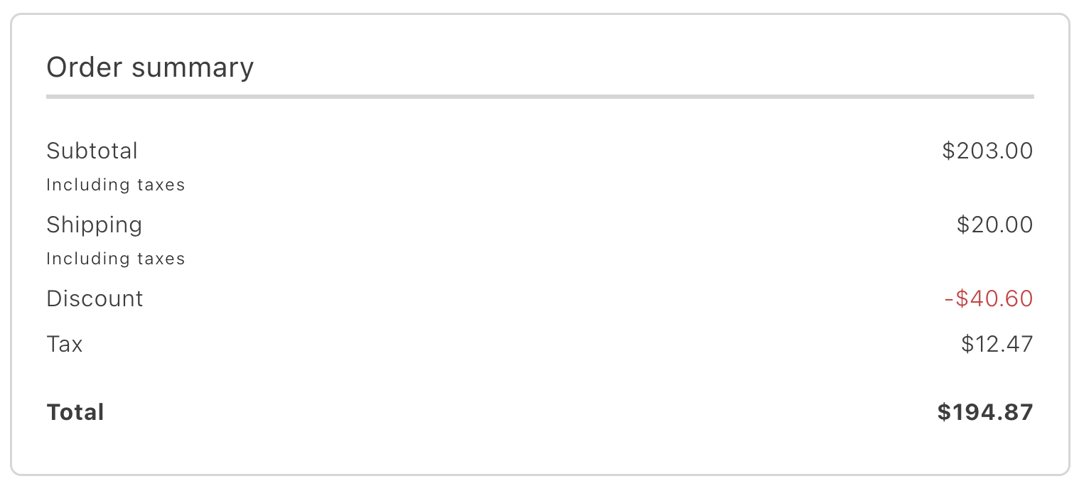
*OrderCostSummary container*
## Configurations
The `OrderCostSummary` container provides the following configuration options:
```text
[
['Options', 'Type', 'Req?', 'Description'],
['withHeader', 'boolean', 'Yes', 'Enables showing or hiding the container header.'],
['orderData', 'OrderDataModel', 'No', 'A structured object containing transformed order data. It can be used as an initial value if data is not fetched from the backend, serving as a fallback.'],
['className', 'string', 'No', 'Allows custom CSS classes to be applied to the form.'],
]
```
## Example
The following example demonstrates how to render the `OrderCostSummary` container:
```javascript
export default async function decorate(block) {
await orderRenderer.render(OrderCostSummary, {})(block);
}
```
---
# OrderHeader Container
Version: 3.2.0
## Configuration
The `OrderHeader` container provides the following configuration options:
| Parameter | Type | Req? | Description |
|---|---|---|---|
| `handleEmailAvailability` | `function` | No | Callback to check whether a given email is available (not yet registered). Used to conditionally offer sign-up during guest order lookup. |
| `handleSignUpClick` | `function` | No | Callback invoked when the sign-up action is triggered from the order header. |
| `orderData` | `OrderDataModel` | No | A structured object containing order data used to pre-populate the header. |
## Slots
This container does not expose any customizable slots.
## Usage
The following example demonstrates how to use the `OrderHeader` container:
```js
await provider.render(OrderHeader, {
handleEmailAvailability: handleEmailAvailability,
handleSignUpClick: handleSignUpClick,
orderData: orderData,
})(block);
```
---
# OrderProductList container
The `OrderProductList` container displays a list of products associated with a specific order or return. Each item in the list is represented by a product card containing details such as the price, applied discounts, tax information, final amount, and product attributes.
The settings for displaying tax amounts can be configured at **Stores** > Configuration > **Sales** > **Tax** > **Order, Invoices, Credit Memos Display Settings**.
*OrderProductList container*
## Configurations
The `OrderProductList` container provides the following configuration options:
```text
[
['Options', 'Type', 'Req?', 'Description'],
['className', 'string', 'No', 'Allows custom CSS classes to be applied to the form.'],
['orderData', 'OrderDataModel', 'No', 'A structured object containing transformed order data. It can be passed as an initial value and used as a fallback if data is not received from the backend.'],
['withHeader', 'boolean', 'No', 'Controls the visibility of the container header, allowing it to be shown or hidden.'],
['showConfigurableOptions', 'function', 'No', 'Allows rendering additional product parameters during container integration by defining key-value pairs for further customization.'],
['routeProductDetails', 'function', 'No', 'A function that returns the URL for the product details page. Receives the product data as an argument.'],
]
```
## Example
The following example demonstrates how to render the `OrderProductList` container:
```javascript
export default async function decorate(block) {
await orderRenderer.render(OrderProductList, {
routeProductDetails: (product) => `/products/${product.productUrlKey}/${product.product.sku}`,
})(block);
}
```
---
# OrderReturns container
The `OrderReturns` container displays the list of returns associated with a specific order. Each return is presented with relevant details, such as return status and associated items. If no returns have been created for the order, the container is not rendered, ensuring that the interface remains clean and free of unnecessary placeholders.
*OrderReturns container*
## Configurations
The `OrderReturns` container provides the following configuration options:
```text
[
['Options', 'Type', 'Req?', 'Description'],
['slot.ReturnItemsDetails', 'slot', 'No', 'Provides the ability to expand information for a specific card. Allows adding additional data or attributes to make the card more detailed and customizable, adapting it to specific product or interface requirements.'],
['slot.DetailsActionParams', 'slot', 'No', 'Enables customization of actions by adding elements, buttons, or links to replace the default setup. This allows for tailored functionality to meet specific user tasks or requirements.'],
['className', 'string', 'No', 'Allows custom CSS classes to be applied to the form for styling.'],
['orderData', 'OrderDataModel', 'No', 'A structured object containing transformed order data. It can be passed as an initial value and used as a fallback if data is not received from the backend.'],
['withHeader', 'boolean', 'No', 'Controls the visibility of the container header, allowing it to be shown or hidden.'],
['withThumbnails', 'boolean', 'No', 'Enables or disables the display of product thumbnails on order cards.'],
['routeReturnDetails', 'function', 'No', 'Specifies the URL where the return number link redirects the customer.'],
['routeProductDetails', 'function', 'No', 'A function that returns the URL for the product details page.'],
['routeTracking', 'function', 'No', 'Specifies the URL where the tracking number link redirects the customer.'],
]
```
## Example
The following example demonstrates how to render the `OrderReturns` container:
```javascript
export default async function decorate(block) {
const isAuthenticated = checkIsAuthenticated();
const returnDetailsPath = isAuthenticated
? CUSTOMER_RETURN_DETAILS_PATH
: RETURN_DETAILS_PATH;
await orderRenderer.render(OrderReturns, {
routeTracking: ({ carrier, number }) => {
if (carrier?.toLowerCase() === 'ups') {
return `${UPS_TRACKING_URL}?tracknum=${number}`;
}
return '';
},
routeReturnDetails: ({ orderNumber, returnNumber, token }) => {
const { searchParams } = new URL(window.location.href);
const orderRefFromUrl = searchParams.get('orderRef');
const newOrderRef = isAuthenticated ? orderNumber : token;
const encodedOrderRef = encodeURIComponent(orderRefFromUrl || newOrderRef);
return `${returnDetailsPath}?orderRef=${encodedOrderRef}&returnRef=${returnNumber}`;
},
routeProductDetails: (productData) => (productData ? `/products/${productData.product.urlKey}/${productData.product.sku}` : '#'),
})(block);
}
```
---
# OrderSearch container
The `OrderSearch` container enables order searches using email, last name, and order number. It is available to both guest and registered users for quick access to order details.
*OrderSearch container*
## Configurations
The `OrderSearch` container provides the following configuration options:
```text
[
['Options', 'Type', 'Req?', 'Description'],
['className', 'string', 'No', 'Allows custom CSS classes to be applied to the form for styling.'],
['isAuth', 'boolean', 'No', 'Indicates whether the user is authenticated.'],
['renderSignIn', 'function', 'No', 'A function responsible for rendering the sign-in form for the user.'],
['routeGuestOrder', 'function', 'No', 'A function that returns the URL for the guest (unauthenticated user) order route.'],
['routeCustomerOrder', 'function', 'No', 'A function that returns the URL for an authenticated customer order details page.'],
['onError', 'function', 'No', 'A function executed when an error occurs. It receives an errorInformation object containing details about the error.'],
]
```
## Example
The following example demonstrates how to render the `OrderSearch` container:
```javascript
const renderSignIn = async (element, email, orderNumber) => authRenderer.render(SignIn, {
initialEmailValue: email,
renderSignUpLink: false,
labels: {
formTitleText: email
? 'Enter your password to view order details'
: 'Sign in to view order details',
primaryButtonText: 'View order',
},
routeForgotPassword: () => 'reset-password.html',
routeRedirectOnSignIn: () => `${CUSTOMER_ORDER_DETAILS_PATH}?orderRef=${orderNumber}`,
})(element);
export default async function decorate(block) {
block.innerHTML = '';
events.on('order/data', async (order) => {
if (!order) return;
block.innerHTML = '';
await orderRenderer.render(OrderSearch, {
isAuth: checkIsAuthenticated(),
renderSignIn: async ({ render, formValues }) => {
if (render) {
renderSignIn(
block,
formValues?.email ?? '',
formValues?.number ?? '',
);
return false;
}
return true;
},
routeCustomerOrder: () => CUSTOMER_ORDER_DETAILS_PATH,
routeGuestOrder: () => ORDER_DETAILS_PATH,
onError: async (errorInformation) => {
console.info('errorInformation', errorInformation);
},
})(block);
});
await orderRenderer.render(OrderSearch, {
isAuth: checkIsAuthenticated(),
renderSignIn: async ({ render, formValues }) => {
if (render) {
renderSignIn(block, formValues?.email ?? '', formValues?.number ?? '');
return false;
}
return true;
},
routeCustomerOrder: () => CUSTOMER_ORDER_DETAILS_PATH,
routeGuestOrder: () => ORDER_DETAILS_PATH,
onError: async (errorInformation) => {
console.info('errorInformation', errorInformation);
},
})(block);
}
```
---
# OrderStatus Container
Version: 3.2.0
## Configuration
The `OrderStatus` container provides the following configuration options:
| Parameter | Type | Req? | Description |
|---|---|---|---|
| `className` | `string` | No | Additional CSS classes to apply to the container |
| `orderData` | `OrderDataModel` | No | A structured object containing order data. Used as an initial value or fallback if data is not fetched from the backend. |
| `statusTitle` | `string` | No | Custom title text to display above the order status indicator. |
| `status` | `StatusEnumProps` | No | The current order status value used to display the status indicator. |
| `routeCreateReturn` | `function` | No | Function that returns the URL for the create return page. |
| `routeOnSuccess` | `function` | No | Function that returns the URL to redirect to after a successful action. |
| `onError` | `function` | No | Callback function triggered when error |
## Slots
This container exposes the following slots for customization:
| Slot | Type | Required | Description |
|------|------|----------|-------------|
| `OrderActions` | `SlotProps` | Yes | |
## Usage
The following example demonstrates how to use the `OrderStatus` container:
```js
await provider.render(OrderStatus, {
className: "Example Name",
orderData: orderData,
statusTitle: "Example Title",
slots: {
// Add custom slot implementations here
}
})(block);
```
---
# ReturnsList container
The `ReturnsList` container displays a complete list of all created returns available to the user. Each return card follows the same structure as the `OrderReturns` container, allowing consistent presentation of return details. It provides an overview of all return requests, enabling users to manage and track their status in one place.
*ReturnsList container*
## Configurations
The `ReturnsList` container provides the following configuration options:
```text
[
['Options', 'Type', 'Req?', 'Description'],
['slot.ReturnItemsDetails', 'slot', 'No', 'Provides the ability to expand information for a specific return card. Allows adding additional data or attributes to make the card more detailed and customizableto specific requirements.'],
['slot.DetailsActionParams', 'slot', 'No', 'Enables customization of actions by adding elements, buttons, or links to replace the default setup. This allows for tailored functionality to meet specific user tasks or requirements.'],
['withReturnsListButton', 'boolean', 'No', 'Determines whether the button at the bottom of the container is visible (applies only in minified view).'],
['className', 'string', 'No', 'Allows custom CSS classes to be applied to the form for styling.'],
['minifiedView', 'boolean', 'No', 'Enables or disables the minified view of the container.'],
['withHeader', 'boolean', 'No', 'Controls the visibility of the container header.'],
['withThumbnails', 'boolean', 'No', 'Enables or disables the display of product thumbnails on order cards.'],
['returnPageSize', 'number', 'No', 'Specifies the number of items displayed on a single page of the returns list.'],
['returnsInMinifiedView', 'number', 'No', 'Defines the number of returns visible in the minified view (default is 1).'],
['routeReturnDetails', 'function', 'No', 'Specifies the URL where the return number link redirects the customer.'],
['routeOrderDetails', 'function', 'No', 'Specifies the URL where the customer should be redirected when clicking the order number link (number and token).'],
['routeTracking', 'function', 'No', 'Specifies the URL where the tracking number link redirects the customer.'],
['routeReturnsList', 'function', 'No', 'Defines the URL for the button click at the bottom of the container.'],
['routeProductDetails', 'function', 'No', 'A function that returns the URL for the product details page.'],
]
```
## Example
The following example demonstrates how to render the `ReturnsList` container:
```javascript
export default async function decorate(block) {
const {
'minified-view': minifiedViewConfig = 'false',
} = readBlockConfig(block);
if (!checkIsAuthenticated()) {
window.location.href = CUSTOMER_LOGIN_PATH;
} else {
await orderRenderer.render(ReturnsList, {
minifiedView: minifiedViewConfig === 'true',
routeTracking: ({ carrier, number }) => {
if (carrier?.toLowerCase() === 'ups') {
return `${UPS_TRACKING_URL}?tracknum=${number}`;
}
return '';
},
routeReturnDetails: ({ orderNumber, returnNumber }) => `${CUSTOMER_RETURN_DETAILS_PATH}?orderRef=${orderNumber}&returnRef=${returnNumber}`,
routeOrderDetails: ({ orderNumber }) => `${CUSTOMER_ORDER_DETAILS_PATH}?orderRef=${orderNumber}`,
routeReturnsList: () => CUSTOMER_RETURNS_PATH,
routeProductDetails: (productData) => (productData ? `/products/${productData.product.urlKey}/${productData.product.sku}` : '#'),
})(block);
}
}
```
---
# ShippingStatus container
The `ShippingStatus` container displays information about shipments, including product images, the delivery service used, and tracking numbers. A separate block is rendered for each shipment created for the order. It also lists products that have not yet been shipped, providing a clear overview of the shipping status for all items.
*ShippingStatus container*
## Configurations
The `ShippingStatus` container provides the following configuration options:
```text
[
['Options', 'Type', 'Req?', 'Description'],
['slots.DeliveryTimeLine', 'slot', 'No', 'Allows integration of the delivery process in a timeline format. Displays key events from dispatch to arrival, making it easier to track delivery progress and view the current stage in real-time.'],
['slots.DeliveryTrackActions', 'slot', 'No', 'Enables integration of custom actions related to order and delivery tracking. Allows customization with parameters such as delivery type, status updates, and timestamps, providing flexibility and control over user interactions and tracking.'],
['slots.ReturnItemsDetails', 'slot', 'No', 'Supports adding or customizing additional data for return items, enabling tailored content to meet specific requirements.'],
['className', 'string', 'No', 'CSS class for additional styling customization of the container.'],
['collapseThreshold', 'number', 'No', 'Sets the minimum number of elements required for images to be displayed in an accordion view.'],
['orderData', 'OrderDataModel', 'No', 'Contains order data, including the order ID and a list of items.'],
['routeOrderDetails', 'function', 'No', 'A function that returns the URL for the product details route.'],
['routeTracking', 'function', 'No', 'Specifies the URL where the customer should be redirected when clicking the tracking number link.'],
['routeProductDetails', 'function', 'No', 'A function that returns the URL for the product details page.'],
]
```
## Example
The following example demonstrates how to render the `ShippingStatus` container:
```javascript
export default async function decorate(block) {
await orderRenderer.render(ShippingStatus, {
routeTracking: ({ carrier, number }) => {
if (carrier?.toLowerCase() === 'ups') {
return `${UPS_TRACKING_URL}?tracknum=${number}`;
}
return '';
},
routeProductDetails: (data) => {
if (data?.orderItem) {
return `/products/${data?.orderItem?.productUrlKey}/${data?.orderItem?.product?.sku}`;
}
if (data?.product) {
return `/products/${data?.product?.urlKey}/${data?.product?.sku}`;
}
return '#';
},
})(block);
}
```
---
# Order Dictionary
The **Order dictionary** contains all user-facing text, labels, and messages displayed by this drop-in. Customize the dictionary to:
- **Localize** the drop-in for different languages and regions
- **Customize** labels and messages to match your brand voice
- **Override** default text without modifying source code for the drop-in
Dictionaries use the **i18n (internationalization)** pattern, where each text string is identified by a unique key path.
Version: 3.2.0
## How to customize
Override dictionary values during drop-in initialization. The drop-in deep-merges your custom values with the defaults.
```javascript
await initialize({
langDefinitions: {
en_US: {
"Order": {
"CreateReturn": {
"headerText": "Your custom message here",
"downloadableCount": "Custom value"
}
}
}
}
});
```
You only need to include the keys you want to change. For multi-language support and advanced patterns, see the [Dictionary customization guide](https://experienceleague.adobe.com/developer/commerce/storefront/dropins/all/dictionaries/).
## Default keys and values
Below are the default English (`en_US`) strings provided by the **Order** drop-in:
```json title="en_US.json"
{
"Order": {
"CreateReturn": {
"headerText": "Return items",
"downloadableCount": "Files",
"returnedItems": "Returned items:",
"configurationsList": {
"quantity": "Quantity"
},
"stockStatus": {
"inStock": "In stock",
"outOfStock": "Out of stock"
},
"giftCard": {
"sender": "Sender",
"recipient": "Recipient",
"message": "Note"
},
"success": {
"title": "Return submitted",
"message": "Your return request has been successfully submitted."
},
"buttons": {
"nextStep": "Continue",
"backStep": "Back",
"submit": "Submit return",
"backStore": "Back to order"
}
},
"OrderComments": {
"emptyState": "No order comments.",
"title": "Order comments"
},
"OrderCostSummary": {
"headerText": "Order summary",
"headerReturnText": "Return summary",
"totalFree": "Free",
"subtotal": {
"title": "Subtotal"
},
"shipping": {
"title": "Shipping",
"freeShipping": "Free shipping"
},
"appliedGiftCards": {
"label": {
"singular": "Gift card",
"plural": "Gift cards"
}
},
"giftOptionsTax": {
"printedCard": {
"title": "Printer card",
"inclTax": "Including taxes",
"exclTax": "Excluding taxes"
},
"itemGiftWrapping": {
"title": "Item gift wrapping",
"inclTax": "Including taxes",
"exclTax": "Excluding taxes"
},
"orderGiftWrapping": {
"title": "Order gift wrapping",
"inclTax": "Including taxes",
"exclTax": "Excluding taxes"
}
},
"tax": {
"accordionTitle": "Taxes",
"accordionTotalTax": "Tax Total",
"totalExcludingTaxes": "Total excluding taxes",
"title": "Tax",
"incl": "Including taxes",
"excl": "Excluding taxes"
},
"discount": {
"title": "Discount",
"subtitle": "discounted"
},
"total": {
"title": "Total"
}
},
"Returns": {
"minifiedView": {
"returnsList": {
"viewAllOrdersButton": "View all returns",
"ariaLabelLink": "Redirect to full order information",
"emptyOrdersListMessage": "No returns",
"minifiedViewTitle": "Recent returns",
"orderNumber": "Order number:",
"returnNumber": "Return number:",
"carrier": "Carrier:",
"itemText": {
"none": "",
"one": "item",
"many": "items"
},
"returnStatus": {
"pending": "Pending",
"authorized": "Authorized",
"partiallyAuthorized": "Partially authorized",
"received": "Received",
"partiallyReceived": "Partially received",
"approved": "Approved",
"partiallyApproved": "Partially approved",
"rejected": "Rejected",
"partiallyRejected": "Partially rejected",
"denied": "Denied",
"processedAndClosed": "Processed and closed",
"closed": "Closed"
}
}
},
"fullSizeView": {
"returnsList": {
"viewAllOrdersButton": "View all orders",
"ariaLabelLink": "Redirect to full order information",
"emptyOrdersListMessage": "No returns",
"minifiedViewTitle": "Returns",
"orderNumber": "Order number:",
"returnNumber": "Return number:",
"carrier": "Carrier:",
"itemText": {
"none": "",
"one": "item",
"many": "items"
},
"returnStatus": {
"pending": "Pending",
"authorized": "Authorized",
"partiallyAuthorized": "Partially authorized",
"received": "Received",
"partiallyReceived": "Partially received",
"approved": "Approved",
"partiallyApproved": "Partially approved",
"rejected": "Rejected",
"partiallyRejected": "Partially rejected",
"denied": "Denied",
"processedAndClosed": "Processed and closed",
"closed": "Closed"
}
}
}
},
"OrderProductListContent": {
"cancelledTitle": "Cancelled",
"allOrdersTitle": "Your order",
"returnedTitle": "Returned",
"refundedTitle": "Your refunded",
"downloadableCount": "Files",
"stockStatus": {
"inStock": "In stock",
"outOfStock": "Out of stock"
},
"GiftCard": {
"sender": "Sender",
"recipient": "Recipient",
"message": "Note"
}
},
"OrderSearchForm": {
"title": "Enter your information to view order details",
"description": "You can find your order number in the receipt you received via email.",
"button": "View Order",
"email": "Email",
"lastname": "Last Name",
"orderNumber": "Order Number"
},
"Form": {
"notifications": {
"requiredFieldError": "This is a required field."
}
},
"ShippingStatusCard": {
"orderNumber": "Order number:",
"returnNumber": "Return number:",
"itemText": {
"none": "",
"one": "Package contents ({{count}} item)",
"many": "Package contents ({{count}} items)"
},
"trackButton": "Track package",
"carrier": "Carrier:",
"prepositionOf": "of",
"returnOrderCardTitle": "Package details",
"shippingCardTitle": "Package details",
"shippingInfoTitle": "Shipping information",
"notYetShippedTitle": "Not yet shipped",
"notYetShippedImagesTitle": {
"singular": "Package contents ({{count}} item)",
"plural": "Package contents ({{count}} items)"
}
},
"OrderStatusContent": {
"noInfoTitle": "Check back later for more details.",
"returnMessage": "The order was placed on {ORDER_CREATE_DATE} and your return process started on {RETURN_CREATE_DATE}",
"returnStatus": {
"pending": "Pending",
"authorized": "Authorized",
"partiallyAuthorized": "Partially authorized",
"received": "Received",
"partiallyReceived": "Partially received",
"approved": "Approved",
"partiallyApproved": "Partially approved",
"rejected": "Rejected",
"partiallyRejected": "Partially rejected",
"denied": "Denied",
"processedAndClosed": "Processed and closed",
"closed": "Closed"
},
"actions": {
"cancel": "Cancel order",
"confirmGuestReturn": "Return request confirmed",
"confirmGuestReturnMessage": "Your return request has been successfully confirmed.",
"createReturn": "Return or replace",
"createAnotherReturn": "Start another return",
"reorder": "Reorder"
},
"orderPlaceholder": {
"title": "",
"message": "Your order has been in its current status since {DATE}.",
"messageWithoutDate": "Your order has been in its current status for some time."
},
"orderPending": {
"title": "Pending",
"message": "The order was successfully placed on {DATE} and your order is processing. Check back for more details when your order ships.",
"messageWithoutDate": "Your order is processing. Check back for more details when your order ships."
},
"orderProcessing": {
"title": "Processing",
"message": "The order was successfully placed on {DATE} and your order is processing. Check back for more details when your order ships.",
"messageWithoutDate": "Your order is processing. Check back for more details when your order ships."
},
"orderOnHold": {
"title": "On hold",
"message": "We’ve run into an issue while processing your order on {DATE}. Please check back later or contact us at support@adobe.com for more information.",
"messageWithoutDate": "We’ve run into an issue while processing your order. Please check back later or contact us at support@adobe.com for more information."
},
"orderReceived": {
"title": "Order received",
"message": "The order was successfully placed on {DATE} and your order is processing. Check back for more details when your order ships.",
"messageWithoutDate": "Your order is processing. Check back for more details when your order ships."
},
"orderComplete": {
"title": "Complete",
"message": "Your order is complete. Need help with your order? Contact us at support@adobe.com"
},
"orderCanceled": {
"title": "Canceled",
"message": "This order was cancelled by you. You should see a refund to your original payment method with 5-7 business days.",
"messageWithoutDate": "This order was cancelled by you. You should see a refund to your original payment method with 5-7 business days."
},
"orderSuspectedFraud": {
"title": "Suspected fraud",
"message": "We’ve run into an issue while processing your order on {DATE}. Please check back later or contact us at support@adobe.com for more information.",
"messageWithoutDate": "We’ve run into an issue while processing your order. Please check back later or contact us at support@adobe.com for more information."
},
"orderPaymentReview": {
"title": "Payment Review",
"message": "The order was successfully placed on {DATE} and your order is processing. Check back for more details when your order ships.",
"messageWithoutDate": "Your order is processing. Check back for more details when your order ships."
},
"guestOrderCancellationRequested": {
"title": "Cancellation requested",
"message": "The cancellation has been requested on {DATE}. Check your email for further instructions.",
"messageWithoutDate": "The cancellation has been requested. Check your email for further instructions."
},
"orderPendingPayment": {
"title": "Pending Payment",
"message": "The order was successfully placed on {DATE}, but it is awaiting payment. Please complete the payment so we can start processing your order.",
"messageWithoutDate": "Your order is awaiting payment. Please complete the payment so we can start processing your order."
},
"orderRejected": {
"title": "Rejected",
"message": "Your order was rejected on {DATE}. Please contact us for more information.",
"messageWithoutDate": "Your order was rejected. Please contact us for more information."
},
"orderAuthorized": {
"title": "Authorized",
"message": "Your order was successfully authorized on {DATE}. We will begin processing your order shortly.",
"messageWithoutDate": "Your order was successfully authorized. We will begin processing your order shortly."
},
"orderPaypalCanceledReversal": {
"title": "PayPal Canceled Reversal",
"message": "The PayPal transaction reversal was canceled on {DATE}. Please check your order details for more information.",
"messageWithoutDate": "The PayPal transaction reversal was canceled. Please check your order details for more information."
},
"orderPendingPaypal": {
"title": "Pending PayPal",
"message": "Your order is awaiting PayPal payment confirmation since {DATE}. Please check your PayPal account for the payment status.",
"messageWithoutDate": "Your order is awaiting PayPal payment confirmation. Please check your PayPal account for the payment status."
},
"orderPaypalReversed": {
"title": "PayPal Reversed",
"message": "The PayPal payment was reversed on {DATE}. Please contact us for further details.",
"messageWithoutDate": "The PayPal payment was reversed. Please contact us for further details."
},
"orderClosed": {
"title": "Closed",
"message": "The order placed on {DATE} has been closed. For any further assistance, please contact support.",
"messageWithoutDate": "Your order has been closed. For any further assistance, please contact support."
}
},
"CustomerDetails": {
"headerText": "Customer information",
"freeShipping": "Free shipping",
"orderReturnLabels": {
"createdReturnAt": "Return requested on: ",
"returnStatusLabel": "Return status: ",
"orderNumberLabel": "Order number: "
},
"returnStatus": {
"pending": "Pending",
"authorized": "Authorized",
"partiallyAuthorized": "Partially authorized",
"received": "Received",
"partiallyReceived": "Partially received",
"approved": "Approved",
"partiallyApproved": "Partially approved",
"rejected": "Rejected",
"partiallyRejected": "Partially rejected",
"denied": "Denied",
"processedAndClosed": "Processed and closed",
"closed": "Closed"
},
"email": {
"title": "Contact details"
},
"shippingAddress": {
"title": "Shipping address"
},
"shippingMethods": {
"title": "Shipping method"
},
"billingAddress": {
"title": "Billing address"
},
"paymentMethods": {
"title": "Payment method"
},
"returnInformation": {
"title": "Return details"
}
},
"Errors": {
"invalidOrder": "Invalid order. Please try again.",
"invalidSearch": "No order found with these order details."
},
"OrderCancel": {
"buttonText": "Cancel Order"
},
"OrderCancelForm": {
"title": "Cancel order",
"description": "Select a reason for canceling the order",
"label": "Reason for cancel",
"button": "Submit Cancellation",
"errorHeading": "Error",
"errorDescription": "There was an error processing your order cancellation."
},
"OrderHeader": {
"title": "{{name}}, thank you for your order!",
"defaultTitle": "Thank you for your order!",
"order": "ORDER #{{order}}",
"CreateAccount": {
"message": "Save your information for faster checkout next time.",
"button": "Create an account"
}
}
}
}
```
---
# Order Data & Events
The **Order** drop-in uses the [event bus](https://experienceleague.adobe.com/developer/commerce/storefront/sdk/reference/events/) to emit and listen to events for communication between drop-ins and external integrations.
Version: 3.2.0
## Events reference
{/* EVENTS_TABLE_START */}
| Event | Direction | Description |
|-------|-----------|-------------|
| [cart/reset](#cartreset-emits) | Emits | Emitted when the component state is reset. |
| [order/placed](#orderplaced-emits) | Emits | Emitted when an order is placed. |
| [companyContext/changed](#companycontextchanged-listens) | Listens | Fired by Company Context (`companyContext`) when a change occurs. |
| [order/data](#orderdata-emits-and-listens) | Emits and listens | Triggered when data is available or changes. |
| [order/error](#ordererror-emits-and-listens) | Emits and listens | Triggered when an error occurs. |
{/* EVENTS_TABLE_END */}
## Event details
The following sections provide detailed information about each event, including its direction, event payload, and usage examples.
### `cart/reset` (emits)
Emitted when the component state is reset.
#### Event payload
#### Example
```js
events.on('cart/reset', (payload) => {
console.log('cart/reset event received:', payload);
// Add your custom logic here
});
```
### `companyContext/changed` (listens)
Fired by Company Context (`companyContext`) when a change occurs.
#### Event payload
```typescript
string | null | undefined
```
#### Example
```js
events.on('companyContext/changed', (payload) => {
console.log('companyContext/changed event received:', payload);
// Add your custom logic here
});
```
### `order/data` (emits and listens)
Emitted when order data is loaded or updated. This includes order details, items, shipping information, and payment status.
#### Event payload
```typescript
OrderDataModel
```
See [`OrderDataModel`](#orderdatamodel) for full type definition.
#### Example
```js
events.on('order/data', (payload) => {
console.log('order/data event received:', payload);
// Add your custom logic here
});
```
### `order/error` (emits and listens)
Emitted when an error occurs during order operations such as fetching order details, reordering items, or processing returns.
#### Event payload
```typescript
{ source: string; type: string; error: Error | string }
```
#### Example
```js
events.on('order/error', (payload) => {
console.log('order/error event received:', payload);
// Add your custom logic here
});
```
### `order/placed` (emits)
Emitted when an order is placed.
#### Event payload
```typescript
OrderDataModel
```
See [`OrderDataModel`](#orderdatamodel) for full type definition.
#### Example
```js
events.on('order/placed', (payload) => {
console.log('order/placed event received:', payload);
// Add your custom logic here
});
```
## Data Models
The following data models are used in event payloads for this drop-in.
### OrderDataModel
Used in: [`order/data`](#orderdata-emits-and-listens), [`order/placed`](#orderplaced-emits).
```ts
type OrderDataModel = {
giftReceiptIncluded: boolean;
printedCardIncluded: boolean;
giftWrappingOrder: {
price: MoneyProps;
uid: string;
};
placeholderImage?: string;
returnNumber?: string;
id: string;
orderStatusChangeDate?: string;
number: string;
email: string;
token?: string;
status: string;
isVirtual: boolean;
totalQuantity: number;
shippingMethod?: string;
carrier?: string;
orderDate: string;
returns: OrdersReturnPropsModel[];
discounts: { amount: MoneyProps; label: string }[];
coupons: {
code: string;
}[];
payments: {
code: string;
name: string;
}[];
shipping?: { code: string; amount: number; currency: string };
shipments: ShipmentsModel[];
items: OrderItemModel[];
totalGiftCard: MoneyProps;
grandTotal: MoneyProps;
grandTotalExclTax: MoneyProps;
totalShipping?: MoneyProps;
subtotalExclTax: MoneyProps;
subtotalInclTax: MoneyProps;
totalTax: MoneyProps;
shippingAddress: OrderAddressModel;
totalGiftOptions: {
giftWrappingForItems: MoneyProps;
giftWrappingForItemsInclTax: MoneyProps;
giftWrappingForOrder: MoneyProps;
giftWrappingForOrderInclTax: MoneyProps;
printedCard: MoneyProps;
printedCardInclTax: MoneyProps;
};
billingAddress: OrderAddressModel;
availableActions: AvailableActionsProps[];
taxes: { amount: MoneyProps; rate: number; title: string }[];
appliedGiftCards: {
code: string;
appliedBalance: MoneyProps;
}[];
};
```
### OrderItemProductModel
```ts
type OrderItemProductModel = {
onlyXLeftInStock?: number;
priceRange?: {
maximumPrice?: {
regularPrice?: MoneyProps;
};
};
uid: string;
__typename: string;
stockStatus?: string;
canonicalUrl?: string;
urlKey?: string;
id: string;
image?: string;
imageAlt?: string;
name: string;
productType: string;
sku: string;
thumbnail: {
url: string;
label: string;
};
giftWrappingAvailable?: boolean;
};
```
### OrderItemModel
```ts
type OrderItemModel = {
giftMessage: {
senderName: string;
recipientName: string;
message: string;
};
giftWrappingPrice: MoneyProps;
productGiftWrapping: {
uid: string;
design: string;
selected: boolean;
image: {
url: string;
label: string;
};
price: MoneyProps;
}[];
taxCalculations: {
includeAndExcludeTax: {
originalPrice: MoneyProps;
baseOriginalPrice: MoneyProps;
baseDiscountedPrice: MoneyProps;
baseExcludingTax: MoneyProps;
};
excludeTax: {
originalPrice: MoneyProps;
baseOriginalPrice: MoneyProps;
baseDiscountedPrice: MoneyProps;
baseExcludingTax: MoneyProps;
};
includeTax: {
singleItemPrice: MoneyProps;
baseOriginalPrice: MoneyProps;
baseDiscountedPrice: MoneyProps;
};
};
productSalePrice: MoneyProps;
status?: string;
currentReturnOrderQuantity?: number;
eligibleForReturn: boolean;
productSku?: string;
type?: string;
discounted?: boolean;
id: string;
productName?: string;
productUrlKey?: string;
regularPrice?: MoneyProps;
price: MoneyProps;
product?: OrderItemProductModel;
selectedOptions?: Array<{
label: string;
value: any;
}>;
thumbnail?: {
label: string;
url: string;
};
downloadableLinks: {
count: number;
result: string;
} | null;
prices: {
priceIncludingTax: MoneyProps;
originalPrice: MoneyProps;
originalPriceIncludingTax: MoneyProps;
price: MoneyProps;
discounts: {
label: string;
amount: { value: number };
}[];
};
itemPrices: {
priceIncludingTax: MoneyProps;
originalPrice: MoneyProps;
originalPriceIncludingTax: MoneyProps;
price: MoneyProps;
discounts: {
label: string;
amount: { value: number };
}[];
};
bundleOptions: Record | null;
totalInclTax: MoneyProps;
priceInclTax: MoneyProps;
total: MoneyProps;
configurableOptions: Record | undefined;
giftCard?: {
senderName: string;
senderEmail: string;
recipientEmail: string;
recipientName: string;
message: string;
};
quantityCanceled: number;
quantityInvoiced: number;
quantityOrdered: number;
quantityRefunded: number;
quantityReturned: number;
quantityShipped: number;
requestQuantity?: number;
totalQuantity: number;
returnableQuantity?: number;
quantityReturnRequested: number;
};
```
---
# Order Functions
The Order drop-in provides API functions that enable you to programmatically control behavior, fetch data, and integrate with Adobe Commerce backend services.
Version: 3.2.0
| Function | Description |
| --- | --- |
| [`cancelOrder`](#cancelorder) | Calls the `cancelOrder` mutation. |
| [`confirmCancelOrder`](#confirmcancelorder) | Confirms the cancellation of an order using the provided order ID and confirmation key. |
| [`confirmGuestReturn`](#confirmguestreturn) | Confirms a return request for a guest order using an order ID and confirmation key. |
| [`getAttributesForm`](#getattributesform) | Calls the `attributesForm` query. |
| [`getAttributesList`](#getattributeslist) | Is a wrapper for the `attributesList` query. |
| [`getCustomer`](#getcustomer) | Is a wrapper for the customer query. |
| [`getCustomerOrdersReturn`](#getcustomerordersreturn) | Returns details about the returns a customer has requested. |
| [`getGuestOrder`](#getguestorder) | Is a wrapper for the `guestOrder` query. |
| [`getOrderDetailsById`](#getorderdetailsbyid) | Fetches detailed order data by order ID from the Commerce backend. |
| [`getStoreConfig`](#getstoreconfig) | Returns information about the storefront configuration. |
| [`guestOrderByToken`](#guestorderbytoken) | Retrieves a guest order using a token generated by Adobe Commerce. |
| [`placeNegotiableQuoteOrder`](#placenegotiablequoteorder) | Places an order for a negotiable quote. |
| [`placeOrder`](#placeorder) | API function for the drop-in. |
| [`reorderItems`](#reorderitems) | Allows a logged-in customer to add all the products from a previous order into their cart. |
| [`requestGuestOrderCancel`](#requestguestordercancel) | Is similar to the `cancelOrder` function, but it is used for guest orders. |
| [`requestGuestReturn`](#requestguestreturn) | Initiates a return request for a guest order. |
| [`requestReturn`](#requestreturn) | Takes the `RequestReturnProps` form as an argument and initiates the process of returning items from an order. |
| [`setPaymentMethodAndPlaceOrder`](#setpaymentmethodandplaceorder) | Sets the payment method on a cart and immediately places the order. |
## cancelOrder
The `cancelOrder` function calls the https://developer.adobe.com/commerce/webapi/graphql/schema/orders/mutations/cancel-order/ mutation. You must pass an order ID and reason.
```ts
const cancelOrder = async (
orderId: string,
reason: string,
onSuccess: Function,
onError: Function
): Promise
```
| Parameter | Type | Req? | Description |
|---|---|---|---|
| `orderId` | `string` | Yes | The ID of the order to cancel. |
| `reason` | `string` | Yes | The reason for canceling the order. |
| `onSuccess` | `Function` | Yes | The callback function to execute when the order is successfully canceled. |
| `onError` | `Function` | Yes | The callback function to execute when an error occurs. |
### Events
Does not emit any drop-in events.
### Returns
Returns `void | null | undefined`.
## confirmCancelOrder
The `confirmCancelOrder` function confirms the cancellation of an order using the provided order ID and confirmation key. The function calls the https://developer.adobe.com/commerce/webapi/graphql/schema/orders/mutations/confirm-cancel-order/ mutation.
```ts
const confirmCancelOrder = async (
orderId: string,
confirmationKey: string
): Promise
```
| Parameter | Type | Req? | Description |
|---|---|---|---|
| `orderId` | `string` | Yes | The ID of the order to cancel. |
| `confirmationKey` | `string` | Yes | A key generated when a guest requests to cancel an order. |
### Events
Emits the [`order/data`](https://experienceleague.adobe.com/developer/commerce/storefront/dropins/order/events/#orderdata-emits-and-listens) event with the updated order information after confirming the cancellation.
### Returns
Returns `void`.
## confirmGuestReturn
The `confirmGuestReturn` function confirms a return request for a guest order using an order ID and confirmation key. The function calls the https://developer.adobe.com/commerce/webapi/graphql/schema/orders/mutations/confirm-return/ mutation.
```ts
const confirmGuestReturn = async (
orderId: string,
confirmationKey: string
): Promise
```
| Parameter | Type | Req? | Description |
|---|---|---|---|
| `orderId` | `string` | Yes | The ID of the order for which the return is being confirmed. |
| `confirmationKey` | `string` | Yes | The confirmation key sent to the guest's email address to authorize the return. |
### Events
Emits the [`order/data`](https://experienceleague.adobe.com/developer/commerce/storefront/dropins/order/events/#orderdata-emits-and-listens) event.
### Returns
Returns [`OrderDataModel`](#orderdatamodel) or `null`.
## getAttributesForm
The `getAttributesForm` function calls the https://developer.adobe.com/commerce/webapi/graphql/schema/attributes/queries/attributes-form/ query.
```ts
const getAttributesForm = async (
formCode: string
): Promise
```
| Parameter | Type | Req? | Description |
|---|---|---|---|
| `formCode` | `string` | Yes | One of "customer_account_create", "customer_account_edit", "customer_address_create", "customer_address_edit". |
### Events
Does not emit any drop-in events.
### Returns
Returns `AttributesFormModel[]`.
## getAttributesList
The `getAttributesList` function is a wrapper for the https://developer.adobe.com/commerce/webapi/graphql/schema/attributes/queries/attributes-list/ query. You must pass an attribute code to retrieve the list. The system default values are `CUSTOMER`, `CUSTOMER_ADDRESS`, `CATALOG_PRODUCT` and `RMA_ITEM`.
```ts
const getAttributesList = async (
entityType: string
): Promise
```
| Parameter | Type | Req? | Description |
|---|---|---|---|
| `entityType` | `string` | Yes | The entity type for which to retrieve the list of attributes. |
### Events
Does not emit any drop-in events.
### Returns
Returns `AttributesFormModel[] | []`.
## getCustomer
The `getCustomer` function is a wrapper for the https://developer.adobe.com/commerce/webapi/graphql/schema/customer/queries/customer/ query. You must pass a customer ID to retrieve the customer data.
```ts
const getCustomer = async (): Promise
```
### Events
Does not emit any drop-in events.
### Returns
Returns [`CustomerDataModelShort`](#customerdatamodelshort).
## getCustomerOrdersReturn
The `getCustomerOrdersReturn` function returns details about the returns a customer has requested. It is a wrapper for the https://developer.adobe.com/commerce/webapi/graphql/schema/customer/queries/customer/ query.
```ts
const getCustomerOrdersReturn = async (
pageSize = 10,
currentPage = 1
): Promise
```
| Parameter | Type | Req? | Description |
|---|---|---|---|
| `pageSize` | `number` | No | The number of orders to return at a time. |
| `currentPage` | `number` | No | See function signature above |
### Events
Does not emit any drop-in events.
### Returns
Returns [`CustomerOrdersReturnModel`](#customerordersreturnmodel) or `null`.
## getGuestOrder
The `getGuestOrder` function is a wrapper for the https://developer.adobe.com/commerce/webapi/graphql/schema/orders/queries/guest-order/ query.
```ts
const getGuestOrder = async (
form: { number: string; email: string; lastname: string; }
): Promise
```
| Parameter | Type | Req? | Description |
|---|---|---|---|
| `number` | `string` | Yes | The order number. |
| `email` | `string` | Yes | The email address associated with the order. |
| `lastname` | `string` | Yes | The last name associated with the order. |
### Events
Does not emit any drop-in events.
### Returns
Returns [`OrderDataModel`](#orderdatamodel) or `null`.
## getStoreConfig
The `getStoreConfig` function returns information about the storefront configuration. It is a wrapper for the https://developer.adobe.com/commerce/webapi/graphql/schema/store/queries/store-config/ query.
```ts
const getStoreConfig = async (): Promise
```
### Events
Does not emit any drop-in events.
### Returns
Returns [`StoreConfigModel`](#storeconfigmodel) or `null`.
## guestOrderByToken
The `guestOrderByToken` function retrieves a guest order using a token generated by Adobe Commerce. It is a wrapper for the `guestOrderByToken` query. The function calls the https://developer.adobe.com/commerce/webapi/graphql/schema/orders/queries/guest-order-by-token/ query.
```ts
const guestOrderByToken = async (
token?: string,
returnRef?: string
): Promise
```
| Parameter | Type | Req? | Description |
|---|---|---|---|
| `token` | `string` | No | A token for the order assigned by Adobe Commerce. |
| `returnRef` | `string` | No | The reference to return. |
### Events
Does not emit any drop-in events.
### Returns
Returns [`OrderDataModel`](#orderdatamodel) or `null`.
## placeNegotiableQuoteOrder
The `placeNegotiableQuoteOrder` function places an order for a negotiable quote. It is a wrapper for the `placeNegotiableQuoteOrder` mutation. The function calls the https://developer.adobe.com/commerce/webapi/graphql/schema/b2b/negotiable-quote/mutations/place-order/ mutation.
```ts
const placeNegotiableQuoteOrder = async (
quoteUid: string
): Promise