This is the Tutorials bundle for Adobe Commerce Storefront on Edge Delivery Services
# Tutorials
> Step-by-step tutorials under drop-ins (cart, checkout, order, account, product details)
> Generated: 2026-05-14T01:45:56.863Z
> Source: https://experienceleague.adobe.com/developer/commerce/storefront
---
# Add messages to mini cart
This tutorial shows you how to add inline and overlay feedback messages that appear in the mini cart when products are added or updated to the cart. These messages provide visual feedback to shoppers about their cart actions.
Inline messages appear at the top of the mini cart for a brief period (three seconds by default) and then automatically disappear, providing immediate feedback to users about their cart actions.
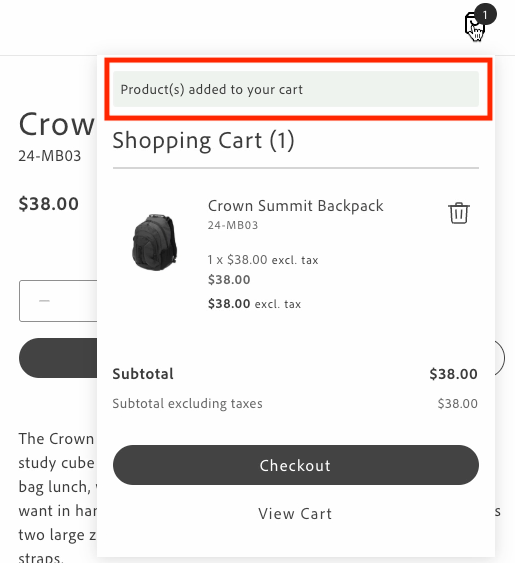
*Minicart inline message*
Overlay messages are displayed at the top center of the mini cart with a semi-transparent background when the same events occur.
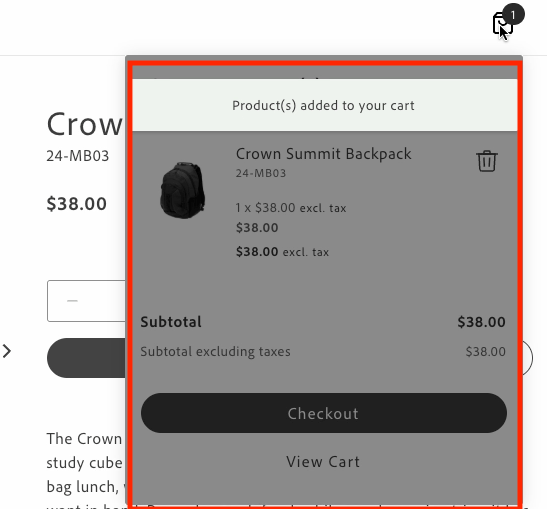
*Minicart overlay message*
You can customize the appearance and behavior of the inline and overlay messages by modifying the following:
- **Message text**: Update the translations in the content placeholders sheet under the `Cart.MiniCart.Message` namespace.
- **Message styling**: Modify the CSS classes in `commerce-mini-cart.css`. The styles use design tokens (prefixed with `--`) to maintain consistency with the design system. Overlays can be customized as follows:
- Background opacity using the alpha value in the overlay's `background-color` (default is 50%)
- Message position using the `top`, `left`, and `transform` properties
- Colors, spacing, shadows, and other visual properties using design tokens
- **Message position**: For inline messages, change where the message appears in the mini cart by modifying the insertion point in the DOM.
- **Display duration**: Change the timeout value in the `showMessage` function (default is 3000ms).
## Prerequisites
Before implementing inline messages, ensure you have:
- Access to the content folder to manage message localization through placeholders.
- Understanding of the design system tokens used in the Commerce boilerplate template.
- The `commerce-mini-cart.css` file in your `blocks/commerce-mini-cart/` directory.
## Events
The inline and overlay messages respond to two cart events:
- `cart/product/added`: Triggered when products are added to the cart
- `cart/product/updated`: Triggered when products in the cart are updated
## Implementation
To add inline or overlay messages to your mini cart, follow these steps:
### 1. Retrieve translations for message texts using placeholders
Get translations for custom messages from the content folder.
```javascript
const placeholders = await fetchPlaceholders();
// Access the message texts from the Cart.MiniCart.Message namespace
const MESSAGES = {
ADDED: placeholders?.Cart?.MiniCart?.Message?.added,
UPDATED: placeholders?.Cart?.MiniCart?.Message?.updated,
};
```
### 2. Create the appropriate message containers
Inline messages require a container for the update message and a shadow wrapper to display the message. Overlay messages require an overlay container and a message container.
### Inline messages
```javascript
// Create a container for the update message
const updateMessage = document.createElement('div');
updateMessage.className = 'commerce-mini-cart__update-message';
// Create a shadow wrapper
const shadowWrapper = document.createElement('div');
shadowWrapper.className = 'commerce-mini-cart__message-wrapper';
shadowWrapper.appendChild(updateMessage);
```
### Overlay messages
```javascript
// Create an overlay container
const overlay = document.createElement('div');
overlay.className = 'commerce-mini-cart__overlay';
// Create a message container
const messageContainer = document.createElement('div');
messageContainer.className = 'commerce-mini-cart__message';
overlay.appendChild(messageContainer);
```
### 3. Create a function to show and hide messages
Create a function that displays the message in the container and then hides it after a specified duration, such as three seconds.
### Inline messages
```javascript
const showMessage = (message) => {
updateMessage.textContent = message;
updateMessage.classList.add('commerce-mini-cart__update-message--visible');
shadowWrapper.classList.add('commerce-mini-cart__message-wrapper--visible');
setTimeout(() => {
updateMessage.classList.remove('commerce-mini-cart__update-message--visible');
shadowWrapper.classList.remove('commerce-mini-cart__message-wrapper--visible');
}, 3000);
};
```
### Overlay messages
```javascript
const showMessage = (message) => {
messageContainer.textContent = message;
overlay.classList.add('commerce-mini-cart__overlay--visible');
setTimeout(() => {
overlay.classList.remove('commerce-mini-cart__overlay--visible');
}, 3000);
};
```
### 4. Add event listeners for cart updates
Listen for the `cart/product/added` and `cart/product/updated` events and display the appropriate message.
```javascript
events.on('cart/product/added', () => showMessage(MESSAGES.ADDED), {
eager: true,
});
events.on('cart/product/updated', () => showMessage(MESSAGES.UPDATED), {
eager: true,
});
```
### 5. Insert the message container into the mini cart block
Add the message container to the mini cart block to display the messages.
### Inline messages
```javascript
// Find the products container and add the message div at the top
const productsContainer = block.querySelector('.cart-mini-cart__products');
if (productsContainer) {
productsContainer.insertBefore(shadowWrapper, productsContainer.firstChild);
} else {
console.info('Products container not found, appending message to block');
block.appendChild(shadowWrapper);
}
```
### Overlay messages
```javascript
block.appendChild(overlay);
```
### 6. Update the CSS styles
Add styles to your `commerce-mini-cart.css` file.
### Inline messages
```css
.commerce-mini-cart__update-message {
display: none;
font: var(--type-body-2-default-font);
letter-spacing: var(--type-body-2-default-letter-spacing);
}
.commerce-mini-cart__message-wrapper {
background-color: var(--color-positive-200);
border-radius: var(--shape-border-radius-1);
padding: var(--spacing-xsmall);
display: none;
margin-bottom: var(--spacing-small);
}
.commerce-mini-cart__message-wrapper--visible,
.commerce-mini-cart__update-message--visible {
display: block;
}
```
### Overlay messages
```css
.commerce-mini-cart__overlay {
background-color: rgb(0 0 0 / 50%);
display: none;
position: absolute;
inset: 0;
z-index: 1000;
border-radius: var(--shape-border-radius-1);
}
.commerce-mini-cart__message {
background-color: var(--color-positive-200);
border-radius: var(--shape-border-radius-1);
padding: var(--spacing-small);
position: absolute;
top: var(--spacing-medium);
left: 50%;
transform: translateX(-50%);
font: var(--type-body-2-default-font);
letter-spacing: var(--type-body-2-default-letter-spacing);
box-shadow: var(--shape-shadow-3);
width: 90%;
max-width: 400px;
text-align: center;
}
.commerce-mini-cart__overlay--visible {
display: block;
}
```
## Complete example
Here's a complete example of implementing inline and overlay messages in your `commerce-mini-cart.js` block file:
### Inline messages
```javascript
// Initializers
export default async function decorate(block) {
const {
'start-shopping-url': startShoppingURL = '',
'cart-url': cartURL = '',
'checkout-url': checkoutURL = '',
} = readBlockConfig(block);
// Get translations for custom messages
const placeholders = await fetchPlaceholders();
const MESSAGES = {
ADDED: placeholders?.Cart?.MiniCart?.Message?.added,
UPDATED: placeholders?.Cart?.MiniCart?.Message?.updated,
};
// Create a container for the update message
const updateMessage = document.createElement('div');
updateMessage.className = 'commerce-mini-cart__update-message';
// Create shadow wrapper
const shadowWrapper = document.createElement('div');
shadowWrapper.className = 'commerce-mini-cart__message-wrapper';
shadowWrapper.appendChild(updateMessage);
const showMessage = (message) => {
updateMessage.textContent = message;
updateMessage.classList.add('commerce-mini-cart__update-message--visible');
shadowWrapper.classList.add('commerce-mini-cart__message-wrapper--visible');
setTimeout(() => {
updateMessage.classList.remove('commerce-mini-cart__update-message--visible');
shadowWrapper.classList.remove('commerce-mini-cart__message-wrapper--visible');
}, 3000);
};
// Add event listeners for cart updates
events.on('cart/product/added', () => showMessage(MESSAGES.ADDED), {
eager: true,
});
events.on('cart/product/updated', () => showMessage(MESSAGES.UPDATED), {
eager: true,
});
block.innerHTML = '';
// Render MiniCart first
await provider.render(MiniCart, {
routeEmptyCartCTA: startShoppingURL ? () => rootLink(startShoppingURL) : undefined,
routeCart: cartURL ? () => rootLink(cartURL) : undefined,
routeCheckout: checkoutURL ? () => rootLink(checkoutURL) : undefined,
routeProduct: (product) => rootLink(`/products/${product.url.urlKey}/${product.topLevelSku}`),
})(block);
// Find the products container and add the message div at the top
const productsContainer = block.querySelector('.cart-mini-cart__products');
if (productsContainer) {
productsContainer.insertBefore(shadowWrapper, productsContainer.firstChild);
} else {
console.info('Products container not found, appending message to block');
block.appendChild(shadowWrapper);
}
return block;
}
```
### Overlay messages
```javascript
// Initializers
export default async function decorate(block) {
const {
'start-shopping-url': startShoppingURL = '',
'cart-url': cartURL = '',
'checkout-url': checkoutURL = '',
} = readBlockConfig(block);
// Get translations for custom messages
const placeholders = await fetchPlaceholders();
const MESSAGES = {
ADDED: placeholders?.Cart?.MiniCart?.Message?.added,
UPDATED: placeholders?.Cart?.MiniCart?.Message?.updated,
};
block.innerHTML = '';
// Render MiniCart first
await provider.render(MiniCart, {
routeEmptyCartCTA: startShoppingURL ? () => rootLink(startShoppingURL) : undefined,
routeCart: cartURL ? () => rootLink(cartURL) : undefined,
routeCheckout: checkoutURL ? () => rootLink(checkoutURL) : undefined,
routeProduct: (product) => rootLink(`/products/${product.url.urlKey}/${product.topLevelSku}`),
})(block);
// Create overlay container
const overlay = document.createElement('div');
overlay.className = 'commerce-mini-cart__overlay';
// Create message container
const messageContainer = document.createElement('div');
messageContainer.className = 'commerce-mini-cart__message';
overlay.appendChild(messageContainer);
block.appendChild(overlay);
const showMessage = (message) => {
messageContainer.textContent = message;
overlay.classList.add('commerce-mini-cart__overlay--visible');
setTimeout(() => {
overlay.classList.remove('commerce-mini-cart__overlay--visible');
}, 3000);
};
// Add event listeners for cart updates
events.on('cart/product/added', () => showMessage(MESSAGES.ADDED), {
eager: true,
});
events.on('cart/product/updated', () => showMessage(MESSAGES.UPDATED), {
eager: true,
});
return block;
}
```
And here's the accompanying CSS file (`commerce-mini-cart.css`):
### Inline messages
```css
.commerce-mini-cart__update-message {
display: none;
font: var(--type-body-2-default-font);
letter-spacing: var(--type-body-2-default-letter-spacing);
}
.commerce-mini-cart__message-wrapper {
background-color: var(--color-positive-200);
border-radius: var(--shape-border-radius-1);
padding: var(--spacing-xsmall);
display: none;
margin-bottom: var(--spacing-small);
}
.commerce-mini-cart__message-wrapper--visible,
.commerce-mini-cart__update-message--visible {
display: block;
}
```
### Overlay messages
```css
.commerce-mini-cart__overlay {
background-color: rgb(0 0 0 / 50%);
display: none;
position: absolute;
inset: 0;
z-index: 1000;
border-radius: var(--shape-border-radius-1);
}
.commerce-mini-cart__message {
background-color: var(--color-positive-200);
border-radius: var(--shape-border-radius-1);
padding: var(--spacing-small);
position: absolute;
top: var(--spacing-medium);
left: 50%;
transform: translateX(-50%);
font: var(--type-body-2-default-font);
letter-spacing: var(--type-body-2-default-letter-spacing);
box-shadow: var(--shape-shadow-3);
width: 90%;
max-width: 400px;
text-align: center;
}
.commerce-mini-cart__overlay--visible {
display: block;
}
```
---
# Add custom product lines to the cart summary
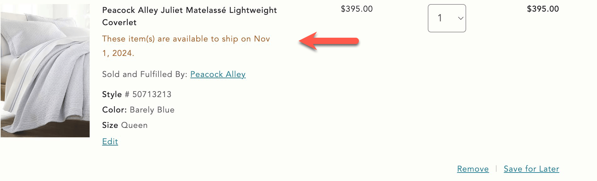
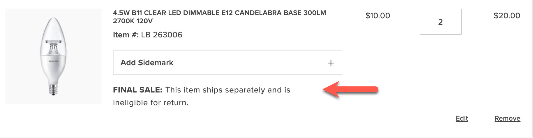
This tutorial describes how to make the following customizations to the `CartSummaryList` container using the Adobe Commerce Boilerplate:
- Add text from a custom product attribute
- Display promotional information in the footer of each product in the cart
## Prerequisites
This tutorial requires that you create the following entities in the Adobe Commerce Admin:
- A custom product attribute. Here, the product attribute is assigned the label `Shipping Notes`, and the **Catalog Input Type for Store Owner* is set to **Text Field**. You can optionally set the **Used for Sorting in Product Listing** option to **Yes** to increase the visibility of products using the product attribute in the Products grid. https://experienceleague.adobe.com/en/docs/commerce-admin/catalog/product-attributes/product-attributes describes how to create a custom product attribute.
In addition, you must assign the product attribute to one or more products. In this tutorial, the text fields will contain the strings "These item(s) are available to ship on Nov 1, 2024" and "FINAL SALE: This item ships separately and is ineligible for return.".
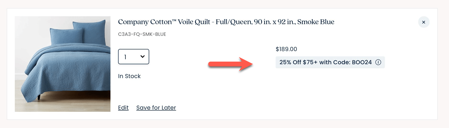
- A custom cart price rule. In this tutorial, a cart price rule named `25% Off $75+ with Code BOO24` has been created. Its definition defines the coupon code, the discount amount, and the conditions that must be met to apply the discount. https://experienceleague.adobe.com/en/docs/commerce-admin/marketing/promotions/cart-rules/price-rules-cart describes how to create a cart price rule.
## Step-by-step
The following steps describe how to modify the https://github.com/hlxsites/aem-boilerplate-commerce/blob/main/blocks/commerce-cart/commerce-cart.js block file in the boilerplate template to add custom content to the `CartSummaryList` container.
### 1. Add text from a custom product attribute
In this task, we'll add text that provides shipping information when certain conditions apply. For example, an item might be out of stock, and therefore cannot be shipped immediately. Or maybe the product is on clearance and cannot be returned. The `CartSummaryList` component is extended to display text defined by a merchant in the Admin using a custom product attribute. If the custom product attribute is not assigned to a product, then no additional information is displayed.
The following images show how these custom lines can be rendered:
**
**
1. Open the `blocks/commerce-cart/commerce-cart.js` boilerplate file. This file imports the `CartSummaryList` container, and we want to use a slot to display the custom product attribute. Find the `provider.render(CartSummaryList, {` line in the file and insert a `ProductAttributes` slot with the following code:
```javascript
slots: {
ProductAttributes: (ctx) => {
// Prepend Product Attributes
const ProductAttributes = ctx.item?.productAttributes;
ProductAttributes?.forEach((attr) => {
if(attr.code === "shipping_notes") {
if(attr.selected_options) {
const selectedOptions = attr.selected_options
.filter((option) => option.label.trim() !== '')
.map((option) => option.label)
.join(', ');
if(selectedOptions) {
const productAttribute = document.createElement('div');
productAttribute.innerText = `${attr.code}: ${selectedOptions}`;
ctx.appendChild(productAttribute);
}
} else if (attr.value) {
const productAttribute = document.createElement('div');
productAttribute.innerText = `${attr.code}: ${attr.value}`;
ctx.appendChild(productAttribute);
}
}
})
},
```
This code creates a slot named `ProductAttributes` that displays the custom product attribute `Shipping Notes`, if it is assigned to a product. If the corresponding attribute is found, the slot creates a new `div` element and appends the attribute code and value to the element. The element is then appended to the `ctx` element, which is the product line in the cart summary.
1. Save the file and generate the page to see the changes.
### 2. Display promotional information in the footer of a cart item
Now we'll add information defined in a custom cart price rule to the footer of the `CartSummaryList` container. If the conditions set in the cart price rules are not met, then no additional information is displayed. For example, if a specific coupon has not been applied or if the subtotal threshold has not been met, then this information is not displayed.
*Display coupon information*
1. Add a `Footer` slot beneath the `ProductAttributes` slot.
```javascript
slots: {
ProductAttributes: (ctx) => {
...
}
Footer: (ctx) => {
// Runs on mount
const wrapper = document.createElement('div');
ctx.appendChild(wrapper);
// Append Product Promotions on every update
ctx.onChange((next) => {
wrapper.innerHTML = '';
next.item?.discount?.label?.forEach((label) => {
const discount = document.createElement('div');
discount.style.color = '#3d3d3d';
discount.innerText = label;
wrapper.appendChild(discount);
});
});
},
```
This code creates a slot named `Footer`, which displays the promotional information defined in the custom cart price rule. If the conditions set in the cart price rule are met, the slot creates a new `div` element and appends the promotional information to the element. The element is then appended to the `ctx` element, which is the product line in the cart summary.
1. Save the file. Add products that total at least $75 and apply the BOO24 coupon code to the cart. The page displays the rule name beneath each item in the cart.
---
# Customize the cart summary block
This tutorial describes how to make the following customizations to the `CartSummaryList` container using the Adobe Commerce Boilerplate:
- Change the product quantity selector to a dropdown menu.
- Configure how to display savings.
- Configure the savings display from the Cart content document.
## Step-by-step
The following steps describe how to modify the https://github.com/hlxsites/aem-boilerplate-commerce/blob/main/blocks/commerce-cart/commerce-cart.js block file in the boilerplate template to add custom content to the `CartSummaryList` container.
### 1. Change the product quantity selector to a dropdown menu
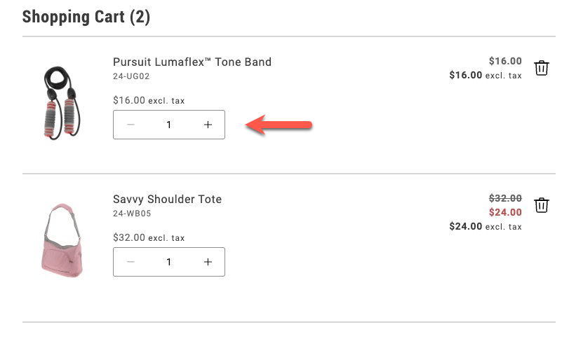
By default, the product quantity selector is a stepper, as shown below:
*Stepper quantity selector*
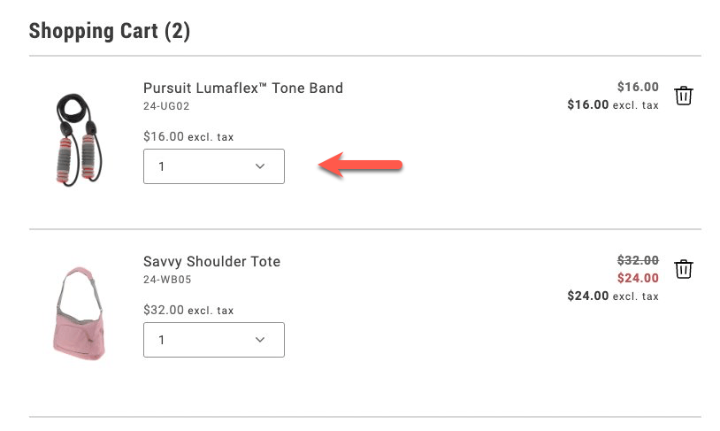
In this task, you'll change the quantity selector to a dropdown menu. The dropdown allows shoppers to select a maximum of 20 items.
*Dropdown quantity selector*
1. Navigate to the `blocks/commerce-cart/commerce-cart.js` file and enable the dropdown selector by adding the following lines to the `provider.render(CartSummaryList)` method:
```js
quantityType: 'dropdown',
dropdownOptions,
```
The `quantityType` property specifies the type of quantity selector to use. The `dropdownOptions` property specifies the values to display in the dropdown. It is defined in the next step.
1. Define the `dropdownOptions` constant at the top of the file, in the `export default async function decorate(block){}` statement.
```js
const DROPDOWN_MAX_QUANTITY = 20;
const dropdownOptions = Array.from(
{ length: parseInt(DROPDOWN_MAX_QUANTITY, 10) },
(_, i) => {
const quantityOption = i + 1;
return {
value: `${quantityOption}`,
text: `${quantityOption}`,
};
}
);
```
This code creates an array of objects with `value` and `text` properties. The `value` property is the quantity value, and the `text` property is the text displayed in the dropdown.
1. Save the file and generate the page to see the changes.
### 2. Display savings as a percentage or a fixed amount
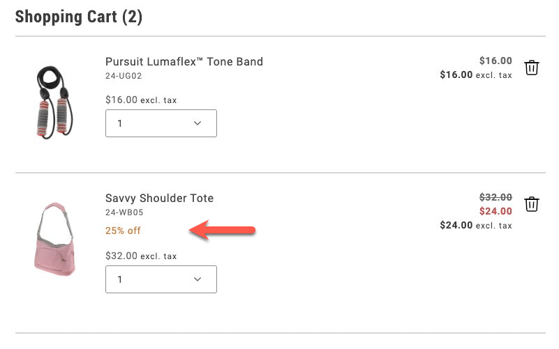
In order to encourage shoppers to buy more, you can display the savings they'll get by purchasing more items. You can display the savings on an item that's on sale as a percentage or as a fixed amount.
*Savings expressed as a percentage*
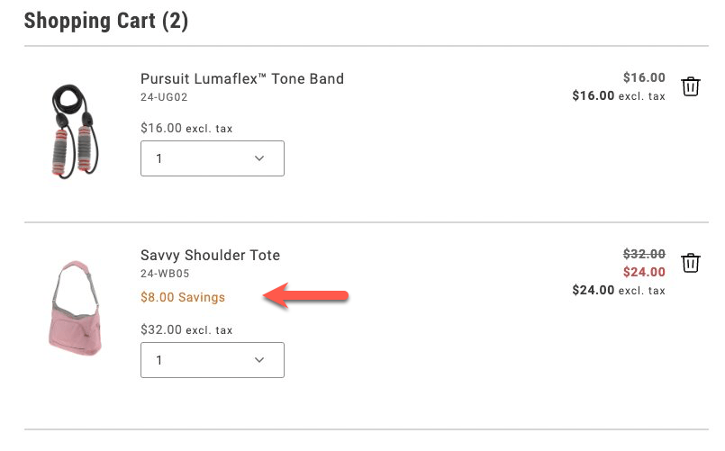
*Savings expressed as a total*
1. Add the following lines to the `provider.render(CartSummaryList)` method, below the `dropdownOptions,` line:
```js
showDiscount: true,
//showSavings: true
```
Comment out one of the lines to choose between displaying the discount as a percentage or a fixed amount.
1. Save the file and generate the page to see the changes.
### 3. Configure the savings display from the Cart content document
To allow a merchandiser or other non-developer to configure how to display savings values, you need to make more changes to the `commerce-cart.js` file and the relevant content documents. For guidance on starter content and the Sidekick browser extension, review https://experienceleague.adobe.com/developer/commerce/storefront/get-started/.
1. Comment out the savings properties from the `provider.render(CartSummaryList)` method.
```js
//showDiscount: true,
//showSavings: true
```
1. Add the following lines to the constant definitions in the `export default async function decorate(block){}` statement:
```js
'show-discount': showDiscount = 'false',
'show-savings': showSavings = 'false',
```
1. Add new lines in the `provider.render(CartSummaryList)` method to check whether `showDiscount` or `showSavings` is set to `true`:
```js
showDiscount: showDiscount === 'true',
showSavings: showSavings === 'true',
```
1. Save the file. When you generate the page, discounts are not displayed because the default values are `false`.
1. Find the `cart` content document in your site's content folder, and add two rows to the Commerce Cart table that set the visibility values for these properties.
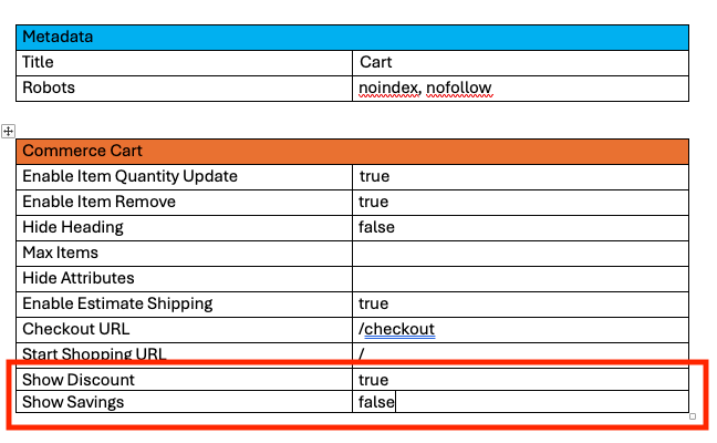
*Commerce Cart table*
Set the values of the Show Discount and Show Savings rows to either `true` or `false`.
1. Preview the changes with the Sidekick browser extension. Then publish the changes to your staging or production environment.
---
# Configuring Product Variation Updates in the Cart
This tutorial shows you how to configure the Edit feature for product variations in both the cart and mini-cart. The **Edit** button allows shoppers to update product variations (like size or color) directly from the cart pages.
The implementation is already available in the codebase. This tutorial focuses on how to *enable* or *disable* this feature through the AEM block configuration.
## How it Works
The **Edit** button feature is controlled by a configuration flag (`enable-updating-product`) that can be set on both the `commerce-cart` and `commerce-mini-cart` blocks in AEM. When activated, it opens a modal interface with a mini Product Detail Page (PDP) that allows shoppers to modify their selected options contextually.
### Cart
In the `commerce-cart.js` implementation, the code checks for this flag and conditionally renders an **Edit** button in the `Footer` slot for configurable products:
```javascript
// First, the configuration is read from the block with a default of 'false'
const {
'hide-heading': hideHeading = 'false',
'max-items': maxItems,
// ... other config properties ...
'checkout-url': checkoutURL = '',
'enable-updating-product': enableUpdatingProduct = 'false',
} = readBlockConfig(block);
// Later in the code, inside the Footer slot
if (ctx.item?.itemType === 'ConfigurableCartItem' && enableUpdatingProduct === 'true') {
const editLink = document.createElement('div');
editLink.className = 'cart-item-edit-link';
UI.render(Button, {
children: placeholders?.Global?.CartEditButton,
variant: 'tertiary',
size: 'medium',
icon: h(Icon, { source: 'Edit' }),
onClick: () => handleEditButtonClick(ctx.item),
})(editLink);
ctx.appendChild(editLink);
}
```
When a shopper clicks the **Edit** button, a modal opens with a mini-PDP interface that allows them to modify their product options. An auto-dismissing notification appears after a successful update.
### Mini Cart
Similarly, in the `commerce-mini-cart.js` implementation, the code uses the same configuration flag to determine whether to display an **Edit** button for each configurable product in the mini-cart, implementing it in the `Thumbnail` slot:
```javascript
// First, the configuration is read from the block with a default of 'false'
const {
'start-shopping-url': startShoppingURL = '',
'cart-url': cartURL = '',
'checkout-url': checkoutURL = '',
'enable-updating-product': enableUpdatingProduct = 'false',
} = readBlockConfig(block);
// Later in the code, inside the Thumbnail slot
if (item?.itemType === 'ConfigurableCartItem' && enableUpdatingProduct === 'true') {
const editLinkContainer = document.createElement('div');
editLinkContainer.className = 'cart-item-edit-container';
const editLink = document.createElement('div');
editLink.className = 'cart-item-edit-link';
UI.render(Button, {
children: placeholders?.Global?.CartEditButton,
variant: 'tertiary',
size: 'medium',
icon: h(Icon, { source: 'Edit' }),
onClick: () => handleEditButtonClick(item),
})(editLink);
editLinkContainer.appendChild(editLink);
ctx.appendChild(editLinkContainer);
}
```
When enabled, this provides a convenient modal-based editing experience. Success messages appear in both the mini-cart and main cart notification areas simultaneously, ensuring consistent user feedback across all cart interfaces.
## Configuration Steps
To modify this feature's configuration, follow these steps:
### 1. Configure the Cart Summary Block
The cart block shows **Edit** buttons *by default* when configurable products are present. If you want to disable it:
1. In your AEM authoring environment, navigate to the page containing your `commerce-cart` block.
2. Select the `commerce-cart` block and open its properties dialog.
3. Locate the existing property with the *Key* `Enable Updating Product`.
4. Change its *Value* to `false` to disable the feature.
5. Save the changes.
6. Preview the changes by clicking the **Preview** button.
7. Publish the changes by clicking the **Publish** button.
> The configuration is already provided in the content block, so you don't need to add a new property - just modify the existing one as needed.
### 2. Configure the Mini Cart Block
The `enable-updating-product` property is *already set to `false` by default* in the mini-cart block. If you want to enable it:
1. In your AEM authoring environment, navigate to the page or header that contains your `commerce-mini-cart` block.
2. Select the `commerce-mini-cart` block and open its properties dialog.
3. Locate the existing property with the *Key* `Enable Updating Product`.
4. Change its *Value* to `true` to enable the feature.
5. Save the changes.
6. Preview the changes by clicking the **Preview** button.
7. Publish the changes by clicking the **Publish** button.
### 3. Example Block Configurations
Here's how your block configuration should look like:
**Cart Block (Enabled by Default):**
| Key | Value |
| :------------------------ | :---- |
| `Enable Updating Product` | `true`|
| `Checkout URL` | `/checkout` | *(Example of another common property)*
**Mini Cart Block (Disabled by Default):**
| Key | Value |
| :------------------------ | :---- |
| `Enable Updating Product` | `false`|
| `Checkout URL` | `/checkout` | *(Example of another common property)*
> The property appears as `Enable Updating Product` (with spaces) in the AEM properties dialog, but is converted to kebab-case (`enable-updating-product`) when processed by the code.
## Testing the Configuration
After configuring the feature, you should test it to ensure it's working as expected:
1. Add a configurable product to your cart.
2. View your cart page:
- If enabled, you should see an **Edit** button for each configurable product.
- If disabled, no **Edit** button should appear.
3. Open the mini cart:
- If enabled, you should see an `Edit` option for configurable products.
- If disabled, no `Edit` option should be visible.
## Feature Behavior
When the **Edit** button is clicked, the following happens:
1. **Modal Interface**: A mini-PDP modal opens directly over the current page, maintaining user context.
2. **Pre-populated Options**: The modal displays the product with current selections already chosen.
3. **In-place Updates**: Changes are applied to the existing cart item.
4. **Comprehensive Messaging**: Success notifications appear in:
- The main cart notification area (if present)
- The mini-cart message system
- Both locations simultaneously for consistent feedback
5. **Auto-dismissing Notifications**: Messages automatically disappear for better UX.
> Using modals ensures users don't lose their shopping context when making product modifications.
With this simple configuration, you can provide your shoppers with a more convenient shopping experience by allowing them to modify product variations directly from the cart.
---
# Add gift options to a product detail page
The [`GiftOptions` container](https://experienceleague.adobe.com/developer/commerce/storefront/dropins/cart/containers/gift-options/) allows you to add gift options, such as gift wrapping or personalized messages, at various places on the storefront, including product detail pages. The gift option features enhance the shopping experience by enabling customers to select these options at multiple times during their shopping experience, such as when adding a product to the cart or during checkout.
The code examples provided here demonstrate the general approach to building custom integrations with the `GiftOptions` container.
> This tutorial is not a fully functional integration and should only be used as a reference.
## Step-by-step
The following steps describe how to render the `GiftOptions` container on the PDP page and apply the selected gift options to the cart when the product is added.
### 1. Import required modules
Import the `GiftOptions` container and `CartProvider`.
```js
```
### 2. Define gift options configuration for an item
In this step, we will define the gift options configuration for a specific item. This can be done in different ways, such as by fetching configurations from the backend using API methods or retrieving them from product data.
#### Example 1: Use `cartItem` data
Use this technique when the product has already been added to the cart, such as on the cart page:
```js
const cartItem = JSON.parse(
sessionStorage.getItem('DROPIN__CART__CART__DATA'),
)?.items?.find((el) => el.sku === product.sku);
```
#### Example 2: Use a custom integration configuration
This configuration can be composed using product data available on the PDP and a store configuration query.
:::tip
It is crucial that the manually-composed configuration matches the actual backend configurations. For example, the available gift wrappings must be fetched from the backend. Otherwise, they will not be applied correctly. The [`GiftOptions` container](https://experienceleague.adobe.com/developer/commerce/storefront/dropins/cart/containers/gift-options/) lists the relevant configuration screens in the Admin.
:::
```js
type ProductGiftOptionsConfig = {
giftWrappingAvailable: boolean;
giftMessageAvailable: boolean;
giftWrappingPrice?: Price;
giftMessage?: {
recipientName?: string;
senderName?: string;
message?: string;
};
productGiftWrapping: GiftWrappingConfigProps[];
};
const predefinedConfig = {
giftWrappingAvailable: true,
giftMessageAvailable: true,
productGiftWrapping: [
{
design: 'Glossy Print Paper',
uid: 'Mg==',
selected: false,
image: {
url: 'https://aemshop.example.com/media/wrapping/glossy.png',
label: 'glossy.png',
},
price: {
currency: 'USD',
value: 25,
},
},
{
design: 'Foil Finish Paper',
uid: 'NQ==',
selected: false,
image: {
url: 'https://aemshop.example.com/media/wrapping/random-grid.jpg',
label: 'random-grid.jpg',
},
price: {
currency: 'USD',
value: 30,
},
},
{
design: 'Kraft Brown Paper',
uid: 'OA==',
selected: false,
image: {
url: 'https://mcstaging.aemshop.net/media/wrapping/brown-paper.jpg',
label: 'brown-paper.jpg',
},
price: {
currency: 'USD',
value: 45,
},
},
],
};
```
### 3. Render the GiftOptions container
For custom integration, we must pass an item prop, which can be either a `cartItem` or a manually-composed gift options configuration. In addition, we need to pass the `onGiftOptionsChange` callback. When provided, the container will not automatically save the gift options. Instead, the integration layer must handle this. The callback receives the updated gift options whenever they change.
```js
CartProvider.render(GiftOptions, {
item: cartItem ?? predefinedConfig,
view: 'product',
onGiftOptionsChange: async (data) => {
console.info('onGiftOptionsChange :>> ', data);
if (data) {
sessionStorage.setItem('updatedGiftOptions', JSON.stringify(data));
}
},
})($giftOptions);
```
### 4. Update the Add to Cart button
At this stage, we extend the **Add to Cart** button functionality by calling the `updateProductsFromCart` API method provided by the cart drop-in component to apply gift options after adding the product to the cart.
> Gift options must be applied after adding the product to the cart. Adobe Commerce does not support applying gift options before adding the product.
```js
// Configuration - Button - Add to Cart
UI.render(Button, {
children: labels.PDP?.Product?.AddToCart?.label,
icon: Icon({ source: 'Cart' }),
onClick: async () => {
try {
addToCart.setProps((prev) => ({
...prev,
children: labels.Custom?.AddingToCart?.label,
disabled: true,
}));
// get the current selection values
const values = pdpApi.getProductConfigurationValues();
const valid = pdpApi.isProductConfigurationValid();
// add the product to the cart
if (valid) {
const { addProductsToCart, updateProductsFromCart } = await import(
'@dropins/storefront-cart/api.js'
);
await addProductsToCart([{ ...values }]).then(async (response) => {
const updatedGiftOptions = JSON.parse(
sessionStorage.getItem('updatedGiftOptions'),
);
if (!updatedGiftOptions) return;
const { items } = response;
const dropinCartData = items.find((el) => el.sku === values.sku);
const {
recipientName,
senderName,
message,
giftWrappingId,
isGiftWrappingSelected,
} = updatedGiftOptions;
const giftOptions = {
gift_message: {
to: recipientName,
from: senderName,
message,
},
gift_wrapping_id: isGiftWrappingSelected
? giftWrappingId
: null,
};
await updateProductsFromCart([
{
uid: dropinCartData.uid,
quantity: dropinCartData.quantity,
giftOptions,
},
]);
});
}
// reset any previous alerts if successful
inlineAlert?.remove();
} catch (error) {
// add alert message
inlineAlert = await UI.render(InLineAlert, {
heading: 'Error',
description: error.message,
icon: Icon({ source: 'Warning' }),
'aria-live': 'assertive',
role: 'alert',
onDismiss: () => {
inlineAlert.remove();
},
})($alert);
// Scroll the alertWrapper into view
$alert.scrollIntoView({
behavior: 'smooth',
block: 'center',
});
} finally {
addToCart.setProps((prev) => ({
...prev,
children: labels.PDP?.Product?.AddToCart?.label,
disabled: false,
}));
}
},
})($addToCart);
```
As a result of these customizations, the default `GiftOption` container is rendered as follows:

*Default GiftOption container*
When the shopper makes a selection, the container is rendered as follows:
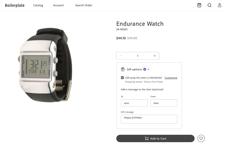
*Default GiftOption container*
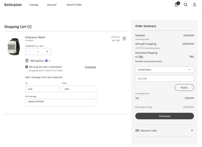
After clicking **Add to Cart**, the product is added to the cart, and the selected gift options are applied. The cart page displays the applied gift options.
*Default GiftOption container*
---
# Order Summary Lines
The Cart drop-in allows you to customize the lines of the Order Summary to meet your requirements.
You might want to group and sort the order summary lines into sections using the Accordion component from the Storefront SDK (Elsie). See the /sdk/components/accordion/ component reference in this documentation.
:::note[Note]
For the full set of UI primitives (including icons), start from the /sdk/components/overview/ in this documentation.
:::
You can specify the line items shown in the accordion and decide the order in which they are displayed.
You can also customize the title and content of these order summary lines.
## Customize the lines of the Order Summary to meet your needs
This customization is possible thanks to the attribute `updateLineItems` from the `OrderSummary` container. This attribute allows you to modify the order summary lines before they are rendered.
```typescript
export const OrderSummary: Container = ({
...
updateLineItems = (lineItems) => lineItems,
...
});
```
It doesn't matter if you want to customize the existing order summary lines, add new ones, or skip some of them.
The `OrderSummary` container passes the `updateLineItems` to the `OrderSummary` component, which performs the appropriate actions.
`updateLineItems` is an optional function that receives the line items as an argument and returns the updated line items. In both cases, `lineItems` are an array of `OrderSummaryLineItem` object.
```typescript
export interface OrderSummaryLineItem {
key: string;
title?: string;
className?: string;
sortOrder: number;
content:
| string
| JSXInternal.Element
| VNode>
| OrderSummaryLineItem[]
| undefined;
}
```
There are default order summary lines in the `OrderSummary` component. If no customization is needed, and therefore nothing is passed using the `updateLineItems` attribute, the default order summary lines will be rendered.
Let's imagine that `lineItems` contains the following lines:
```typescript
const lineItems: Array = [
{
key: 'subTotalContent',
sortOrder: 100,
content: subTotalContent,
},
{
key: 'discountsContent',
sortOrder: 300,
content: discountsContent,
},
{
key: 'taxContent',
sortOrder: 400,
content: taxContent,
},
];
```
In the example above, the `OrderSummary` component renders the sub-total, discounts, and tax lines, in that order.
The value of the `sortOrder` attribute determines the order in which the lines are rendered.
The larger the `sortOrder` value, the lower the line will be rendered in the order summary.
The `content` attribute can be a string, a JSX element, or an array of `OrderSummaryLineItem` objects (whenever is not `undefined`).
For instance, you could choose to render a JSX element in a form of a `OrderSummaryLine` container.
This `OrderSummaryLine` container it is defined as follows:
```typescript
export interface OrderSummaryLineProps extends HTMLAttributes {
label: string;
price: VNode>;
classSuffixes?: Array;
labelClassSuffix?: string;
testId?: string;
children?: any;
}
```
See an example of how to use the `OrderSummaryLine` container below, where only the mandatory props are passed:
```html
{children}
);
```
Note that the `OrderSummaryLine` container behaves like a wrapper for the `OrderSummaryLine` component.
The component ultimately decides how to render the line item based on the `children` attribute.
```typescript
export interface OrderSummaryLineComponentProps
extends HTMLAttributes {
label: string;
price: VNode>;
classSuffixes?: Array;
labelClassSuffix?: string;
testId?: string;
children?: any;
}
```
### Where to perform the customizations
To customize the order summary lines, you need to render the `Cart` component passing the `OrderSummary` component as a slot.
When rendering the `OrderSummary` component, you can pass the `updateLineItems` attribute to customize the order summary lines as needed.
```typescript
// Cart
provider.render(Cart, {
slots: {
OrderSummary: (ctx) => {
const orderSummary = document.createElement('div');
provider.render(OrderSummary, {
updateLineItems: (lineItems) => {
// Customize the order summary lines here
return lineItems;
}
}
}
}
});
```
## Examples
For the examples shown below, assume that this is how `Order Summary` looks originally:
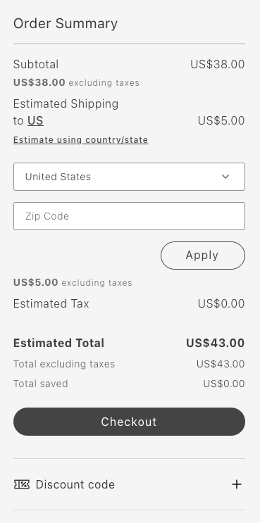
*Cart without any customization*
### Remove Item: Remove total saved
The following example removes the Total saved line:
```typescript
updateLineItems: (lineItems) => {
const index = lineItems.map(item => item.key).indexOf('totalSavedContent');
lineItems.splice(index, 1);
return lineItems;
}
```
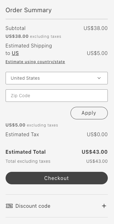
*Cart after removing Total Saved line*
### Reorder items: Move primary action to the beginning
The following example moves the Checkout button to the top:
```typescript
updateLineItems: (lineItems) => {
lineItems.map(lineItem => {
if (lineItem.key === 'primaryActionContent') {
lineItem.sortOrder = 50;
}
return lineItem;
});
return lineItems;
};
```
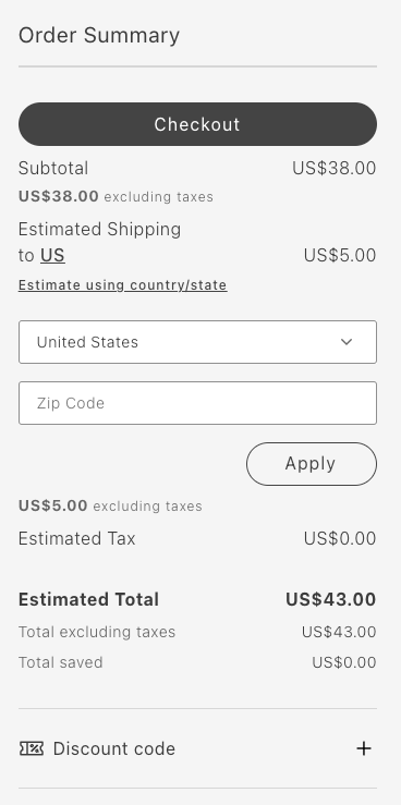
*Cart after moving primary action to the beginning*
### Group items: Group subtotal and tax in an accordion
The following example groups the subtotal and tax in an accordion:
```typescript
updateLineItems: (lineItems) => {
const totalsIndex = lineItems.map(item => item.key).indexOf('taxContent');
const taxContent = lineItems.splice(totalsIndex, 1)[0];
const subtotalIndex = lineItems.map(item => item.key).indexOf('subTotalContent');
const subTotalContent = lineItems.splice(subtotalIndex, 1)[0];
lineItems.push({
key: 'subtotalTaxGrouped',
sortOrder: 50,
title: 'Subtotal and Tax',
content: [
taxContent,
subTotalContent,
],
});
return lineItems;
}
```
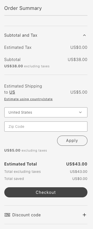
*Cart after grouping subtotal and tax in an accordion*
### Add item: Add a new order summary line
The following example adds the FPT line:
```typescript
updateLineItems: (lineItems) => {
const totalFpt = ctx.data.items.reduce((allItemsFpt, item) => {
const itemFpt = item.fixedProductTaxes.reduce((accumulator, fpt) => {
accumulator.labels.push(fpt.label);
accumulator.total += fpt.amount.value;
return accumulator;
}, {
labels: [],
total: 0
});
allItemsFpt.labels = [...allItemsFpt.labels, ...itemFpt.labels];
allItemsFpt.total += itemFpt.total;
return allItemsFpt;
}, {
labels: [],
total: 0
});
lineItems.push({
key: 'fpt',
sortOrder: 350,
title: 'Fixed Product Tax',
content: OrderSummaryLine({label: "FPT(" + totalFpt.labels.join(',') + ')', price: Price({amount: totalFpt.total}), classSuffix: 'fpt'})
})
return lineItems;
};
```
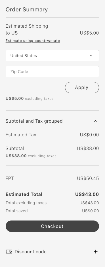
*Cart after adding a new order summary line*
---
# Add a payment method
The Checkout drop-in component provides extensibility features for integrating third-party payment providers. Use slots to customize the list of payment methods shown during the checkout process.
> **Supported payment providers** The Checkout drop-in supports Adyen payment methods (including Bancontact) and payment extensions in addition to the Braintree example below. See the [release notes](https://experienceleague.adobe.com/developer/commerce/storefront/releases/) for the latest supported providers.
## Step-by-step
This tutorial walks you through integrating Braintree as a payment provider with the Commerce boilerplate template. While we use Braintree as an example, you can adapt these same steps for other payment providers.
### 1. Prerequisites
For this tutorial, you must configure the Braintree extension on your Adobe Commerce backend before integrating it with the Commerce boilerplate template. The Braintree extension is bundled with Adobe Commerce and can be https://experienceleague.adobe.com/en/docs/commerce-admin/stores-sales/payments/braintree in the Admin.
If you choose to integrate with a different payment provider, consider the following:
- The provider must be supported by Adobe Commerce.
- The provider likely offers an extension that you must install and configure on your Adobe Commerce backend.
### 2. Add the Braintree client SDK
To integrate the Braintree payment provider with the Commerce boilerplate template, you must add the Braintree client SDK to your project.
### HTML element
Use the following `script` tag to add the Braintree client SDK to an HTML file.
```html
```
### Import declaration
Use the following `import` declaration to add the Braintree client SDK directly to the `commerce-checkout.js` block file.
```js
import 'https://js.braintreegateway.com/web/dropin/1.43.0/js/dropin.min.js';
```
### 3. Define a custom handler
1. Create a `braintreeInstance` variable to manage the Braintree drop-in instance.
```js
let braintreeInstance;
```
1. Update the [`PaymentMethods`](https://experienceleague.adobe.com/developer/commerce/storefront/dropins/checkout/containers/payment-methods/) container to include a custom handler for the Braintree payment method. Set `autoSync` to `false` to prevent automatic calls to the [`setPaymentMethod`](https://experienceleague.adobe.com/developer/commerce/storefront/dropins/checkout/functions/#setpaymentmethod) function when the payment method changes.
```js
CheckoutProvider.render(PaymentMethods, {
slots: {
Methods: {
braintree: {
autoSync: false,
render: async (ctx) => {
const container = document.createElement('div');
window.braintree.dropin.create({
authorization: 'sandbox_cstz6tw9_sbj9bzvx2ngq77n4',
container,
}, (err, dropinInstance) => {
if (err) {
console.error(err);
}
braintreeInstance = dropinInstance;
});
ctx.replaceHTML(container);
},
},
},
},
})($paymentMethods),
```
### 4. Handle the payment method
Implement the Braintree payment logic within the `handlePlaceOrder` handler of the [`PlaceOrder`](https://experienceleague.adobe.com/developer/commerce/storefront/dropins/checkout/containers/place-order/) container. This involves processing the payment using the Braintree https://developer.paypal.com/braintree/docs/guides/payment-method-nonces.
```js
CheckoutProvider.render(PlaceOrder, {
handlePlaceOrder: async ({ cartId, code }) => {
await displayOverlaySpinner();
try {
switch (code) {
case 'braintree': {
braintreeInstance.requestPaymentMethod(async (err, payload) => {
if (err) {
removeOverlaySpinner();
console.error(err);
return;
}
await checkoutApi.setPaymentMethod({
code: 'braintree',
braintree: {
is_active_payment_token_enabler: false,
payment_method_nonce: payload.nonce,
},
});
await orderApi.placeOrder(cartId);
});
break;
}
default: {
// Place order
await orderApi.placeOrder(cartId);
}
}
} catch (error) {
console.error(error);
throw error;
} finally {
await removeOverlaySpinner();
}
},
})($placeOrder),
```
## Example
See https://github.com/hlxsites/aem-boilerplate-commerce/tree/demos/blocks/commerce-checkout-braintree in the `demos` branch of the boilerplate repository for complete JS and CSS code for the Braintree payment method checkout flow.
---
# Integrate with a third-party address verification API
You might want to enhance the shopper experience by streamlining the process of populating and verifying the shipping address, thereby reducing the risk of user error. You can achieve this by implementing a third-party address lookup and autocomplete APIs, such as those provided by https://mapsplatform.google.com/maps-products/#places-section.
This tutorial describes how to override any field in a checkout address form and extend it to integrate with this service. The implementation supports backend-configurable validation and full form submission integration.
Upon successful completion of this tutorial, a form similar to the following will be displayed:
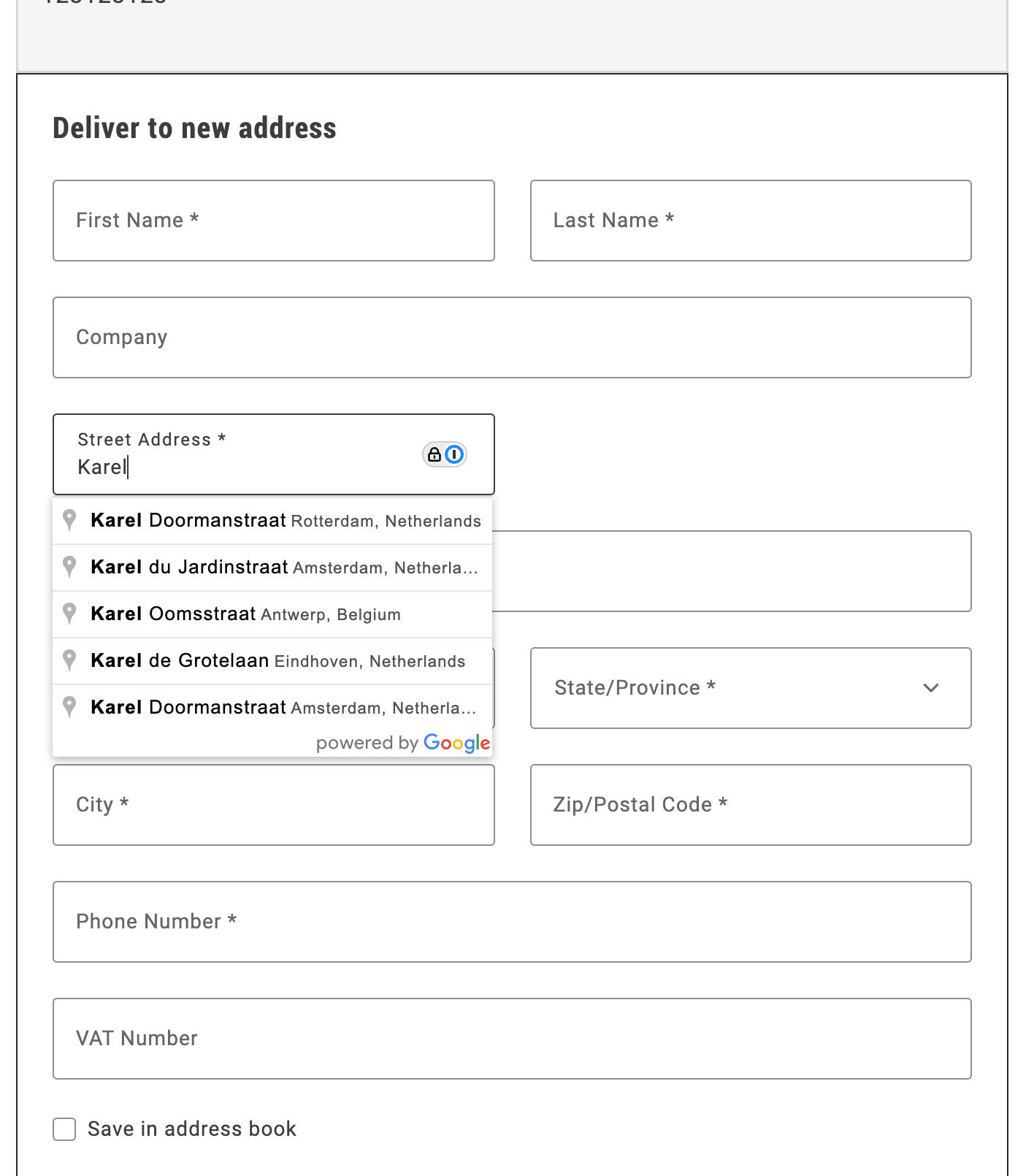
*Autocomplete shipping address*
## Step-by-step
The following steps describe how to integrate the Google Address Validation API with the Commerce boilerplate template using the provided address autocomplete implementation.
### 1. Prerequisites
For this tutorial, you must have a valid Google API key. https://developers.google.com/maps/documentation/javascript/get-api-key describes the process to obtain and set up this key.
### 2. Download and configure the address autocomplete implementation
1. **Download the implementation:**
Copy the `address-autocomplete.js` file from `/public/samples/address-autocomplete.js` in this documentation repository to your project directory.
2. **Replace the API key placeholder:**
Open the `address-autocomplete.js` file and replace `ADD-YOUR-GOOGLE-API-KEY-HERE` with your actual Google API key:
```javascript
const CONFIG = {
googleApiKey: 'YOUR_ACTUAL_GOOGLE_API_KEY',
// ... rest of configuration
};
```
### 3. Import and initialize the autocomplete service
In your `commerce-checkout.js` file, make the following changes to enable address autocomplete:
1. **Import the autocomplete service:**
```javascript
import { initializeAutocompleteWhenReady } from './address-autocomplete.js';
```
2. **Initialize the autocomplete in the `initializeCheckout` function:**
```javascript
const initializeCheckout = async () => {
// ... existing checkout initialization code ...
// Initialize address autocomplete for shipping form
const shippingContainer = document.querySelector('[data-commerce-checkout-shipping]');
if (shippingContainer) {
initializeAutocompleteWhenReady(shippingContainer, 'input[name="street"]');
}
// ... rest of initialization code ...
};
```
The `initializeAutocompleteWhenReady` function automatically:
- Waits for the address form to be rendered
- Attaches autocomplete functionality to the street input field
- Handles form field population when an address is selected
- Manages Google Maps API loading and initialization
## Example
The complete address autocomplete implementation is available in `/public/samples/address-autocomplete.js`. This implementation includes:
- **AddressAutocompleteService class**: Handles Google Places API integration
- **initializeAutocompleteWhenReady function**: Utility function for easy integration
- **Automatic form field population**: Populates street, city, country, and postal code fields
- **Keyboard navigation**: Arrow keys, Enter, and Escape support
- **Error handling**: Graceful fallback when Google Maps API is unavailable
For additional customization options and advanced usage, see the implementation comments in the sample file.
---
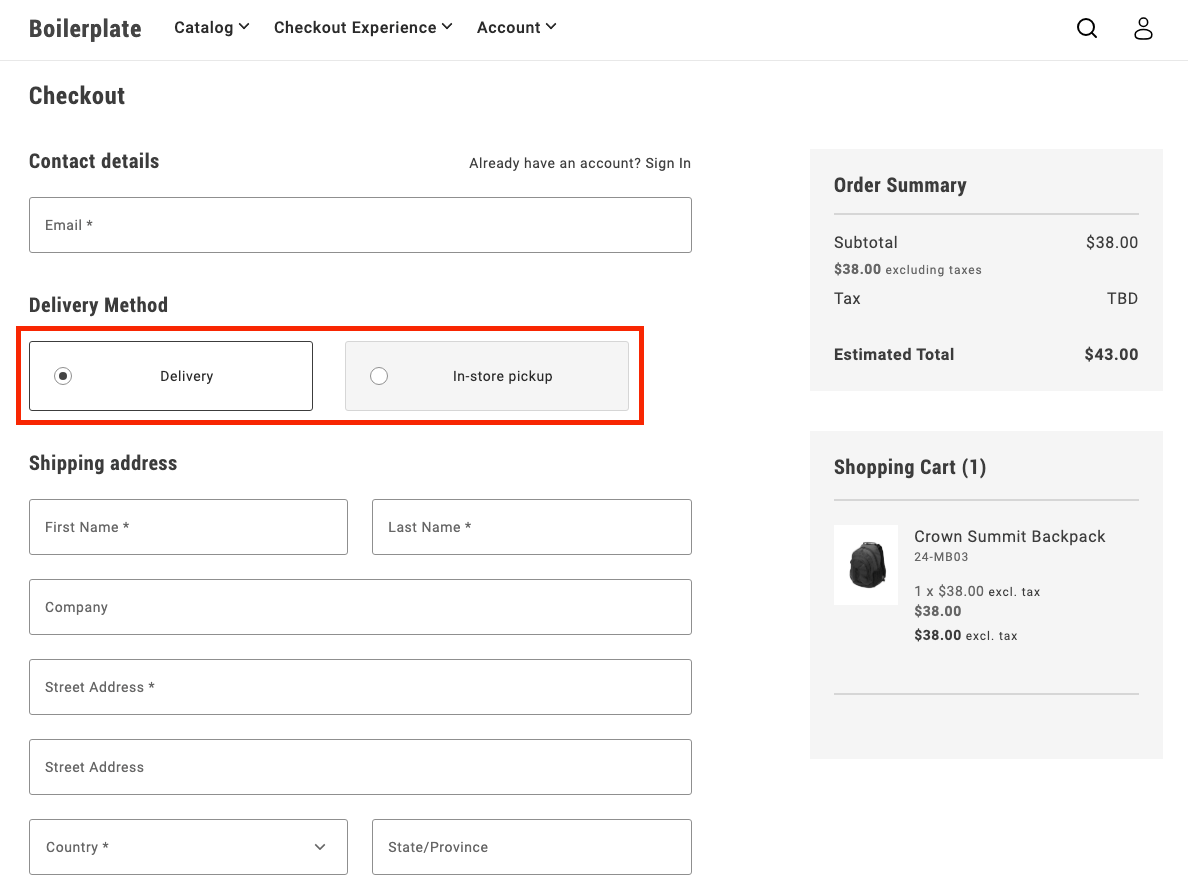
# Buy online, pickup in store
Buy online, pickup in store (BOPIS) is a popular fulfillment option that allows customers to purchase items online and pick them up in-store.
The Commerce boilerplate template does not include a BOPIS checkout flow by default, but you can easily implement one using Adobe's drop-in components.
## Step-by-step
The following steps describe how to modify the https://github.com/hlxsites/aem-boilerplate-commerce/blob/main/blocks/commerce-checkout/commerce-checkout.js block file in the boilerplate template to allow users to choose between delivery and in-store pickup during the checkout process.
### 1. Prerequisites
Before you start, you must configure https://experienceleague.adobe.com/en/docs/commerce-admin/stores-sales/delivery/basic-methods/shipping-in-store-delivery options in the Adobe Commerce Admin to define pickup locations. The [`fetchPickupLocations`](#fetch-pickup-locations) function retrieves the list of available pickup locations using a GraphQL query.
### 2. Update content fragment
1. To create a new section for the delivery options, additional DOM elements are required. You can add these elements by modifying the content fragment.
```html
Delivery Method
```
1. You must also add new selectors to render the required components and content.
```javascript
const $deliveryButton = checkoutFragment.querySelector('.checkout-delivery-method__delivery-button');
const $inStorePickupButton = checkoutFragment.querySelector('. checkout-delivery-method__in-store-pickup-button');
const $inStorePickup = checkoutFragment.querySelector('.checkout__in-store-pickup');
```
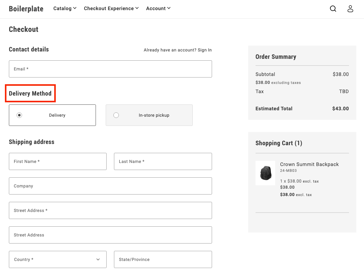
### 3. Add toggle buttons
During initialization, the code renders two buttons:
- Delivery
- In-store pickup
These buttons allow users to toggle between the two options.
```js
UI.render(ToggleButton, {
label: 'Delivery',
onChange: () => onToggle('delivery'),
})($deliveryButton),
UI.render(ToggleButton, {
label: 'In-store Pickup',
onChange: () => onToggle('in-store-pickup'),
})($inStorePickupButton),
```
### 4. Toggle between options
The `onToggle` function manages switching between the delivery and in-store pickup options. It updates the selected state of the buttons and toggles the visibility of the corresponding forms.
```js
async function onToggle(type) {
if (type === 'delivery') {
deliveryButton.setProps((prev) => ({ ...prev, selected: true }));
inStorePickupButton.setProps((prev) => ({ ...prev, selected: false }));
$shippingForm.removeAttribute('hidden');
$delivery.removeAttribute('hidden');
$inStorePickup.setAttribute('hidden', '');
} else {
inStorePickupButton.setProps((prev) => ({ ...prev, selected: true }));
deliveryButton.setProps((prev) => ({ ...prev, selected: false }));
$shippingForm.setAttribute('hidden', '');
$delivery.setAttribute('hidden', '');
$inStorePickup.removeAttribute('hidden');
}
}
```
### 5. Fetch pickup locations
The `fetchPickupLocations` function retrieves the list of available pickup locations using a GraphQL query. Users can choose a location where they'd like to pick up their order.
```js
async function fetchPickupLocations() {
return checkoutApi
.fetchGraphQl(
`query pickupLocations {
pickupLocations {
items {
name
pickup_location_code
}
total_count
}
}`,
{ method: 'GET', cache: 'no-cache' }
)
.then((res) => res.data.pickupLocations.items);
}
```
### 6. Render location options
After the code fetches the pickup locations, it renders options as radio buttons. The user can select a location, which updates the shipping address with the corresponding pickup location code.
```js
const pickupLocations = await fetchPickupLocations();
pickupLocations.forEach((location) => {
const { name, pickup_location_code } = location;
const locationRadiobutton = document.createElement('div');
UI.render(RadioButton, {
label: name,
name: 'pickup-location',
value: name,
onChange: () => {
checkoutApi.setShippingAddress({
address: {},
pickupLocationCode: pickup_location_code,
});
},
})(locationRadiobutton);
$inStorePickup.appendChild(locationRadiobutton);
});
```
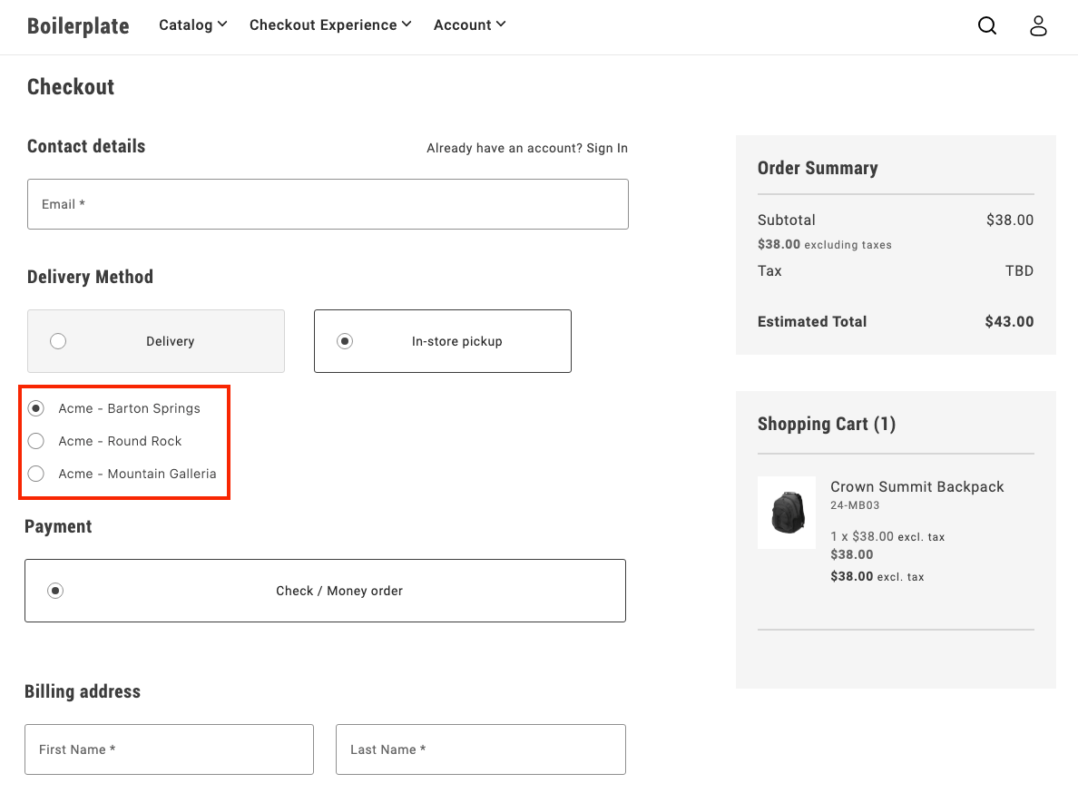
### 7. Finalize the flow
After a user selects **In-store pickup** and chooses a location, the pickup form is shown, while the shipping form is hidden. This provides a clear and seamless way for users to choose how they want to receive their order.
## Example
See https://github.com/hlxsites/aem-boilerplate-commerce/tree/demos/blocks/commerce-checkout-bopis in the `demos` branch of the boilerplate repository for complete JS and CSS code for the BOPIS checkout flow.
---
# Implement multi-step checkout
This tutorial provides a customizable example to implement a comprehensive multi-step checkout in your Adobe Commerce storefront that supports **all user scenarios**: guest users, logged-in customers, and virtual products.
## Overview
This implementation provides a **complete multi-step checkout** for the Adobe Commerce boilerplate that handles:
- **Guest users** - Email capture and address entry
- **Logged-in customers** - Saved address selection and account integration
- **Virtual products** - Automatic shipping step bypass
- **Mixed carts** - Physical + virtual product combinations
- **Modular architecture** - Event-driven step coordination
## Implementation Features
| Feature | Status |
|---------|--------|
| Guest users | ✅ |
| Logged-in customers | ✅ |
| Virtual products | ✅ |
| Mixed carts (physical + virtual products) | ✅ |
| Custom payment/shipping methods | 🔧 |
## Multi-step Customization
Key areas specific to multi-step checkout customization:
- **Step progression logic** - Modify `steps.js` for custom user flows and step transitions
- **Individual step modules** - Customize step behavior in `steps/` folder
- **Step validation** - Control when users can advance between steps
- **Fragment management** - Adapt step-specific HTML fragments in `fragments.js`
- **Step visibility** - Customize CSS classes for active/inactive step states
- **Manual synchronization** - Control when data is saved to the cart
## Architecture
### File Structure
The multi-step checkout implementation follows a modular architecture:
| File | Purpose | Key Features |
|------|---------|--------------|
| `commerce-checkout-multi-step.js` | Entry point and block decorator | Initializes the checkout system |
| `commerce-checkout-multi-step.css` | Step styling and visibility controls | Step progression, visual states, responsive design |
| `steps.js` | Main implementation | Step coordination and state management |
| `steps/shipping.js` | Shipping/contact step logic | Login detection, address forms, email validation |
| `steps/shipping-methods.js` | Delivery method selection | Shipping options, cost calculation |
| `steps/payment-methods.js` | Payment method selection | Payment provider integration |
| `steps/billing-address.js` | Billing address step | Conditional billing form rendering |
| `fragments.js` | HTML fragment creation | Step-specific DOM structure generation |
| `containers.js` | Container rendering functions | Drop-in container management |
| `components.js` | UI component functions | Reusable UI elements |
| `utils.js` | Utility functions and helpers | Virtual cart detection, validation |
| `constants.js` | Shared constants and configuration | CSS classes, form names, storage keys |
### Manual Synchronization Control
In multi-step checkout, containers use **`autoSync: false`** to disable automatic backend synchronization, allowing manual control over when data is saved:
```javascript
// Containers with manual sync control
const containers = [
'LoginForm', // Manual email/authentication handling
'ShippingMethods', // Manual shipping method selection
'PaymentMethods', // Manual payment method selection
'BillToShippingAddress' // Manual billing address control
];
// Example: ShippingMethods with manual sync
CheckoutProvider.render(ShippingMethods, {
UIComponentType: 'ToggleButton',
autoSync: false, // Disable automatic cart updates
})(container);
```
**AutoSync behavior:**
- **`autoSync: true` (default)** - Local changes automatically sync with backend via GraphQL mutations
- **`autoSync: false`** - Changes maintained locally only, no automatic API calls
**Why disable autoSync in multi-step:**
- **Controlled timing** - Save data only when step is completed and validated
- **Better UX** - Prevent partial/invalid data from being sent to cart
- **Step coordination** - Parent step manager controls when to persist data
- **Validation first** - Ensure all step requirements met before saving
**Manual sync example:**
```javascript
// Step completion with manual sync (triggered by continue button)
const continueFromStep = async () => {
if (!validateStepData()) return;
// Manual API call with error handling
try {
await checkoutApi.setShippingMethodsOnCart([{
carrier_code: selectedMethod.carrier.code,
method_code: selectedMethod.code,
}]);
} catch (error) {
console.error('Failed to save step data:', error);
return; // Don't proceed if API call fails
}
// Only continue if API call succeeded
await displayStepSummary(selectedMethod);
await continueToNextStep();
events.emit('checkout/step/completed', null);
};
```
**Key patterns:**
- **Continue button trigger** - API calls happen when user clicks continue, not on selection
- **Try-catch wrapping** - All API calls must be wrapped for error handling
- **Early return on error** - If API fails, don't proceed to next step
- **Success-only progression** - Only move forward if data successfully saved
This approach ensures data integrity and provides smooth step transitions without premature backend updates.
### API Reference
Step modules rely on the checkout drop-in's API functions for cart management. The complete API reference is available in the [Checkout functions](https://experienceleague.adobe.com/developer/commerce/storefront/dropins/checkout/functions/) documentation.
**Key APIs for multi-step implementation:**
| Function | Purpose | Used In Step |
|----------|---------|--------------|
| `setGuestEmailOnCart()` | Set guest user email | Shipping (email capture) |
| `setShippingAddress()` | Set shipping address on cart | Shipping (address collection) |
| `setShippingMethodsOnCart()` | Set shipping methods on cart | Shipping Methods |
| `setPaymentMethod()` | Set payment method on cart | Payment Methods |
| `setBillingAddress()` | Set billing address on cart | Payment Methods, Billing Address |
| `isEmailAvailable()` | Check email availability | Order Header (account creation) |
| `getStoreConfigCache()` | Get cached store configuration | Address forms (default country) |
| `estimateShippingMethods()` | Estimate shipping costs | Address forms (cost calculation) |
All step completion logic should use these APIs with proper error handling as shown in the manual sync examples above.
**Note:** The implementation uses event-driven data (`events.lastPayload()`) instead of direct `getCart()` or `getCustomer()` calls for performance optimization and real-time state management.
### Component Registry Pattern
The `components.js` file implements a registry system specifically for **SDK components and external UI library components**:
```javascript
// components.js - Component registry (separate from containers)
const registry = new Map();
// Component IDs for UI elements
export const COMPONENT_IDS = {
CHECKOUT_HEADER: 'checkoutHeader',
SHIPPING_STEP_CONTINUE_BTN: 'shippingStepContinueBtn',
PAYMENT_STEP_TITLE: 'paymentStepTitle',
// ... more component IDs
};
// Core component methods
export const hasComponent = (id) => registry.has(id);
export const removeComponent = (id) => {
const component = registry.get(id);
if (component) {
component.remove();
registry.delete(id);
}
};
// Render SDK components
export const renderCheckoutHeader = (container) => renderComponent(
COMPONENT_IDS.CHECKOUT_HEADER,
async () => UI.render(Header, {
className: 'checkout-header',
level: 1,
size: 'large',
title: 'Checkout',
})(container)
);
export const renderStepContinueBtn = async (container, stepId, onClick) =>
renderPrimaryButton(container, stepId, { children: 'Continue', onClick });
```
**Key distinction from containers:**
- **`containers.js`** - Manages **drop-in containers** (LoginForm, AddressForm, ShippingMethods, etc.)
- **`components.js`** - Manages **SDK/UI library components** (Button, Header, ProgressSpinner, etc.)
**Usage guidelines:**
- **Use `components.js` for:** Headers, buttons, spinners, modals, and other UI elements from the SDK
- **Use `containers.js` for:** Checkout drop-ins, account drop-ins, cart drop-ins, and other business logic containers
- **Recommended approach:** Keep drop-in containers and UI components in separate registries for better organization
This ensures clean architecture where `components.js` handles pure UI elements while `containers.js` manages complex business logic containers.
### Container Management
The `containers.js` file provides a complete system for managing **drop-in containers** (LoginForm, AddressForm, ShippingMethods, etc.) with registry-based lifecycle management.
**Registry System:**
```javascript
// containers.js - Registry system for drop-in containers
const registry = new Map();
// Core registry methods
export const hasContainer = (id) => registry.has(id);
export const getContainer = (id) => registry.get(id);
export const unmountContainer = (id) => {
if (!registry.has(id)) return;
const containerApi = registry.get(id);
containerApi.remove();
registry.delete(id);
};
// Helper to render or get existing container
const renderContainer = async (id, renderFn) => {
if (registry.has(id)) {
return registry.get(id); // Return existing
}
const container = await renderFn(); // Render new
registry.set(id, container);
return container;
};
```
**Container IDs and render functions:**
Each container is identified by a unique string ID and has a corresponding render function that handles the registry logic:
```javascript
// Predefined container identifiers
export const CONTAINERS = Object.freeze({
LOGIN_FORM: 'loginForm',
SHIPPING_ADDRESS_FORM: 'shippingAddressForm',
SHIPPING_METHODS: 'shippingMethods',
PAYMENT_METHODS: 'paymentMethods',
// ... more containers
});
// Usage in container functions
export const renderLoginForm = async (container) => renderContainer(
CONTAINERS.LOGIN_FORM,
async () => CheckoutProvider.render(LoginForm, { /* config */ })(container)
);
```
**Key benefits of the container system:**
- **Centralized logic** - Complex container configuration in one place
- **Prevents duplicates** - Registry ensures same container isn't rendered multiple times
- **Memory management** - Automatic cleanup prevents memory leaks
- **State preservation** - Containers maintain state across step transitions
**Registry lifecycle:**
1. **Check existing** - `hasContainer()` / `getContainer()` to find existing instances
2. **Render once** - `renderContainer()` creates new containers only if needed
3. **Cleanup** - `unmountContainer()` removes containers and clears references
This comprehensive container management approach ensures efficient resource usage and prevents common issues like duplicate event listeners or memory leaks.
### Step Modules
The `steps/` folder contains individual step modules that handle specific checkout phases. Each step module implements a consistent interface and manages its own domain logic, UI rendering, and data validation.
**Step module structure:**
Each step file in the `steps/` folder follows the same architectural pattern:
```javascript
// steps/shipping.js - Example step module
export const createShippingStep = ({ getElement, api, events, ui }) => {
return {
async display(data) {
// Render step UI using containers (LoginForm, AddressForm)
// Handle different user types (guest vs logged-in)
// Use manual sync patterns for form data
},
async displaySummary(data) {
// Show completed step summary using fragment functions
// Create edit functionality for step modifications
},
async continue() {
// Validate step data and make API calls
// Handle step progression logic
// Emit completion events
},
isComplete(data) {
// Validate step completion based on cart data
// Handle virtual product logic
},
isActive() {
// Check if step is currently active
}
};
};
```
**Available step modules:**
- **`shipping.js`** - Handles email capture (LoginForm) and shipping address collection (AddressForm)
- **`shipping-methods.js`** - Manages delivery method selection and shipping cost calculation
- **`payment-methods.js`** - Handles payment provider integration and method selection
- **`billing-address.js`** - Manages conditional billing address form rendering
**Step module responsibilities:**
- **UI rendering** - Uses container functions to render drop-ins
- **Data validation** - Validates step completion
- **API integration** - Makes manual API calls with error handling
- **Event handling** - Responds to checkout events
- **Summary creation** - Generates read-only summaries with edit functionality
### Fragment Management
The `fragments.js` file is responsible for creating all DOM structure in the multi-step checkout. It provides a centralized system for generating HTML fragments, managing selectors, and creating reusable summary components.
**Core responsibilities:**
- **DOM Structure Creation** - Generates HTML fragments for each step and the main checkout layout
- **Selector Management** - Centralizes all CSS selectors in a frozen object for consistency
- **Summary Components** - Provides reusable functions for creating step summaries with edit functionality
- **Utility Functions** - Helper functions for fragment creation and DOM querying
**Fragment Creation Pattern:**
```javascript
// Step-specific fragment creation
function createShippingStepFragment() {
return createFragment(`
`);
}
// Main checkout structure
export function createCheckoutFragment() {
const checkoutFragment = createFragment(`
`);
// Append step fragments to main structure
return checkoutFragment;
}
```
**Centralized Selector System:**
```javascript
// All selectors defined in one place
export const selectors = Object.freeze({
checkout: {
loginForm: '.checkout__login',
shippingAddressForm: '.checkout__shipping-form',
shippingStepContinueBtn: '.checkout__continue-to-shipping-methods',
// ... more selectors
}
});
```
**Summary Creation Functions:**
```javascript
// Reusable summary components with edit functionality
export const createLoginFormSummary = (email, onEditClick) => {
const content = document.createElement('div');
content.textContent = email;
return createSummary(content, onEditClick);
};
export const createAddressSummary = (data, onEditClick) => {
// Format address data into summary display
return createSummary(formattedContent, onEditClick);
};
```
**Key benefits of fragment management:**
- **Consistent DOM structure** - All HTML is generated through standardized functions
- **CSS class coordination** - Selectors and fragments use the same class names
- **Reusable components** - Summary functions can be used across different steps
- **Maintainable markup** - All HTML structure defined in one centralized location
### Element Access Pattern
Step modules access DOM elements using the centralized selector system from `fragments.js`. Here's how step modules import and use those selectors:
```javascript
// steps/shipping.js - Element access in step modules
const { checkout } = selectors;
const elements = {
$loginForm: getElement(checkout.loginForm),
$loginFormSummary: getElement(checkout.loginFormSummary),
$shippingAddressForm: getElement(checkout.shippingAddressForm),
$shippingAddressFormSummary: getElement(checkout.shippingAddressFormSummary),
$shippingStep: getElement(checkout.shippingStep),
$shippingStepContinueBtn: getElement(checkout.shippingStepContinueBtn),
};
```
**Key benefits of this pattern:**
- **Centralized selectors** - All CSS classes defined in one location
- **Type safety** - Object structure prevents typos and missing selectors
- **Maintainability** - Easy to update selectors across the entire system
- **Consistency** - All step modules follow the same element access pattern
- **Fragment coordination** - Selectors match the structure created by fragments
This ensures that fragments create the DOM structure and steps access it through a consistent, maintainable selector system.
### Summary and Edit Pattern
When users complete a step by clicking the continue button and validation succeeds, the step transitions to **summary mode**:
```javascript
// Step completion flow
async function continueFromStep() {
// 1. Validate step data
if (!validateStep()) return;
// 2. Save data to cart
await api.setStepData(formData);
// 3. Hide step content, show summary
await displayStepSummary(data);
// 4. Move to next step
await displayNextStep();
}
```
**Summary features:**
- **Read-only display** - Shows completed step information in condensed format
- **Edit functionality** - "Edit" link allows users to return and modify data
- **Visual state** - Different styling indicates step completion
- **Persistent data** - Summary reflects the actual saved cart data
**Edit flow:**
```javascript
// Edit button functionality
const handleEdit = async () => {
await displayStep(true); // Reactivate step
// Previous data automatically pre-fills forms
};
```
This pattern ensures users can review their choices and make changes at any point without losing progress.
### Place Order Button Enablement
The **Place Order** button is disabled by default and only becomes enabled when all required steps are completed:
```javascript
// Place order button management
async function updatePlaceOrderButton(data) {
const allStepsComplete = steps.shipping.isComplete(data) &&
(!isVirtualCart(data) ? steps.shippingMethods.isComplete(data) : true) &&
steps.paymentMethods.isComplete(data) &&
steps.billingAddress.isComplete(data);
if (allStepsComplete) {
placeOrderButton.setProps({ disabled: false });
} else {
placeOrderButton.setProps({ disabled: true });
}
}
```
**Progressive enablement features:**
- **Disabled by default** - Prevents incomplete order submissions
- **Step validation** - Checks each step's completion status
- **Virtual product logic** - Skips shipping validation for virtual carts
- **Real-time updates** - Button state updates as users complete steps
- **Visual feedback** - Users can see their progress toward completion
## Implementation Guide
The following sections demonstrate how to build a **production-ready multi-step checkout** using Adobe's drop-in components. This implementation replaces the regular one-step checkout in the boilerplate template with a sophisticated, modular system.
### 1. Create the entry point and main structure
Create the main block file `commerce-checkout.js` and set up the modular architecture:
```javascript
// Initializers
// Block-level utils
// Fragments
export default async function decorate(block) {
setMetaTags('Checkout');
document.title = 'Checkout';
block.replaceChildren(createCheckoutFragment());
const stepsManager = createStepsManager(block);
await stepsManager.init();
}
```
Create `fragments.js` for the main HTML structure:
```javascript
export function createCheckoutFragment() {
return document.createRange().createContextualFragment(`
`);
}
```
This modular approach separates concerns: the entry point coordinates everything, fragments handle HTML creation, and the steps manager handles step logic.
### 2. Step fragments and HTML structure
Create the step-specific fragments in `fragments.js`. Each checkout step gets its own fragment with specific containers and CSS classes:
```javascript
/**
* Creates the shipping address fragment for the checkout.
* Includes login form and address form containers.
*/
function createShippingStepFragment() {
return document.createRange().createContextualFragment(`
`);
}
/**
* Creates the shipping methods fragment for the checkout.
*/
function createShippingMethodsStepFragment() {
return document.createRange().createContextualFragment(`
`);
}
```
**Key fragment concepts:**
- **CHECKOUT_STEP_CONTENT** - Shows containers when step is active (editable mode)
- **CHECKOUT_STEP_SUMMARY** - Shows completed step information (read-only mode)
- **CHECKOUT_STEP_BUTTON** - Continue buttons for step progression
- **Multiple containers per step** - Each fragment can contain multiple containers with their own summary versions
- **CSS-driven visibility** - No DOM manipulation, just class-based show/hide
The shipping step includes **both login and address containers** because guests need both email capture (via LoginForm) and shipping address entry (via AddressForm).
### 3. Create step modules
Create individual step modules that implement the universal step interface. Each step module follows the pattern described in the [Step Modules architecture section](#step-modules).
**Required step files:**
- **`steps/shipping.js`** - Email capture (LoginForm) and shipping address collection (AddressForm)
- **`steps/shipping-methods.js`** - Delivery method selection and cost calculation
- **`steps/payment-methods.js`** - Payment provider integration and method selection
- **`steps/billing-address.js`** - Conditional billing address form rendering
**Implementation reference:**
For complete implementations of these step modules, see the sample files in the https://github.com/hlxsites/aem-boilerplate-commerce/tree/demos/blocks/commerce-checkout-multi-step/steps. Each file demonstrates the full step interface implementation with proper error handling, user flow logic, and integration with containers and APIs.
### 4. Implement the steps manager
Create `steps.js` to coordinate all step logic and manage the checkout flow. Build this step by step:
1. **Set up the basic structure** with imports and function signature:
```javascript
import { createShippingStep } from './steps/shipping.js';
import { createShippingMethodsStep } from './steps/shipping-methods.js';
import { createPaymentMethodsStep } from './steps/payment-methods.js';
import { createBillingAddressStep } from './steps/billing-address.js';
export default function createStepsManager(block) {
// Implementation will go here
}
```
2. **Create step instances** by gathering dependencies and instantiating each step module:
```javascript
export default function createStepsManager(block) {
const elements = getElements(block);
const dependencies = { elements, api, events, ui };
const steps = {
shipping: createShippingStep(dependencies),
shippingMethods: createShippingMethodsStep(dependencies),
paymentMethods: createPaymentMethodsStep(dependencies),
billingAddress: createBillingAddressStep(dependencies)
};
}
```
3. **Implement step coordination logic** that determines which step to show based on completion status:
```javascript
async function handleCheckoutUpdated(data) {
// Step 1: Shipping - always required
if (!steps.shipping.isComplete(data)) {
await steps.shipping.display(data);
return;
}
await steps.shipping.displaySummary(data);
// Step 2: Shipping Methods (skip for virtual products)
if (!isVirtualCart(data)) {
if (!steps.shippingMethods.isComplete(data)) {
await steps.shippingMethods.display(data);
return;
}
await steps.shippingMethods.displaySummary(data);
}
// Step 3: Payment Methods
if (!steps.paymentMethods.isComplete(data)) {
await steps.paymentMethods.display(data);
return;
}
await steps.paymentMethods.displaySummary(data);
// Step 4: Billing Address (if needed)
if (!steps.billingAddress.isComplete(data)) {
await steps.billingAddress.display(data);
return;
}
await steps.billingAddress.displaySummary(data);
}
```
4. **Wire up event handling** to respond to checkout state changes:
```javascript
return {
async init() {
events.on('checkout/initialized', handleCheckoutUpdated);
events.on('checkout/updated', handleCheckoutUpdated);
}
};
```
The steps manager uses the **early return pattern** - if a step is incomplete, it displays that step and exits. Only when all previous steps are complete does it move to the next step. This ensures proper linear progression through the checkout flow.
### 5. Add CSS styling for step controls
Create the CSS that controls step visibility and progression. Add this to your `commerce-checkout-multi-step.css` file:
1. **Step visibility controls** - Define the core classes that show/hide step content:
```css
/* Hide all step content by default */
.checkout-step-content {
display: none;
}
/* Show content when step is active */
.checkout-step-active .checkout-step-content {
display: block;
}
/* Hide summaries by default */
.checkout-step-summary {
display: none;
}
/* Show summaries when step is completed (not active) */
.checkout-step:not(.checkout-step-active) .checkout-step-summary {
display: block;
}
/* Hide continue buttons when step is completed */
.checkout-step:not(.checkout-step-active) .checkout-step-button {
display: none;
}
```
2. **Step progression styling** - For complete visual styling (borders, colors, animations, etc.), see https://github.com/hlxsites/aem-boilerplate-commerce/tree/demos/blocks/commerce-checkout-multi-step/commerce-checkout-multi-step.css in the demo repository.
These CSS rules create the core multi-step behavior: **content shows when active**, **summaries show when completed**, and **step progression controls** guide users through the checkout flow.
## Example
See https://github.com/hlxsites/aem-boilerplate-commerce/tree/demos/blocks/commerce-checkout-multi-step in the `demos` branch of the boilerplate repository for complete JS and CSS code for the multi-step checkout flow.
---
# Validate shipping address
Use the `AddressValidation` container to present both the original and suggested addresses from your verification service, letting shoppers choose before placing their order.
This tutorial shows how to integrate the container in the `commerce-checkout` block.
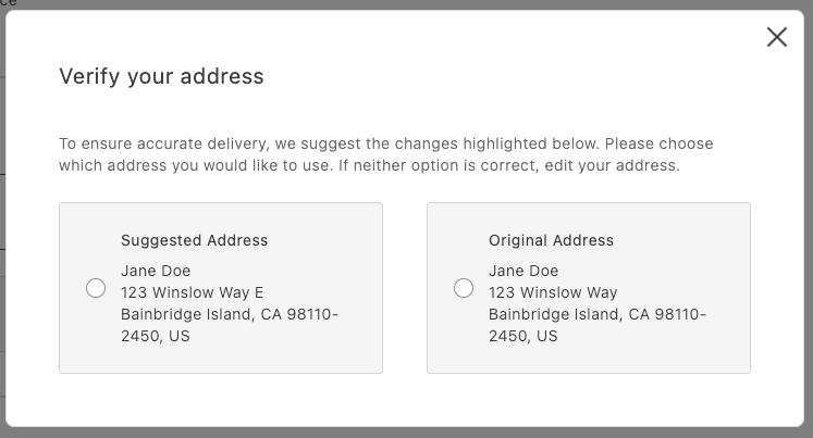
*AddressValidation displayed in a modal*
## Overview
At a high level:
- Call your address verification service before placing the order.
- If it returns a suggestion, open a modal and render `AddressValidation`.
- If the shopper selects the suggestion, persist it as the shipping address; otherwise, use the original address.
## Integration
```javascript
// in commerce-checkout.js block
// Handler passed to the PlaceOrder container
const handlePlaceOrder = async ({ cartId, code }) => {
await displayOverlaySpinner(loaderRef, $loader);
try {
// Payment Services credit card
if (code === PaymentMethodCode.CREDIT_CARD) {
if (!creditCardFormRef.current) {
console.error('Credit card form not rendered.');
return;
}
if (!creditCardFormRef.current.validate()) {
// Credit card form invalid; abort order placement
return;
}
// Submit Payment Services credit card form
await creditCardFormRef.current.submit();
}
// Address validation
const suggestion = await validateAddress();
if (suggestion) {
const container = document.createElement('div');
await showModal(container);
await renderAddressValidation(container, {
suggestedAddress: suggestion,
handleSelectedAddress: async ({ selection, address }) => {
if (selection === 'suggested') {
// Update the shipping form using the suggested address
sessionStorage.removeItem(SHIPPING_ADDRESS_DATA_KEY);
shippingForm.setProps((prevProps) => ({
...prevProps,
inputsDefaultValueSet: address,
}));
} else {
// Place order
await orderApi.placeOrder(cartId);
}
removeModal();
},
});
} else {
// Place order
await orderApi.placeOrder(cartId);
}
} catch (error) {
console.error(error);
throw error;
} finally {
removeOverlaySpinner(loaderRef, $loader);
}
};
```
```javascript
// in containers.js
/**
* Renders the AddressValidation container in its own host element
* @param {HTMLElement} container - DOM element to render into
*/
export const renderAddressValidation = async (
container,
{ suggestedAddress, handleSelectedAddress }
) =>
CheckoutProvider.render(AddressValidation, {
suggestedAddress,
handleSelectedAddress,
})(container);
```
```javascript
// in utils.js (example stub)
export const validateAddress = async () => {
// Here’s where your API call goes
return {
city: 'Bainbridge Island',
countryCode: 'US',
postcode: '98110-2450',
region: 'CA',
street: ['123 Winslow Way E'],
};
};
```
Finally, add some padding for better appearance:
```css
/* commerce-checkout.css */
.modal-content .checkout-address-validation {
padding: var(--spacing-big);
}
```
## Next steps
- See the [`AddressValidation` container](https://experienceleague.adobe.com/developer/commerce/storefront/dropins/checkout/containers/address-validation/) for props and behaviors.
- Ensure your suggestion matches the `CartAddressInput` format.
---
# Order Cancellation
The order drop-in component enables both logged-in users and guest users to cancel an order.
## Big picture
The order cancellation workflow is as follows:
1. The shopper selects an order to cancel. Guest users must use the order search form to locate the order. Logged-in customers can select an order from their order history or use the search form.
1. The shopper submits the cancellation form after selecting a cancellation reason.
1. If the shopper is a logged-in customer, the order is `Canceled` immediately. Otherwise, the order status remains `Pending` until the guest clicks a link in a confirmation email.
## Prerequisites
Adobe Commerce must be configured to allow order cancellations. In the Admin, go to **Stores** > Configuration > **Sales** > **Sales** > **Order Cancellation** and set the following options:
```text
[
['Configuration', 'Description'],
['Order cancellation through GraphQL', 'Set to Yes to enable order cancellations.'],
[
'Order cancellation reasons',
'A list of reasons that the shopper can choose from to explain why they want to cancel the order. You can customize the default options to provide a list that is applicable to your business.',
],
]
```
*Order cancellation configuration options*
## Step-by-step
The following steps describe how to implement the order cancellation workflow for both logged in customers and guests.
### 1. Display the order history (logged-in customers only)
The workflow for logged-in customers is straightforward. An order can be canceled only if it has a status of `Received`, `Pending`, or `Processing`.
> The logged-in customer can also use the order search form to locate the order. See [Search for the order](#search-for-the-order) for this use case.
The customer selects an active order from their order history to cancel.
*Order history*
The order history page uses the `OrderProductListContent` component to render the list of orders that the customer previously placed. It iterates over the list of orders and uses the `CartSummaryItem` component to render each order item. The order item is an instance of the `OrderItemModel`, which contains all the necessary properties of an order item.
The following example shows an implementation of the `OrderProductListContent` component:
```jsx
...
{item.list?.map((product: OrderItemModel) => (
))}
...
```
### 2. Search for the order
A guest user does not have access to the order history page. Therefore, the only way to access an order is by using the Order Search form. The search order form retrieves the order that matches the specified email address, last name, and order name, as shown below:
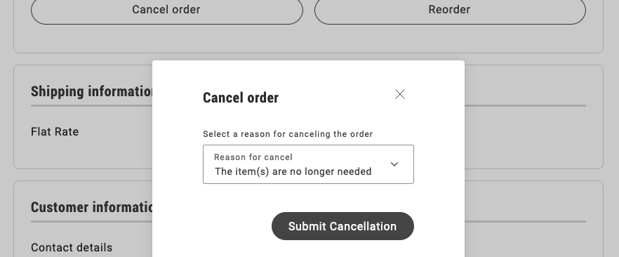
*Order cancellation form*
The `OrderSearchForm` component is responsible for rendering the form to search for an order.
It receives the following parameters:
```text
[
['Configuration', 'Description'],
['fieldsConfig', 'An array of fields to be rendered in the form.'],
['loading', 'A boolean to indicate whether the form is loading.'],
[
'inLineAlert',
'After submitting the form, an inline alert is shown with the result of the operation (success, warning, error) with its respective message.',
],
[
'onSubmit',
'A function to be called when the form is submitted and a flag to indicate if the form is valid.',
],
]
```
See the following code for an example of the implementation:
```jsx
...
{inLineAlert.text ? (
}
/>
) : null}
...
```
### 3. Render and submit the cancellation form
The cancellation form allows the customer to select a cancellation reason and submit the form.

*Order cancellation form*
The `OrderCancel` component renders the `OrderCancelForm` container inside a modal.
This modal receives two parameters:
```text
[
['Parameter', 'Description'],
['orderRef', 'Identifies the order.'],
['cancelReasons', 'Contains all the configured cancellation reasons.'],
]
```
For example:
```jsx
...
}
data-testid="order-cancellation-reasons-modal"
>
...
```
The `OrderCancelForm` component is responsible for:
- Rendering the form with multiple cancellation reasons and a submission button.
- Handling the form submission.
- Showing the appropriate error messages if a failure occurs after submitting the form.
```jsx
...
{isErrorVisible && (
)}
...
```
### 4. Display the confirmation notice
When a logged-in customer submits the cancellation form, Commerce immediately sets the status of the order to `Canceled` and the drop-in displays a confirmation notice.
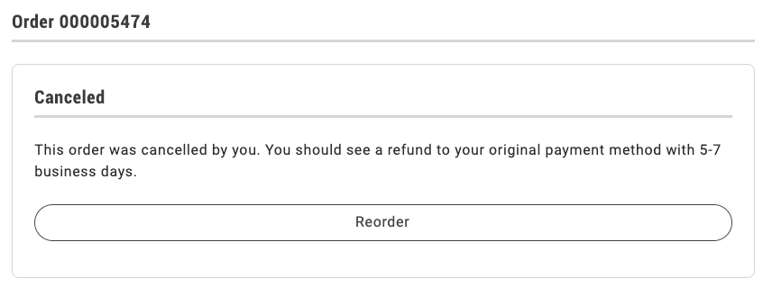
*Confirmation for logged-in users.*
If the shopper is a guest user, the drop-in displays the following dialog:
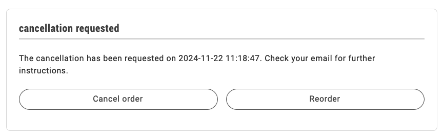
*Guest user is notified that cancellation has been requested.*
The order status remains `Pending` until the shopper clicks the link in an email similar to the following to confirm the cancellation.
> **Confirm Your Main Website Store Order Cancellation** It seems that you'd like to cancel your order #000000001. If this is correct, please _click here_ to confirm your cancellation request.
If you have questions about your order, you can email us at _support@example.com_.
Once clicked, the order becomes `Canceled` and the order status page is updated accordingly.
The order status page uses the `OrderStatusContent` component to render the order with all its properties and the available actions.
See the following code for an example of the `OrderStatusContent` implementation below:
```jsx
...
{isReturnPage ? returnMessage : orderMessage}
...
```
After performing any action, the order status page is re-rendered, so that it reflects the new status and the available actions. The appropriate message is shown to the user, depending on the action performed.
---
# Notify Me CTA
When a product or selected variant is out of stock, the primary Call to Action (CTA) button on the Product Detail Page (PDP) can display **"Notify Me"** instead of **"Add to Cart"**. This applies to both simple products and configurable products with multiple options (for example, size and color). When the shopper switches to a different variant, the CTA updates dynamically based on that variant's stock status.
> **Notify Me as customization** "Notify Me" is a frequently requested customization. This tutorial shows how to add it using the event bus and CTA updates. If your implementation requires backend integration (for example, an admin toggle for back-in-stock notifications), this approach keeps the logic in your block. If it becomes standard behavior in the future, it may be added to the boilerplate directly.
## Prerequisites
Before following these steps, you should understand:
- [Events](https://experienceleague.adobe.com/developer/commerce/storefront/dropins/product-details/events/) — `pdp/data`, `pdp/valid`, and subscription patterns
- [Functions](https://experienceleague.adobe.com/developer/commerce/storefront/dropins/product-details/functions/) — `getProductConfigurationValues` for reading selected options
- [Cart Events](https://experienceleague.adobe.com/developer/commerce/storefront/dropins/cart/events/) — `cart/data` for detecting when the product is already in the cart
- **Add to Cart button** — Your block must include an Add to Cart button. This can be a standard HTML `